
 I
I
In This Pairing
Some font pairings work because the typefaces look similar. Playfair Display and Inter succeed for the opposite reason: each font brings something the other deliberately lacks.
Playfair Display is expressive, elegant, and hard to ignore. Inter is clean, practical, and happy doing the less glamorous work. Together, they create a typography system that feels polished without becoming precious and modern without looking like every startup launched last Tuesday.
The Playfair Display + Inter font pairing works especially well for editorial websites, personal brands, consultants, creative studios, and premium service businesses.
Playfair Display gives headlines a memorable voice, while Inter keeps paragraphs, navigation, buttons, and supporting information easy to read.
The fonts do not perform the same job. That is precisely why the relationship works.
New to typography? Our font design for beginners guide explains how typefaces are built—and why details such as spacing, weight, and letterforms matter when pairing fonts.
Playfair Display + Inter Font Pairing Snapshot
Overview of Playfair Display and Inter
A good pairing is not simply two attractive fonts sharing a page. It is a division of responsibility.
Here, Playfair Display handles expression. Inter handles communication.
What Is Playfair Display?
Playfair Display is a high-contrast serif inspired by transitional typefaces from the late eighteenth century. Its delicate hairlines, pronounced thick strokes and elegant letterforms give it a literary, high-end character.
It naturally attracts attention, making it ideal for page titles, article headlines, pull quotes and short display text. The font is often associated with magazines, fashion, hospitality, publishing and premium personal brands.
Its weakness is also part of its charm. Those dramatic details become less comfortable at small sizes, so Playfair Display needs room to perform. Forcing it into long body paragraphs is a little like wearing an evening gown to the gym. Technically possible. Still a questionable decision.
What Is Inter?
Inter is a highly legible sans serif designed for screens. Its open letterforms, generous x-height and practical spacing make it comfortable in paragraphs, menus, buttons, labels and interfaces.
Where Playfair Display is theatrical, Inter is disciplined.
Inter’s broad weight range also supports a complete hierarchy without introducing another font. Regular works well for body copy, while Medium and SemiBold can handle subheadings, navigation and calls to action.
Its calm, modern personality gives Playfair Display space to be expressive without letting the design become overly decorative.
Why the Playfair Display + Inter Font Pairing Works
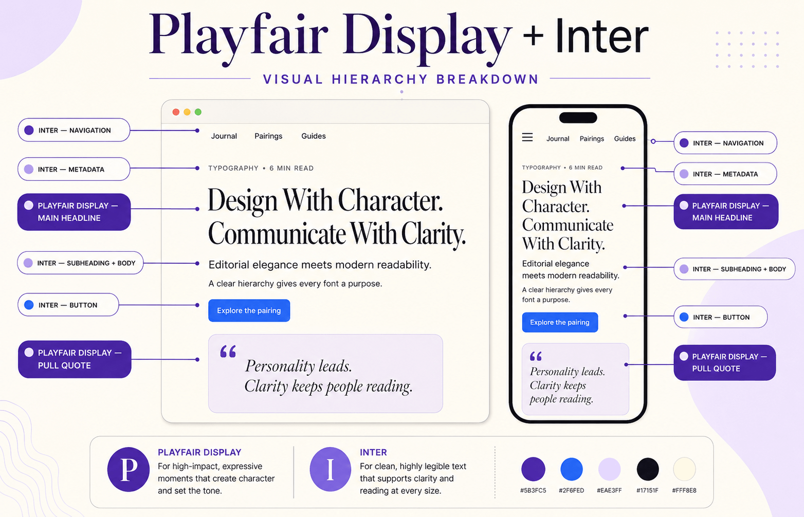
Playfair Display and Inter create contrast at several levels: visual, historical, emotional and functional.
One carries the influence of traditional editorial typography. The other was designed for contemporary digital environments. That difference makes the hierarchy clear before the reader consciously studies it.
✓ Clear Serif and Sans-Serif Contrast
Playfair Display uses pronounced serifs and dramatic stroke contrast. Inter has clean, restrained sans-serif forms.
Readers can therefore distinguish headings from supporting text immediately. The design gains hierarchy without relying on shadows, outlines, five accent colours, or other signs that the formatting toolbar was left unsupervised.
✓ Editorial Personality Meets Digital Practicality
Playfair Display gives a page the authority associated with books and magazines. Inter provides the usability expected from a modern website.
This is valuable for brands that want to feel established without looking dated or contemporary without becoming cold and generic.
Playfair Display sets the mood. Inter makes that mood usable.
✓ A Naturally Strong Hierarchy
Playfair Display can lead through the H1 and selected H2 headings. Inter can manage paragraphs, H3 headings, navigation, metadata and buttons.
Because the roles are visibly different, you can create a strong hierarchy using only font, size, weight and spacing. There is rarely a need to add more typefaces.
✓ Balanced Emotional Tone
Playfair Display alone can become formal or overly luxurious. Inter alone may feel neutral and utilitarian. Together, they soften each other’s extremes.
The result feels elegant but not stiff, modern but not sterile, and premium without becoming unapproachable.
See the Playfair Display + Inter Pairing in Action
Use this preview to judge contrast, reading rhythm and hierarchy before applying the pairing to a real website or brand system.
ABCDEFGHIJKLMNOPQRSTUVWXYZ
abcdefghijklmnopqrstuvwxyz
0123456789 ! ? & % $ # @ ( ) [ ] : ; , .
When to Use the Playfair Display + Inter Font Pairing
This pairing works best when a design needs personality at the top of the page and clarity everywhere else.
📰 Editorial Websites and Magazines
This is the pairing’s natural habitat. Playfair Display gives article titles and pull quotes traditional editorial authority, while Inter keeps long articles, author details, dates and navigation comfortable to read.
The contrast helps the page feel designed rather than merely formatted.
👤 Personal Brands and Consultants
Consultants, writers, strategists and creative professionals often need to balance expertise with personality.
Use Playfair Display for the main promise and major service headings. Let Inter handle credentials, descriptions, testimonials, forms and calls to action. The result feels professional without becoming corporate wallpaper.
✨ Fashion, Lifestyle and Premium Services
Playfair Display brings the elegance expected in fashion, beauty, hospitality and lifestyle design. Inter translates that elegance into a functional digital experience.
The pairing works especially well with strong photography, generous white space, restrained colours and simple layouts.
🎨 Creative Studios and Portfolios
Designers, photographers, architects and studios can use Playfair Display to frame projects as stories rather than another row of thumbnails. Inter keeps case-study details, client information and results easy to scan.
When to Avoid the Playfair Display + Inter Pairing
No pairing is universally appropriate. This one may feel misplaced when a brand needs to appear rugged, highly technical, child-focused or deliberately raw.
Inter can handle a software interface beautifully, but Playfair Display is better kept on the marketing website than inside dense dashboards, tables and settings screens. Let Inter run the product.
The Playfair Display + Inter Font pairing is also less suitable for playful children’s brands or industrial businesses where polished editorial elegance may send the wrong message.
Typography should support the brand’s personality, not arrive wearing a tuxedo to the wrong event.
How to Structure a Clear Hierarchy With Playfair Display and Inter
The pairing succeeds when each font receives a disciplined role.
Playfair Display should lead. Inter should organise, explain and guide.
Headline Strategy
Use Playfair Display Medium, SemiBold or Bold for the H1 and major H2 headings. Start around 48–64 pixels on desktop and 36–44 pixels on mobile.
Keep the line height relatively tight, usually between 1.05 and 1.2 and test mobile line breaks carefully. Sentence case generally looks more natural than long all-capital headlines.
Body Text Strategy
Use Inter Regular for paragraphs at approximately 17–19 pixels, with a line height between 1.55 and 1.7.
Keep text columns around 55–75 characters wide. Inter may remain technically legible in tiny type, but “technically legible” is not the standard we are aiming for.
Subheadings, Buttons and UI
Inter SemiBold works well for H3 headings, labels, menus and supporting information. Use Inter Medium or SemiBold for buttons, forms and interface elements.
Avoid placing Playfair Display inside most buttons. An action such as “Buy Now” should feel immediate, not like the opening line of a Victorian novel.
Recommended Weight and Hierarchy Setup
| Role | Font | Weight | Starting Size |
| Main title | Playfair Display | 600–700 | 48–64 px |
| Major heading | Playfair Display | 500–600 | 32–40 px |
| Supporting heading | Inter | 600–700 | 24–28 px |
| Body copy | Inter | 400 | 17–19 px |
| Navigation and buttons | Inter | 500–600 | 15–17 px |
| Captions and metadata | Inter | 400–500 | 13–15 px |
Treat these values as starting points. Real content and real screens remain better judges than a perfectly behaved type specimen.
How to Use Playfair Display and Inter on a Website
Consistency matters more than cleverness. Decide what each font owns before building the pages, then maintain those roles throughout the site.
Hero Sections
Use Playfair Display for the primary promise, Inter for the supporting paragraph and Inter SemiBold for the button.
For example:
Playfair Display headline: “Build a Brand People Remember.”
Inter supporting text: “Create a clearer identity through thoughtful strategy, typography and design.”
Inter button: “View Our Services”
Content and Landing Pages
Use Playfair Display for page titles and selected major headings. Set paragraphs, service details, lists, captions and links in Inter.
On content-heavy pages, use Inter SemiBold for H3 headings. This keeps the structure clear without covering the page in decorative serif text.
Navigation, Forms and Footers
Keep functional elements in Inter. Navigation should be predictable, forms should be effortless, and footer links should be clear.
These areas are not where Playfair Display needs to audition for another role.
Real-World Use Case: A Consultant’s Personal Brand
Imagine a business consultant who needs to communicate experience, strategic thinking and a modern approach. A single neutral sans serif would be clear, but it could also make the site resemble dozens of competitors.
Playfair Display can give the homepage promise a distinctive voice: “Clearer Strategy for the Decisions That Matter.”
Inter then handles service descriptions, case studies, testimonials and booking buttons. The serif creates authority; the sans serif keeps the offer accessible. The website feels considered without becoming ornamental.
Common Mistakes Designers Make With This Pairing
✗ Using Playfair Display for Long Body Copy
Playfair Display can handle a short introduction or quotation, but its delicate details become tiring across long screen-based paragraphs. Keep it for display text and let Inter do the reading-heavy work.
✗ Making Both Fonts Equally Loud
If Playfair Display is oversized while Inter is bold, uppercase and brightly coloured, the hierarchy becomes a shouting contest.
Choose one dominant voice. Playfair Display should usually attract attention first; Inter should support it.
✗ Using Too Many Weights
A reliable system may need only Playfair Display SemiBold, Playfair Display Italic, Inter Regular and Inter SemiBold.
More weights do not automatically create more sophistication. Sometimes they simply create more decisions.
✗ Ignoring Mobile Headlines
Large Playfair Display headlines can break awkwardly on narrow screens. Test long titles on mobile and adjust the size, width or wording when necessary.
Typography is not responsive merely because the CSS says it is.
Myth Debunked: Serif Fonts Do Not Make Websites Look Old
Serifs are often blamed for dated-looking websites, but the problem is usually the surrounding design.
Pair Playfair Display with cramped layouts, decorative flourishes and serif body text, and it may feel old-fashioned. Pair it with Inter, modern photography, generous white space and a clean grid, and it feels editorial.
Context changes the character of a typeface.
Professional Mistake: Choosing Fonts Before Defining the Brand
Playfair Display and Inter look attractive together, which makes them easy to choose too early.
First decide what the brand should communicate. If it needs to feel elegant, intelligent, contemporary or premium, the pairing makes sense. If it should feel playful, industrial or rebellious, another combination may be more honest.
The goal is not to select the prettiest fonts. It is to choose typography that makes the right promise.
Before committing to this pairing, consider whether its elegant, editorial personality matches your business. Our guide on how to choose the right font for your brand will help you evaluate brand personality, audience, readability, and real-world use.
Playfair Display + Inter vs Other Serif and Sans-Serif Pairings
The best alternative depends on whether you want more warmth, restraint or drama.
| Pairing | Personality | Best For |
| Playfair Display + Inter | Editorial and modern | Personal brands, magazines, premium services |
| Lora + Poppins | Warm and approachable | Educators, consultants, lifestyle brands |
| Libre Baskerville + Inter | Literary and restrained | Publishers and professional services |
| Cormorant Garamond + Inter | Artistic and luxurious | Fashion, beauty and hospitality |
| Merriweather + Inter | Practical and dependable | Blogs, education and long-form content |
Choose Playfair Display + Inter font pairing when you want noticeable editorial contrast. Choose Lora + Poppins for greater warmth or Libre Baskerville + Inter for quieter authority.
If this pairing feels too dramatic, explore Libre Baskerville + Inter for quieter, more traditional authority or Lora + Poppins for a warmer, friendlier personality. Both offer strong serif-and-sans-serif contrast with a different mood.
For the principles behind these choices, read our guide on how to pair fonts like a designer.
Designer-Level Refinement Tips
✦ Give Playfair Display Room
Increase the white space around major headings before making the font unnecessarily large. Space helps its expressive letterforms feel deliberate.
✦ Control the Colour Palette
Dark charcoal or deep purple works well for Playfair Display, while a slightly softer charcoal can reduce the density of Inter body text.
Use accent colours selectively. The typography already has personality; the palette does not need to perform acrobatics.
✦ Test Real Content
A pairing may look flawless with “The Art of Modern Living” and collapse when the real headline contains twelve words and a particularly stubborn hyphen.
Test long titles, numbers, buttons, quotations and awkward line breaks. Real copy reveals what polished sample text politely hides.
✦ Use Italics Sparingly
Playfair Display Italic can add a beautiful editorial accent to short statements and pull quotes. Use it selectively.
Think of italics as seasoning. A little adds character. An enthusiastic handful changes the meal.
Frequently Asked Questions
Is Playfair Display and Inter a good font pairing?
Yes. They provide clear serif-and-sans-serif contrast without visual conflict. Playfair Display adds editorial personality, while Inter provides structure and readability.
Are Playfair Display and Inter free?
Both fonts are available through Google Fonts under open-source licences suitable for personal and commercial projects. Review the current licence terms when downloading the files.
Which font should I use for headings?
Use Playfair Display for page titles and major headings. Inter works better for smaller subheadings, labels, navigation and interface text.
Can Playfair Display be used for body copy?
It can support short introductions or quotations, but Inter is the stronger choice for long body text—especially on screens.
Does this pairing work on mobile?
Yes. Inter performs very well on screens, while Playfair Display remains effective when headline size, line height and line breaks are adjusted for smaller devices.
The Bottom Line: Is Playfair Display + Inter Right for Your Brand?
The Playfair Display + Inter font pairing is one of the most dependable ways to combine editorial elegance with modern clarity.
Playfair Display creates the memorable moments. Inter organises the information and keeps functional elements easy to use. Their roles are different, but complementary.
Use the pairing when your brand needs to feel polished, intelligent and contemporary. Give Playfair Display space to lead, let Inter handle the practical work, and resist decorating what already works.