 I
I
In This Guide
Knowing how to choose the right font for your brand can shape how people see your business before they read a single word.
Typography gets there first.
The right typeface can make a brand feel premium instead of inexpensive, trustworthy instead of amateur, or modern instead of outdated. Yet many businesses spend weeks refining their logos and colors, only to choose a font because it “looked nice” in a mockup.
At Fontish, we believe in something simple:
Typography isn’t decoration. It’s strategy.
In this guide, I’ll show you how to choose fonts that reflect your brand personality, build a practical typography system, and avoid the subtle mistakes that weaken credibility.
The goal isn’t to follow a passing trend. It’s to create typography your brand can grow into—not quickly outgrow.
Why Choosing the Right Font for Your Brand Actually Matters

Imagine seeing the same company name presented in two different fonts.
One version uses Playfair Display, with elegant proportions and generous spacing.
The other uses Comic Sans.
- Same company.
- Same products.
- Same prices.
Completely different first impression.
That’s the power of typography.
Fonts don’t simply display words—they shape expectations. Long before someone reads your copy, they’re already forming assumptions about your professionalism, personality, and credibility based on what they see.
A refined serif immediately suggests heritage and sophistication, while a geometric sans serif feels clean and efficient. A playful handwritten font might make one brand feel approachable, yet make another appear unprofessional.
Most people never stop to think,
“That’s an excellent typography system.”
Instead, they experience something much subtler.
They instinctively decide whether a brand feels trustworthy.
Or they don’t.
That’s why typography deserves far more attention than it usually receives.
If your fonts feel inconsistent, your brand feels inconsistent. And when typography lacks direction, even well-written messaging begins to lose some of its authority.
One of the biggest misconceptions I encounter is the idea that typography is the final design decision.
It isn’t.
Typography is one of the foundations everything else is built upon.
If you’re still learning how headings, spacing, and hierarchy work together, our Typography Hierarchy Guide explains how individual font choices become a complete communication system rather than a collection of disconnected design decisions.
Because that’s ultimately what you’re creating.
Not simply a font selection.
A visual language your audience learns to recognize.
The Psychology Behind Fonts and Brand Perception

Now that we’ve established why choosing the right font matters, it’s worth understanding why different fonts create such different emotional responses.
Fonts communicate personality remarkably quickly. Our brains recognize visual patterns almost instantly, and typography becomes part of that first impression before we’re even aware it’s happening.
No typeface can magically create trust or luxury on its own, of course. But certain font categories consistently reinforce particular qualities when they’re used in the right context.
Serif Fonts
Serif fonts communicate authority.
They suggest tradition.
More importantly, they project confidence without ever needing to raise their voice.
Classic serif typefaces such as Merriweather, Libre Baskerville, and Cormorant Garamond frequently appear in industries where credibility matters more than novelty.
You’ll commonly find them used by:
- Law firms
- Financial institutions
- Editorial publications
- Luxury brands
- Universities
- Premium hospitality companies
Their distinctive finishing strokes naturally create a sense of heritage and refinement.
That doesn’t mean every serif feels old-fashioned.
Modern editorial serifs like Playfair Display combine traditional foundations with dramatic contrast, making them equally effective for luxury branding, fashion websites, and contemporary editorial design.
Sans Serif Fonts
If serif fonts speak with experience, sans serifs speak with clarity.
They’re clean, direct, and efficient.
That’s exactly why typefaces such as Inter, Helvetica, Poppins, and Montserrat dominate modern interfaces. They remain highly readable across digital products while adapting beautifully to websites, mobile apps, and user interfaces.
You’ll see them everywhere, from SaaS companies and technology startups to digital agencies and product websites.
Even within this category, personality varies.
A geometric sans like Poppins feels approachable and contemporary, whereas a neutral system such as Inter deliberately steps into the background, allowing the content itself to take center stage.
Neither approach is objectively better.
They’re simply solving different branding problems.
Script Fonts
Few font categories communicate emotion as quickly as script fonts.
Used thoughtfully, they evoke craftsmanship, elegance, individuality, and personality almost immediately.
That’s why they’re so common in industries like:
- Boutique fashion
- Wedding services
- Beauty brands
- Luxury packaging
- Handmade products
Their personality, however, is also their greatest limitation.
A script font that looks stunning in a logo can become frustratingly difficult to read in navigation menus, product descriptions, or long passages of text.
Experienced designers know where to stop.
They use script fonts to create memorable moments—not entire reading experiences.
Display Fonts
Display fonts are designed to attract attention.
They’re expressive.
They’re memorable.
And they’re surprisingly easy to misuse.
Fonts such as Bebas Neue and Abril Fatface thrive in large headlines where personality matters most. Reduce them to body text, however, and readability disappears almost immediately.
I like to think of display fonts the same way I think about spices in cooking.
A small amount elevates everything around it.
Too much overwhelms the entire dish.
Myth Debunk: “If My Product Is Good, Fonts Don’t Matter.”
I hear this argument more often than you might expect while explaining how to choose the right font for brands.
It’s also one of the quickest ways to weaken an otherwise excellent brand.
People rarely evaluate products in isolation.
They evaluate presentation.
A premium product presented with inconsistent typography immediately feels less premium, while a trustworthy business with poor typography often appears less trustworthy—even if the service itself is exceptional.
Most visitors can’t explain why they feel that way.
They simply do.
Typography influences perceived professionalism.
Professionalism builds trust.
And trust influences conversions.
Your font isn’t replacing your product.
It’s introducing it.
First impressions rarely ask for a second chance.
Step-by-Step Framework to Choose the Right Font for Your Brand

Understanding how font typography influences perception is valuable.
Knowing how to translate that understanding into practical decisions is what separates memorable brands from forgettable ones.
Whenever I help someone build a brand identity, I don’t begin by browsing Google Fonts or scrolling through endless font libraries. I begin with strategy, because fonts are the answer—not the first question.
Here’s the framework I recommend every time.
Step 1: Define Your Brand Personality
Before choosing a single typeface, define the personality you’re trying to communicate.
It sounds obvious, yet it’s the step most businesses skip.
Instead, they search for phrases like “best fonts for logos” or “modern fonts for websites” and hope something immediately feels right.
That’s working backwards.
Start with your brand, not your font library.
Ask yourself:
- Do we want to feel modern or traditional?
- Premium or approachable?
- Bold or understated?
- Corporate or creative?
- Innovative or dependable?
Now narrow those ideas down to just three adjectives.
For example:
Luxury skincare brand
- Elegant
- Calm
- Premium
AI startup
- Intelligent
- Modern
- Efficient
Children’s learning platform
- Friendly
- Playful
- Encouraging
Those three words become your design compass.
Whenever you’re evaluating a font, ask yourself one simple question:
Does this typeface reinforce these three qualities?
If the answer is no, keep looking.
One lesson I’ve learned over the years is that professional designers rarely choose fonts because they’re personally attached to them. They choose them because they solve communication problems, and that’s a subtle but important distinction.
Step 2: Understand Your Audience and Industry
Great typography never exists in isolation.
The perfect font for one business can feel completely out of place for another.
Imagine launching a cybersecurity company using an elegant wedding-style script font. Technically, there’s nothing wrong with the typeface—but strategically, almost everything is.
The opposite is just as true.
A luxury jewellery brand built around an overly playful rounded display font immediately loses some of the exclusivity it’s trying to communicate.
Your audience already arrives with expectations.
Strong typography respects those expectations just enough to establish credibility before introducing personality through thoughtful design choices.
As you’re researching your market, ask yourself:
- What typography is common in my industry?
- Which conventions build trust?
- Where can I differentiate without creating confusion?
Notice what I’m not asking.
I’m not asking:
“What font is everyone else using?”
There’s an important difference.
Understanding industry conventions doesn’t mean copying them. It simply gives you a foundation for deciding where consistency builds trust and where originality creates an advantage.
The best designers know the rules before deciding which ones are worth breaking.
Step 3: Choose the Right Font Category
Once you’ve defined your personality and understood your audience, choosing a font category becomes much easier.
At this point, you’re no longer guessing.
You’re matching visual language to business strategy.
A simple framework looks like this:
| Brand Personality | Recommended Font Style | Example Fonts |
| Luxury & Editorial | High-contrast serif | Playfair Display, Cormorant Garamond |
| Modern Technology | Geometric sans serif | Inter, Space Grotesk, Poppins |
| Creative Studio | Expressive display + clean sans | Abril Fatface + Inter |
| Corporate & Finance | Neutral serif or neo-grotesk sans | Merriweather, Helvetica, Inter |
| Friendly Consumer Brand | Rounded sans serif | Nunito, Poppins, DM Sans |
One detail is worth emphasizing.
Notice that we’re choosing font categories first.
Specific fonts come later.
That’s exactly how experienced designers approach how to choose the right font. They decide what kind of visual language the brand needs before comparing individual typefaces.
If you’re unsure which fonts naturally complement one another, our Best Font Pairings Guide showcases combinations that have already proven themselves across branding, editorial design, and digital products. Starting with tested pairings can save hours of unnecessary experimentation.
Step 4: Test Readability in Real-World Situations
This is where beautiful typography often falls apart.
Many fonts look incredible inside a logo presentation or a polished Behance mockup.
Then they meet reality.
Reality includes:
- Mobile screens
- Navigation menus
- Product pages
- Email newsletters
- Dashboards
- Buttons
- Long-form articles
Suddenly, that ultra-thin headline doesn’t feel elegant anymore.
It feels difficult to read.
Professional designers rarely judge typography from isolated previews because they know context changes everything. A typeface that shines in a hero banner may struggle inside a pricing table or navigation menu.
Whenever you’re evaluating the right font, test it in situations your audience will actually encounter.
✓ Body text at 16–18px
✓ Mobile devices
✓ Large desktop headlines
✓ Navigation menus
✓ Call-to-action buttons
✓ Product cards
✓ Social media graphics
One simple rule has saved me from countless redesigns over the years:
If it struggles on mobile, it isn’t ready for your brand.
Readability isn’t the most exciting part of typography.
It is, however, one of the strongest signals of professionalism.
Step 5: Build a Simple Typography System
Now we move from choosing fonts to building a system.
That’s an important distinction.
You don’t need six fonts.
In most cases, you don’t even need four.
The strongest brand identities usually rely on just two or three carefully chosen typefaces, each with a clearly defined role.
Two-font systems
Ideal for:
- SaaS products
- Startups
- Corporate websites
- Digital platforms
Benefits include:
- Faster loading times
- Easier maintenance
- Stronger consistency
- Cleaner visual identity
Three-font systems
Best suited to:
- Editorial websites
- Luxury brands
- Fashion
- Creative agencies
The third typeface introduces controlled contrast without making the design feel cluttered.
The keyword is controlled.
Every font should have a purpose.
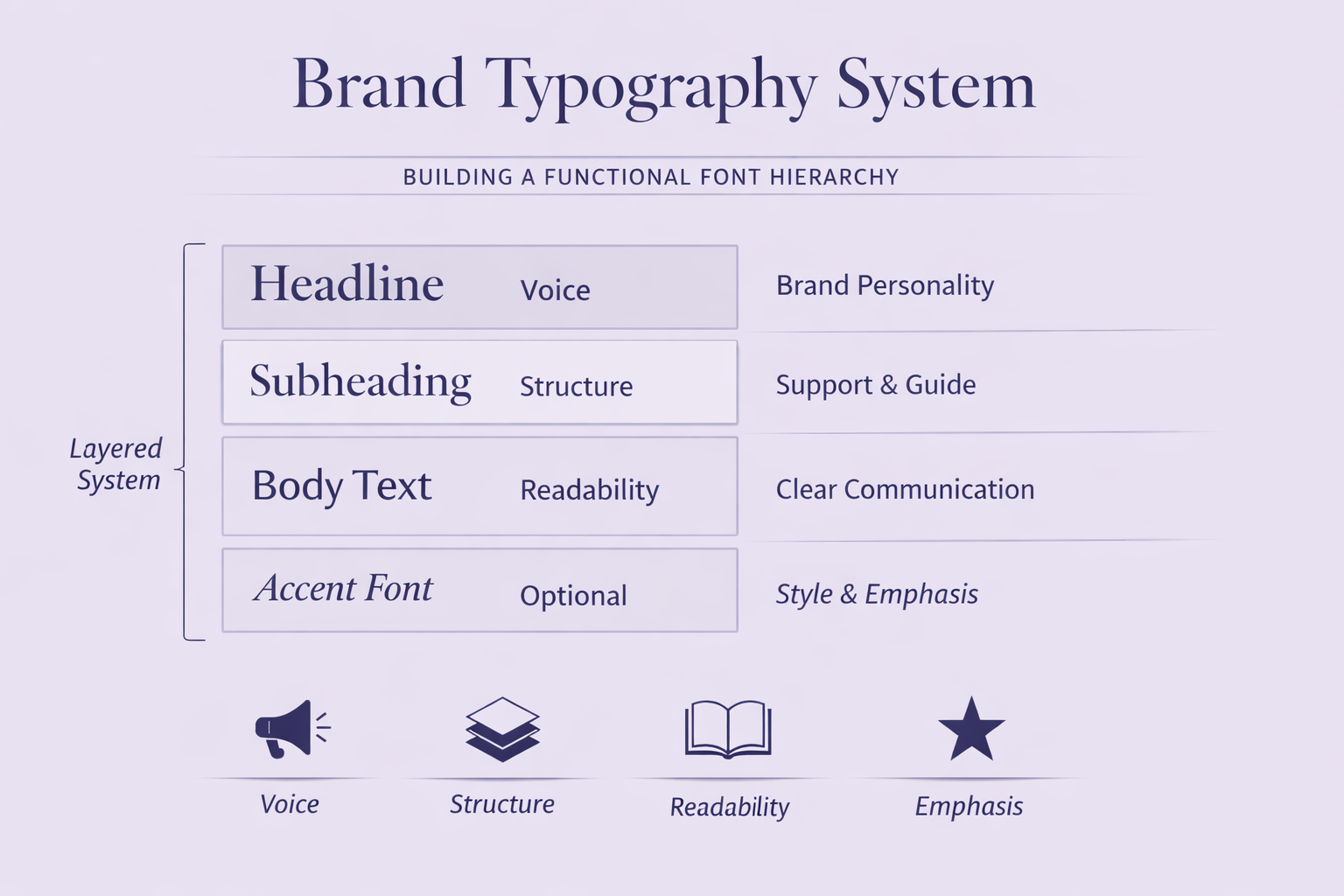
A typical typography system might look like this:
- Headline font — establishes personality and brand voice.
- Body font — prioritizes readability across long passages.
- Accent font (optional) — reserved for pull quotes, highlights, or decorative moments.
Each typeface contributes something unique.
None competes for attention.
One of the most common mistakes beginners make is choosing multiple fonts with nearly identical personalities. Instead of creating contrast, they create uncertainty, leaving readers with the feeling that something is slightly off—even if they can’t explain why.
A carefully balanced serif and sans serif pairing, on the other hand, establishes hierarchy almost effortlessly.
If you’d like to understand why some pairings feel so natural while others never quite work, our How to Pair Fonts Like a Designer guide explores the principles behind successful typography combinations rather than simply recommending fonts.
Understanding Font Categories (So You Don’t Guess)
| Category | Example Look | Brand Personality |
| Old Style Serif | classic serif sample | traditional |
| Modern Serif | high contrast serif | luxury |
| Geometric Sans | round letters | tech |
| Neo-Grotesk | neutral sans | corporate |
By this stage, you’ve defined your brand personality and built a framework for choosing fonts strategically.
Now it’s time to look a little deeper at the typefaces themselves.
Many people think typography consists of just four broad categories:
- Serif
- Sans serif
- Script
- Display
That’s a perfectly reasonable starting point.
Professional designers, however, tend to think in smaller classifications because each subgroup communicates something slightly different. Those differences may seem subtle on paper, but they have a surprisingly large impact on how a brand is perceived.
The better you understand these categories, the less you’ll rely on guesswork.
Serif Fonts: Old Style, Transitional, and Modern
Not all serif fonts tell the same story.
Some feel scholarly and timeless.
Others feel luxurious and contemporary.
Understanding those differences makes it much easier to choose a typeface that reinforces your brand rather than simply decorating it.
Old Style Serif
Examples
- Garamond
- Libre Baskerville
Best for
- Publishing
- Universities
- Professional services
- Heritage brands
Old Style serifs have been around for centuries, and that history still shapes how people perceive them today. They communicate intelligence, stability, and quiet confidence without feeling overly formal.
They’re rarely flashy.
That’s precisely what makes them so effective.
When credibility matters more than novelty, Old Style serifs remain one of the strongest choices available.
Transitional Serif
Examples
- Baskerville
- Georgia
Transitional serifs sit comfortably between traditional and modern typography.
They retain the authority of older serif styles while introducing cleaner proportions and slightly higher contrast, giving them a more contemporary feel without sacrificing trust.
They’re particularly well suited to:
- Corporate publishing
- Consulting firms
- Professional blogs
- Educational organizations
If your brand needs to feel established without appearing old-fashioned, this category deserves serious consideration.
Modern Serif
Examples
- Playfair Display
- Cormorant Garamond
Modern serifs are often associated with elegance.
High contrast, refined proportions, and dramatic letterforms immediately communicate sophistication, which explains why they’re so common in industries where perception plays a major role.
You’ll frequently see them used by:
- Luxury fashion brands
- Editorial publications
- Beauty companies
- Premium lifestyle products
One mistake I see quite often is assuming these fonts create luxury on their own.
They don’t.
Luxury comes from the complete system—thoughtful spacing, restrained color palettes, balanced layouts, and disciplined typography working together.
A beautiful serif simply gives that system a strong foundation.
Sans Serif Fonts: Humanist, Geometric, and Neo-Grotesk
Sans serif fonts are often treated as though they’re all the same.
They’re not.
In fact, the differences between these categories can be just as meaningful as the differences between serif styles.
Choosing the right subgroup helps your typography communicate exactly the right personality before anyone reads a single sentence.
Humanist Sans Serif
Examples
- Gill Sans
- Frutiger
- Calibri
Humanist sans serifs borrow subtle characteristics from handwriting, making them feel warmer and more approachable than purely geometric alternatives.
That warmth makes them particularly effective for organizations that want to balance professionalism with empathy.
They’re commonly used by:
- Educational platforms
- Healthcare providers
- Non-profit organizations
- Service-based businesses
If your goal is to appear knowledgeable without becoming cold or overly corporate, a Humanist sans serif is an excellent place to begin.
Geometric Sans Serif
Examples
- Poppins
- Montserrat
- Futura
- Sora
Geometric sans serifs are built from simple circles, straight lines, and clean proportions.
The result is typography that feels structured, modern, and highly intentional.
It’s no coincidence that these fonts dominate technology websites, startup branding, and product design.
They’re especially well-suited to:
- SaaS products
- AI companies
- Digital agencies
- Mobile apps
- Technology brands
One detail worth remembering, though, is that geometry isn’t the same thing as personality.
Some geometric fonts can feel slightly sterile when they’re used on their own. Pair them with warmer imagery, thoughtful spacing, or a more expressive secondary typeface, and they become far more inviting without losing their modern character.
Neo-Grotesk Sans Serif
Examples
- Helvetica
- Arial
- Inter
- Univers
Neo-grotesk fonts take a different approach.
Rather than expressing personality themselves, they allow the content to become the focus.
That’s one of the reasons Inter has become such a favourite among product designers. It’s exceptionally readable across websites, dashboards, documentation, and user interfaces, all while remaining visually unobtrusive.
These fonts work particularly well for:
- Corporate brands
- Enterprise software
- Financial services
- Product interfaces
- Government organizations
Sometimes the best typography isn’t the font people remember.
It’s the one they never have to think about.
Variable Fonts: Small File, Big Advantage
If your brand lives primarily online, variable fonts deserve serious attention.
Instead of loading separate files for Light, Regular, Medium, Bold, and every other weight you intend to use, a variable font combines them into a single file.
That seemingly small change offers several practical advantages:
- Faster page loads
- Better website performance
- Greater design flexibility
- Easier typography management
Performance may not be the first thing people associate with typography, but it matters.
Every additional font file adds weight to your website, increasing loading times and creating more work for browsers. Even small improvements can make a noticeable difference to the overall user experience.
Good typography isn’t only about appearance.
It’s also about performance.
How to Match Fonts to Brand Personality
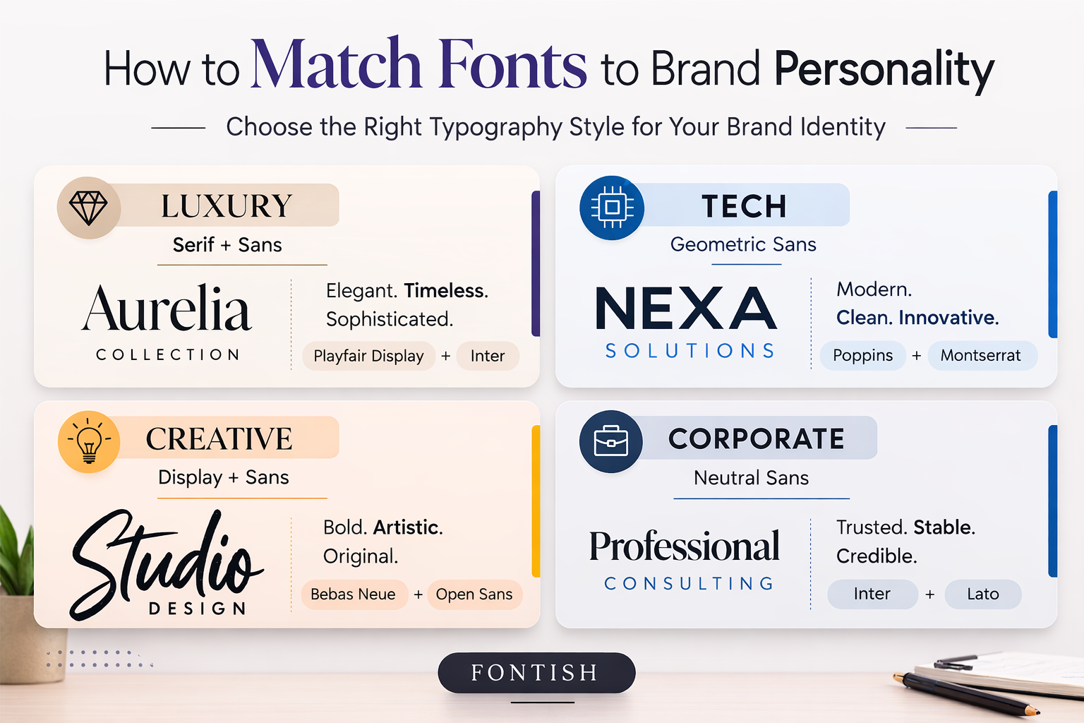
Understanding font categories is useful.
Knowing when to use them is where typography becomes strategic.
Instead of asking,
“Which font looks good?”
ask a more valuable question:
“What should my brand feel like?”
That single shift changes the entire decision-making process on how to choose the right font.
Let’s look at a few examples.
Luxury Brands
Luxury typography is surprisingly restrained.
Many people assume luxury branding requires ornate scripts or elaborate letterforms, but the opposite is often true.
Premium brands tend to rely on generous spacing, elegant proportions, and disciplined typography rather than excessive decoration.
A pairing such as Playfair Display and Inter creates an editorial aesthetic that feels sophisticated without becoming theatrical.
This approach works particularly well for:
- Fashion labels
- Luxury skincare brands
- Jewellery companies
- Interior designers
- Boutique hotels
Luxury rarely comes from adding more.
More often, it comes from knowing exactly what to leave out.
Technology Startups
Technology brands benefit from clarity above almost everything else.
Clean geometric headlines combined with highly readable body text create an experience that feels efficient, trustworthy, and easy to navigate.
A pairing such as Space Grotesk for headlines and DM Sans for body copy communicates innovation without sacrificing accessibility.
It’s an excellent combination for:
- AI companies
- SaaS platforms
- Fintech startups
- Productivity software
- Developer tools
The objective isn’t to look futuristic.
It’s to make complexity feel simple.
Creative Agencies
Creative businesses have more freedom to express personality.
That doesn’t mean every font should compete for attention.
In fact, the strongest creative identities often rely on one expressive display typeface supported by a calm, highly readable body font.
For example:
- Abril Fatface + Inter
- DM Serif Display + Lato
- Bebas Neue + Lora
Each pairing creates an immediate first impression while remaining comfortable to read over longer pages.
Creativity works best when it’s intentional rather than unpredictable.
Corporate and Financial Brands
When trust is your product, typography should reinforce stability.
Neutral sans serifs, such as Inter, or dependable serif families like Merriweather, communicate professionalism without becoming visually dull.
The objective isn’t to impress visitors.
It’s to reassure them.
That subtle distinction influences almost every design decision.
Personal Brands
Personal brands occupy an interesting middle ground.
You want to appear knowledgeable and professional, but you also want people to feel they’re connecting with a real person rather than a faceless business.
Typography should support that balance.
A combination such as DM Serif Display for headlines and Lato for body copy creates a personality that’s confident, approachable, and quietly distinctive.
Whether you’re a consultant, coach, author, or content creator, your typography should amplify your voice—not compete with it.
Font Pairing Strategy for Strong Brand Systems
By now, you’ve chosen a font category that aligns with your brand.
The next challenge is deciding what happens when two typefaces need to work together.
This is where many otherwise strong branding projects begin to lose consistency.
I’ve found that most typography problems aren’t actually font problems.
They’re pairing problems.
Individually, two fonts may look beautiful. Place them on the same page, however, and they suddenly begin competing for attention instead of working together.
Strong pairings create hierarchy.
Weak pairings create confusion.
One font should naturally lead the conversation while the other quietly supports it.
Think of it like a great interview.
If both people speak at the same time, nobody enjoys listening. The strongest conversations have rhythm, contrast, and clear roles—and typography follows exactly the same principle.
Use Contrast, Not Conflict
The best font pairings rely on controlled contrast rather than dramatic differences.
A small amount of contrast helps readers understand what deserves attention first. Too much contrast makes the design feel disjointed.
Some of the most reliable combinations include:
- Serif + Sans Serif
- Bold + Regular
- High Contrast + Neutral
- Traditional + Contemporary
Each pairing introduces visual variety while maintaining harmony.
Take Playfair Display paired with Inter as an example.
Playfair Display establishes personality and elegance.
Inter quietly supports readability across navigation, body copy, buttons, and interface elements.
Neither font is trying to dominate the page.
Each has a clearly defined job, and that’s exactly why the combination feels so balanced.
When fonts understand their roles, readers don’t notice the typography.
They notice how easy everything is to read.
Don’t Pair Fonts That Feel Like Cousins
One of the most common mistakes I see is pairing fonts that are almost identical.
For example:
- Montserrat + Poppins
- Helvetica + Arial
- Open Sans + Inter
Every one of those typefaces is excellent.
Pairing them together, however, rarely creates enough distinction to justify using both.
Instead of establishing hierarchy, the design feels slightly inconsistent—as though someone changed fonts halfway through the project without meaning to.
Whenever two fonts share nearly identical proportions and personalities, you’re usually better off choosing one font family and using different weights.
In many situations, the strongest pairing isn’t another font at all.
It’s thoughtful typography within the same family.
Build Hierarchy Before Personality
This is where beginners and experienced designers often take completely different approaches.
Beginners usually ask:
“Which font looks the most interesting?”
Experienced designers ask:
“Which font should people notice first?”
That single shift changes everything.
Hierarchy should always come before personality.
Once readers can comfortably navigate the page, personality becomes an enhancement rather than a distraction.
As you’re building your typography system, ask yourself:
- Which font attracts attention?
- Which font supports long-form reading?
- Which font guides navigation?
- Which font appears in buttons, forms, and calls to action?
Every role should have a clear purpose.
When those roles become blurred, readers work harder than they should to understand your content.
Good typography removes that effort.
Common Mistakes Brands Make When Choosing Fonts
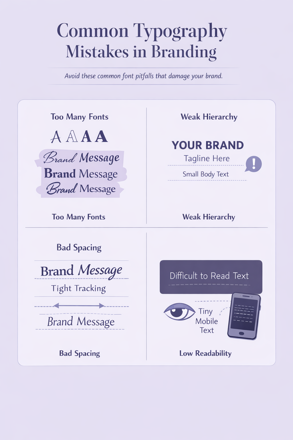
Choosing the right font is only half the challenge.
Avoiding the wrong decisions is just as important.
After reviewing countless websites over the years, I’ve noticed that the same typography mistakes appear again and again. Some are obvious from the moment a page loads. Others are subtle enough that business owners never realize typography is quietly undermining an otherwise excellent brand.
The encouraging news is that almost all of them are easy to avoid once you know what to look for.
1. Using Too Many Fonts
When every font has its own personality, your brand ends up with none.
I’ve seen websites using six or seven different typefaces on a single page—one for headings, another for subheadings, a third for body copy, a fourth for buttons, and somehow a decorative script font tucked away in the footer.
The result isn’t sophisticated.
It’s distracting.
Strong branding depends on consistency.
Every additional typeface introduces another visual voice, and before long, those voices begin competing instead of complementing one another.
Whenever possible, keep your system simple.
Two fonts are usually enough.
Three can work beautifully when each serves a clearly defined purpose.
Anything beyond that should have an objective reason rather than a personal preference.
2. Chasing Trends Instead of Building a Brand
Typography trends come and go.
Brand identities should last much longer.
Every year, a handful of fonts become impossible to avoid. They dominate design galleries, social media, and portfolio websites until suddenly every startup begins looking strangely familiar.
For a while, the trend feels exciting.
Eventually, it begins to date itself.
There’s nothing inherently wrong with following trends, but building your entire identity around one is rarely a good long-term strategy.
Whenever you’re considering a typeface, ask yourself a simple question:
Will this still represent my brand three years from now?
If you’re hesitant to answer, it’s probably worth exploring other options.
Timeless typography isn’t about avoiding trends completely.
It’s about refusing to depend on them.
3. Ignoring Mobile Devices
Even experienced designers occasionally fall into this trap.
A typography system that feels elegant on a large desktop monitor can quickly become frustrating on a phone.
Thin strokes disappear.
Letter spacing begins to look awkward.
Long headlines wrap in unexpected places.
Layouts that once felt spacious suddenly feel cramped.
That’s why I recommend evaluating typography on mobile from the beginning rather than treating it as the final step in the design process.
Every font you choose should comfortably pass four simple tests:
- Is it readable at 16–18px?
- Does it remain clear on smaller screens?
- Can users quickly scan headings?
- Does the layout still feel balanced when space becomes limited?
If the answer is “no” to any one of those questions, the typography system probably needs more work.
4. Confusing Thin with Elegant
This misconception has survived for years.
Many designers instinctively associate lighter font weights with premium branding.
Sometimes they’re right.
Quite often, they aren’t.
There’s a significant difference between typography that feels delicate and typography that’s simply difficult to read.
A thin headline surrounded by generous white space can feel refined.
The same weight used in navigation menus, pricing tables, or product descriptions usually creates unnecessary friction.
Professional typography isn’t about choosing the lightest weight available.
It’s about choosing the clearest one.
More often than not, Medium or SemiBold communicates confidence far better than an ultra-light alternative ever could.
Readability has never been the enemy of elegance.
In many cases, it’s one of the reasons elegance succeeds.
5. Forgetting That Spacing Is Part of Typography
Here’s something many beginners don’t discover until much later.
Bad typography is often a spacing problem rather than a font problem.
I’ve seen exceptional typefaces ruined by cramped line heights, inconsistent margins, and awkward paragraph spacing. I’ve also seen fairly ordinary fonts transformed into polished, premium-looking typography simply by giving them room to breathe.
That’s why experienced designers rarely judge fonts in isolation.
They evaluate the entire system.
- Line height
- Letter spacing
- Paragraph spacing
- Margins
- Hierarchy
- Rhythm
Typography is as much about composition as it is about letterforms.
Every element influences the next.
When one part falls out of rhythm, the entire reading experience becomes less comfortable—even if readers can’t explain why.
Professional Mistake Case Study
A few years ago, I reviewed the website of a young SaaS startup that wanted to position itself as modern, innovative, and trustworthy.
At first glance, everything looked polished.
The photography was clean.
The layout felt contemporary.
The colour palette worked well.
Yet something felt slightly off.
The typography was the problem.
The designer had chosen an ultra-light geometric sans serif for almost everything. Headlines, navigation, body copy, and buttons all relied on the same thin weight, while tight line spacing made longer sections increasingly difficult to read.
Nothing looked obviously broken.
It simply demanded more effort than it should have.
Fortunately, the solution was remarkably simple.
We:
- Changed headlines from Light to SemiBold.
- Increased the body text size.
- Added more line height.
- Improved spacing between sections.
- Simplified the typography hierarchy.
Nothing else changed.
The colours stayed exactly the same.
The photography stayed the same.
The layout barely changed at all.
Yet the entire website immediately felt more established.
Visitors spent longer exploring the site, support requests became slightly less frequent, and the client later reported an increase in demo requests.
Was typography the only reason?
Probably not.
But removing friction almost always improves user experience, and better user experience usually leads to better business outcomes.
Sometimes the smallest design decisions create the biggest difference.
Case Study: A Brand Transformation Through Typography
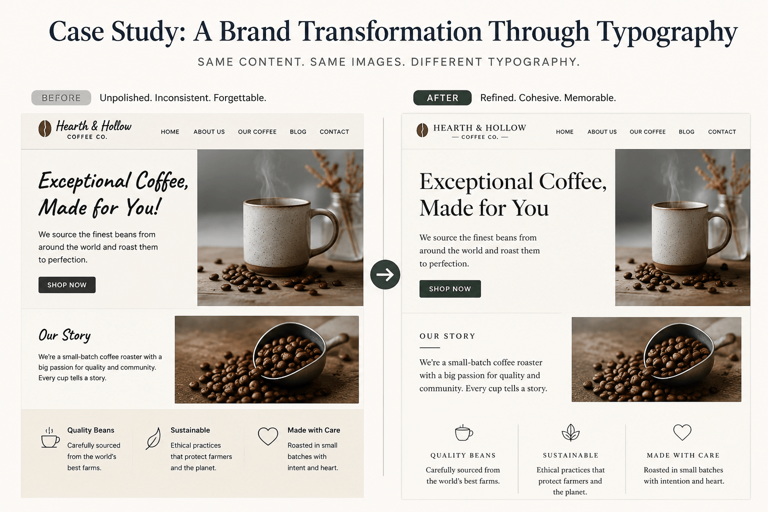
Let’s look at one final example.
Imagine two versions of the same premium coffee company.
Both sell the same products.
Both use the same photography.
Both tell the same brand story.
The only meaningful difference is typography.
Before
The original identity relied on:
- A decorative script logo
- Three unrelated Google Fonts
- Inconsistent font weights
- Tight line spacing
- Random capitalization styles
Nothing was technically broken.
But nothing worked together either.
The brand wanted to position itself as premium, yet the typography suggested something far less intentional. Visitors couldn’t explain why it felt slightly unpolished—they simply trusted it a little less.
That’s often how typography works.
People don’t consciously judge individual fonts.
They judge the overall experience those fonts create.
After
Instead of redesigning the entire brand, the company focused almost exclusively on typography.
The new system introduced:
- Playfair Display for headlines
- Inter for body copy and interface elements
- Consistent spacing across every page
- Clear heading hierarchy
- A disciplined weight system
The transformation was immediate.
The photography appeared more expensive.
The copy sounded more authoritative.
Even the logo felt stronger, despite remaining almost unchanged.
That’s one of typography’s most overlooked strengths.
It rarely works in isolation.
Instead, it quietly elevates everything around it.
A thoughtful typography system can make colours feel richer, layouts feel cleaner, and messaging feel more trustworthy without demanding attention for itself.
That’s exactly what great branding should do.
Advanced Insights Most Designers Miss

Most typography guides stop after recommending a handful of fonts.
That’s helpful.
It just isn’t enough.
Professional designers spend far less time asking “Which font should I use?” and far more time asking “How should this entire system work together?”
That shift in thinking changes almost every design decision.
Here are four lessons that consistently separate polished brand identities from average ones.
1. Spacing Beats Font Choice
If I had to choose a font between an average typeface with exceptional spacing and an exceptional typeface with poor spacing, I’d choose the first option every single time.
Without hesitation.
Good spacing gives typography room to breathe. It establishes rhythm, improves readability, and creates the quiet confidence people often associate with premium brands.
In many situations, adjusting line height by just a few pixels has a greater impact than changing the font itself.
Spacing isn’t glamorous.
It’s simply one of the highest-return improvements you can make.
2. Weight Discipline Matters More Than You Think
One of the easiest ways to make typography feel inconsistent is by using every available font weight.
Light.
Regular.
Medium.
SemiBold.
Bold.
Extra Bold.
Black.
Just because your font family includes eight weights doesn’t mean your brand needs eight voices.
Most professional typography systems work beautifully with just three:
- Regular for body copy
- Medium or SemiBold for subheadings
- Bold for headlines
That’s usually enough.
When every heading uses a different weight, readers lose the visual cues that help them navigate a page. Hierarchy becomes less obvious, and the design quietly loses consistency.
I often compare font weights to an orchestra.
Every instrument has a role, but they aren’t all playing at full volume all the time.
Typography works exactly the same way.
3. Performance Is Part of Good Design
Typography isn’t only about appearance.
It’s also about performance.
Every additional font file your website loads adds weight, increases requests, and asks visitors to wait just a little longer before interacting with your content.
Individually, those delays may seem insignificant.
Collectively, they matter.
Whenever possible:
- Load only the weights you actually use.
- Consider variable fonts where appropriate.
- Avoid downloading multiple families that perform the same role.
- Test typography on real devices instead of relying solely on design software.
Beautiful typography that slows your website isn’t solving the whole problem.
The best typography systems balance aesthetics, usability, and performance equally well.
4. Never Ignore Font Licensing
This may not be the most exciting topic in typography.
It is, however, one of the easiest places to make an expensive mistake.
Many businesses assume that downloading a font automatically permits them to use it commercially.
Unfortunately, that’s not always true.
Some fonts are free for personal use but require commercial licences for branding, advertising, client work, or digital products. Others have separate rules for websites, apps, or embedded software.
Before committing to any typeface, take a few minutes to confirm:
- Commercial licensing
- Webfont permissions
- App licensing
- Distribution rights
- Client transfer terms
One reason Google Fonts has become so widely adopted is that licensing is refreshingly straightforward.
Sometimes simplicity is every bit as valuable as the typeface itself.
Tools & Resources to Help You Choose the Right Font
The internet isn’t short on font libraries.
Finding fonts has never been the problem.
Choosing them well is.
Here are a few resources I regularly recommend.
Google Fonts
An excellent starting point for open-source, professionally designed typefaces with clear commercial licensing.
It’s especially valuable for startups, personal brands, and businesses building their first typography system.
Adobe Fonts
If you’re already working within Adobe Creative Cloud, Adobe Fonts provides an extensive collection of professional typefaces that integrate seamlessly with your existing workflow.
Font Pairing Resources
Choosing one strong font can be challenging.
Choosing two that genuinely complement each other is often much harder.
That’s exactly why we’ve created a growing collection of pairing guides on Fontish. Rather than simply listing combinations, they explain why certain pairings work and how to apply those principles to your own projects.
Typography Learning Resources
Typography is a discipline, not a single decision.
The better you understand concepts such as hierarchy, spacing, kerning, tracking, readability, and visual rhythm, the easier every future design decision becomes.
If you’re just beginning that journey, explore our Typography Dictionary, Typography Hierarchy Guide, and Font Design for Beginners. Together, they provide the foundation for building complete typography systems instead of collecting isolated tips.
Future-Proofing Your Brand Typography
Good typography doesn’t simply work today.
It continues working years from now.
That’s why experienced designers think beyond launch day.
Before finalizing your typography system, ask yourself a few practical questions.
Will these fonts still work:
- On your website?
- Inside marketing emails?
- Across social media graphics?
- In presentations?
- Inside mobile apps?
- On printed materials?
- Across products you haven’t even launched yet?
If the answer is consistently yes, you’re building something far more valuable than a collection of fonts.
You’re building a system.
One final recommendation:
Document your typography.
Record your heading sizes, body text, line heights, font weights, button styles, letter spacing, and colour usage. It may feel unnecessary while you’re working alone, but the moment another designer, developer, or marketer joins your project, those guidelines become invaluable.
Consistency isn’t maintained by memory.
It’s maintained by systems.
How to Choose The Right Font: The Bottom Line
Choosing the right font for your brand isn’t about finding the trendiest typeface or copying whatever successful companies happen to be using.
It’s about making thoughtful decisions that consistently reinforce who you are and how you want your audience to perceive you.
Start by defining your brand personality. Understand the expectations of your audience, then choose a font category that naturally supports both. From there, test your typography in real-world situations, build a simple system instead of collecting random fonts, and commit to using it consistently.
You’ll probably notice the difference sooner than you expect.
Your website feels more polished.
Your marketing becomes more cohesive.
Your brand communicates confidence without trying harder—it simply communicates more clearly.
None of those improvements require louder colours, larger logos, or expensive redesigns.
More often, they’re the result of quieter decisions made with greater intention.
That’s why I believe typography delivers one of the highest returns on any branding investment. It influences almost every interaction someone has with your business, even though most people never consciously notice it.
Build your typography with the same care you’d give your logo, messaging, or product.
Your audience may never compliment your font choices directly.
They’ll remember how your brand made them feel.
And that’s what great typography has been doing all along.
How to Choose the Right Font for Your Brand: Frequently Asked Questions
How many fonts should a brand use?
For most brands, two fonts are more than enough: one for headlines and another for body copy. Three fonts can work well when each serves a clearly defined purpose, but adding more often introduces unnecessary complexity rather than stronger branding.
Are free fonts professional enough for branding?
Absolutely.
Many respected brands rely on professionally designed open-source typefaces such as Inter, Roboto, Source Sans 3, Merriweather, and Libre Baskerville.
What matters isn’t whether a font is free.
What matters is whether it’s appropriate for your brand and used consistently.
Can I use a display font for body text?
Generally, no.
Display fonts are designed to attract attention in headlines, logos, and short pieces of text. Their distinctive letterforms become tiring over longer passages, which is why they’re best reserved for moments of emphasis rather than everyday reading.
How do I know if I’ve chosen the right font?
Don’t judge it inside a font picker.
Build a real page.
Add headings, paragraphs, buttons, navigation, images, and forms. Then view everything on desktop, tablet, and mobile before stepping away for a day.
Fresh eyes reveal problems that tired eyes overlook.
If your typography still feels balanced, readable, and consistent after that break, you’ve probably made the right decision.