
 I
I
On This Page
Typography is one of those things people notice only when it goes wrong.
You’ve probably visited a website that felt difficult to read, glanced at a logo that looked oddly unprofessional, or abandoned an article because the text felt exhausting. Chances are, typography—not the content—was the real culprit.
That’s because typography isn’t simply about making words look attractive. It’s the system that determines how written information is presented, understood, and experienced. It quietly shapes first impressions, builds trust, and guides readers through every page they encounter.
Whether you’re designing a website, creating a brand identity, publishing a book, or building a mobile app, understanding typography is one of the fastest ways to improve your work.
If you’re just getting started, it’s also worth learning the difference between a font and a typeface, as well as concepts like kerning, tracking, and leading. Together, these form the foundation of professional typography.
What Is Typography?
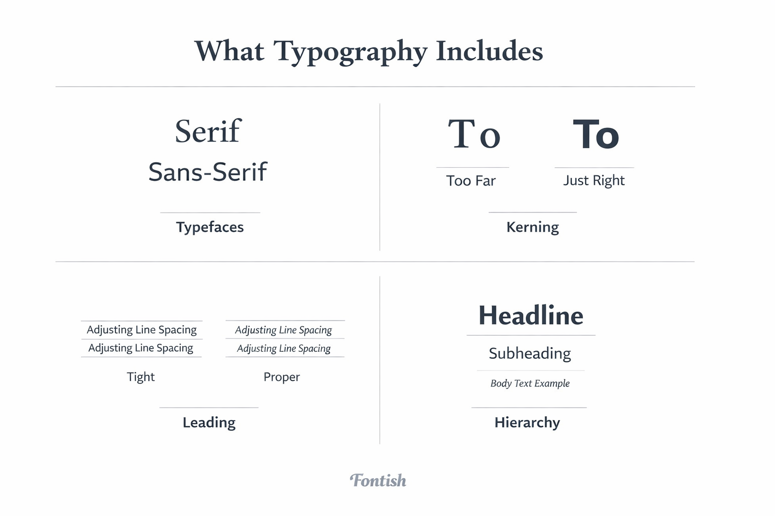
Typography is the art and technique of arranging text so that it is clear, readable, and visually engaging.
That definition is accurate—but designers usually think about typography in a much more practical way.
Typography is the way your words behave on a page or screen.
It controls how people move through information, which elements they notice first, and whether reading feels effortless or frustrating. Good typography almost disappears because it lets the content shine. Poor typography constantly reminds readers that something feels “off.”
Typography is built from several interconnected elements, including:
- Typeface and font selection
- Font size and scale
- Line spacing (leading)
- Letter spacing (tracking and kerning)
- Text alignment
- Visual hierarchy
- Contrast and font weight
- Overall page layout
Individually, these decisions may seem small. Together, they determine how effectively your message is communicated.
A common misconception is that typography simply means choosing an attractive font.
Professional designers know that’s only one piece of the puzzle.
Typography is really about creating structure. It tells readers where to begin, where to look next, and which information deserves the most attention. The exact same sentence can feel elegant, playful, authoritative, or chaotic depending on how it’s typeset.
That’s why typography is often described as invisible design. When it’s done well, readers focus on the message—not the formatting.
The Core Elements of Typography
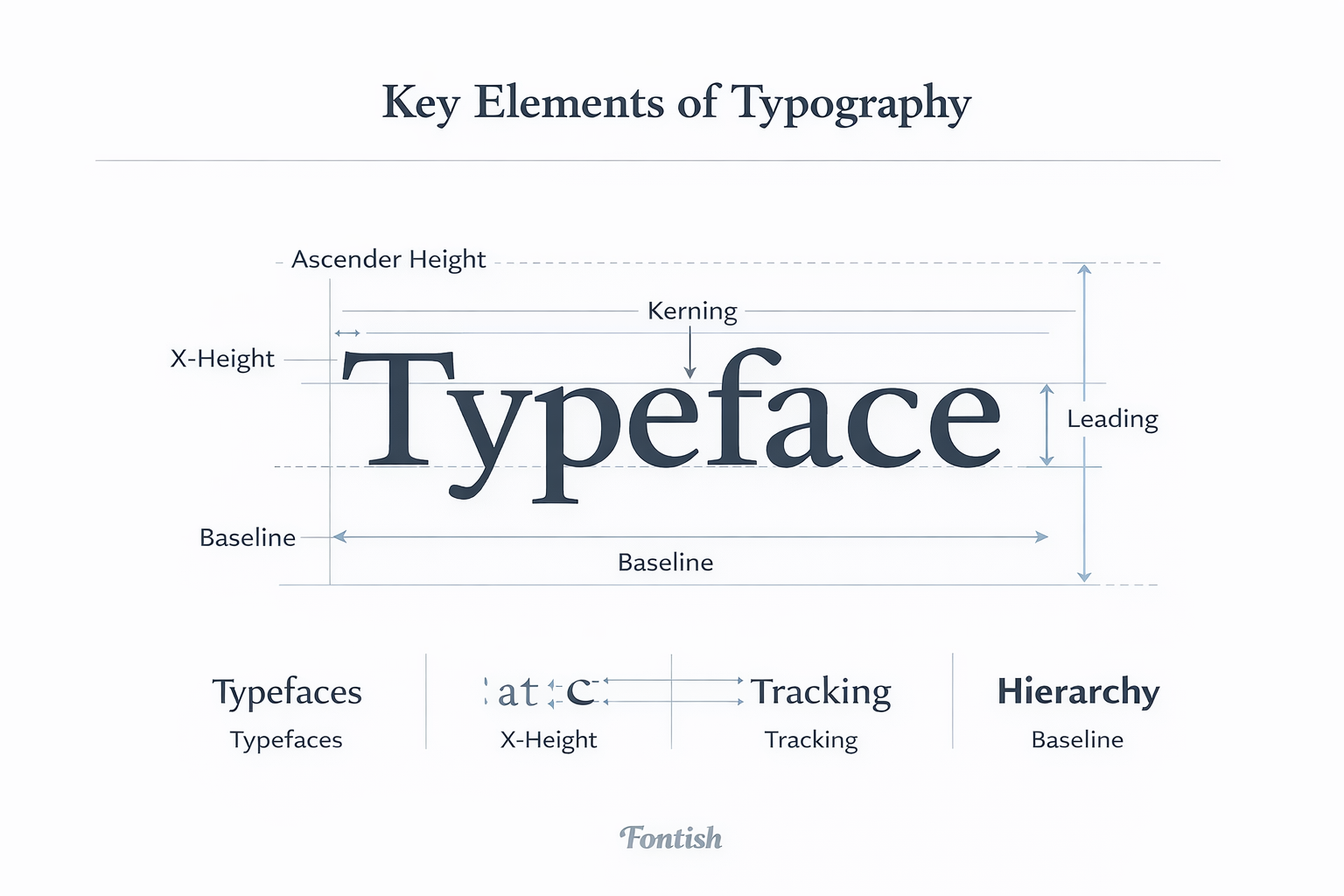
Before you can use typography effectively, it’s important to understand the building blocks that make every design work.
Typeface vs. Font
Although people often use these terms interchangeably, they aren’t the same.
A typeface is the overall design family, while a font is one specific variation within that family.
For example, Inter is a typeface. Inter Regular, Inter Bold, and Inter Italic are individual fonts within that typeface.
It may sound like a technical distinction, but using the correct terminology becomes second nature as your design skills grow.
Hierarchy
Visual hierarchy determines the order in which readers process information.
Large headlines attract attention first. Subheadings provide structure. Body text delivers the details. Captions and supporting text come last.
Without hierarchy, every element competes equally for attention. With hierarchy, readers naturally flow through the page without thinking about it.
Leading
Leading refers to the vertical space between lines of text.
Too little spacing makes paragraphs feel cramped and difficult to read. Too much spacing breaks the visual connection between lines and interrupts reading rhythm.
Well-balanced leading creates comfortable reading that people rarely notice—which is exactly the goal.
Kerning and Tracking
Both deal with spacing, but they solve different problems.
Kerning adjusts the distance between individual letter pairs, while tracking changes spacing across an entire word or paragraph.
Even small adjustments can dramatically improve the polish of a design. Poor spacing often explains why amateur typography feels unbalanced, even when the font itself is excellent.
Alignment
Alignment gives text structure.
For most websites and digital content, left alignment remains the easiest format to read because our eyes naturally follow a consistent starting point.
Centered text works well for short headlines or invitations, while justified text requires careful spacing to avoid distracting gaps.
Contrast
Contrast creates emphasis.
Designers build contrast by changing font size, weight, color, or even combining different typefaces.
A bold headline paired with lighter body text immediately tells readers where to focus. Without contrast, everything blends together, and the page loses direction.
Why Typography Matters in Design
Typography shapes far more than appearance. It influences how people read, think, and feel about your content long before they process the words themselves.
Readability and Legibility
Although they’re often treated as synonyms, readability and legibility describe two different ideas.
Legibility is how easy it is to distinguish individual letters. Readability is how comfortably someone can read larger blocks of text.
Imagine reading an article set in a decorative script font. You might recognize every letter, but reading several paragraphs quickly becomes tiring. That’s a readability problem.
Strong typography reduces cognitive effort. Readers spend less time decoding text and more time absorbing your message.
Brand Identity
Typography is one of the strongest visual signals a brand can use.
Before someone reads your headline, they’ve already formed an impression based on the type itself. Elegant serif typefaces often suggest heritage and luxury, while clean sans-serif fonts feel modern, approachable, and efficient.
That’s why companies invest heavily in typography systems instead of simply choosing fonts they like. Consistent typography creates recognition, reinforces personality, and builds trust across every touchpoint.
User Experience (UX)
Good typography makes interfaces feel effortless.
Clear headings help users scan a page, generous spacing improves reading comfort, and consistent styles make navigation feel predictable. Together, these choices reduce friction and create a smoother user experience.
Think about the websites you enjoy using. Chances are you rarely notice their typography—because it’s quietly doing its job.
Marketing and Conversions
Typography also affects business results.
Landing pages with clear hierarchy are easier to scan. Well-designed call-to-action buttons attract attention naturally. Product descriptions become easier to understand when spacing, alignment, and contrast work together.
People rarely buy because a font is beautiful.
They buy because the message is easy to find, easy to understand, and easy to trust.
How Typography Works
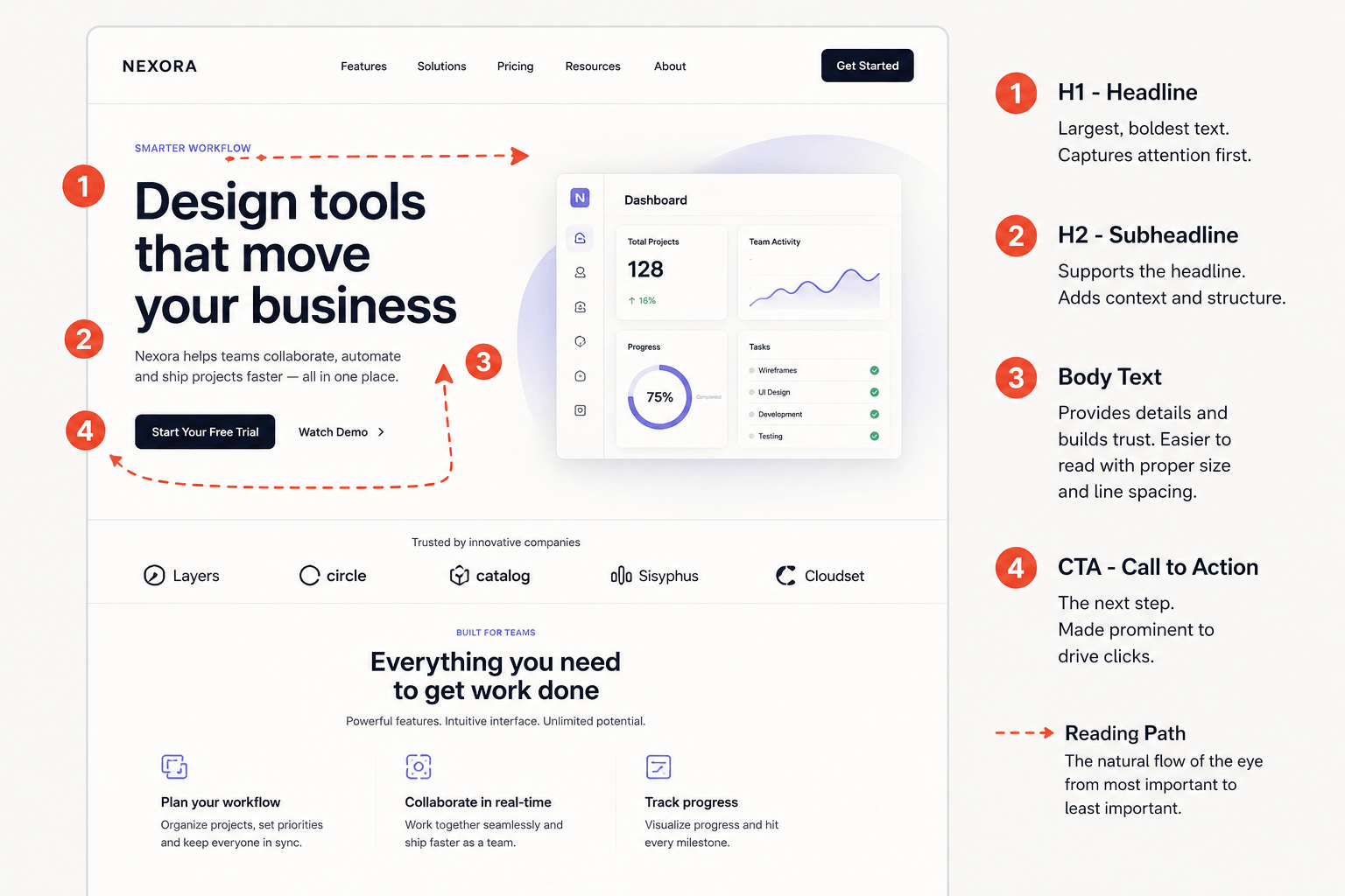
Typography works because our brains process visual patterns before they process language.
Long before we begin reading, we’re already judging size, spacing, contrast, and organization. Designers use this behavior to guide attention through a layout.
Visual Hierarchy
Not every piece of information deserves equal attention.
Large headlines attract the eye first, followed by subheadings, highlighted text, and finally body copy. This predictable sequence helps readers understand what matters most without consciously thinking about it.
A page where every heading is the same size quickly becomes overwhelming because nothing stands out.
Rhythm and Flow
Typography creates rhythm through repetition and consistency.
Balanced spacing, predictable heading sizes, comfortable line lengths, and generous margins help readers move naturally from one section to the next.
When rhythm is inconsistent, reading becomes surprisingly tiring—even if the writing itself is excellent.
Emotional Tone
Fonts communicate personality before words communicate meaning.
A classic serif can feel refined and trustworthy. A geometric sans-serif often feels modern and innovative. Script fonts introduce elegance or personality, while display fonts create bold visual impact when used sparingly.
One myth worth clearing up is that certain fonts are “professional” while others are not.
In reality, professionalism comes from using the right typeface in the right context. A playful display font may be perfect for a children’s event poster but completely inappropriate for a law firm’s website.
Context always matters more than popularity.
Typography in Web Design vs. Print Design
The principles of typography stay the same, but their application changes depending on where the text appears.
Web Typography
Digital typography must adapt to different screen sizes, resolutions, browsers, and accessibility requirements.
A layout that feels perfect on a desktop monitor may become difficult to read on a mobile phone if font sizes, spacing, or line lengths aren’t adjusted responsively.
Designers also have to consider loading speed, variable fonts, and accessibility guidelines when choosing type for the web.
Print Typography
Print offers much more control.
Designers know exactly how readers will experience the page, allowing them to fine-tune details like paper stock, ink, margins, and viewing distance.
Books, magazines, brochures, and packaging all rely on typography, but the constraints are very different from those of responsive websites.
The fundamentals remain the same: clarity first, decoration second.
Common Typography Mistakes
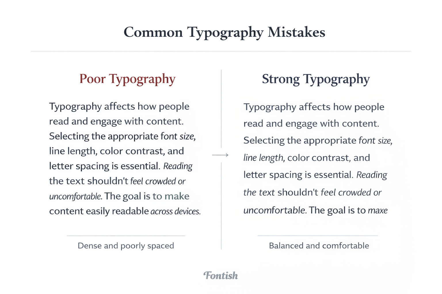
Even experienced designers make typography mistakes. The good news? Most are easy to fix once you know what to look for.
Using Too Many Typefaces
One of the quickest ways to make a design feel inconsistent is by introducing too many typefaces.
In most projects, two fonts are enough: one for headings and one for body text. Occasionally, a third can work for accents, but anything beyond that usually creates unnecessary visual noise.
Ignoring Line Length
Lines that stretch too wide force readers to work harder as their eyes travel back and forth across the page. Extremely narrow columns create the opposite problem by interrupting the reading rhythm.
As a general rule, aim for around 60 to 75 characters per line for comfortable reading on desktop screens.
Weak Contrast
If your headings look almost identical to your body text, readers won’t know where to begin.
Contrast isn’t about making everything bold. It’s about creating enough visual difference in size, weight, or color that the hierarchy feels obvious.
Overusing Decorative Fonts
Display and script fonts are designed to grab attention—not carry an entire article.
Using them for long paragraphs usually hurts readability and makes the design feel less professional. Save expressive fonts for headlines, logos, or short promotional text where they can have the greatest impact.
Forgetting Accessibility
Typography should work for everyone.
Tiny font sizes, low color contrast, or overly tight spacing can make content difficult to read for users with visual impairments or reading difficulties. Accessible typography isn’t a limitation—it’s good design.
Professional Tips for Better Typography
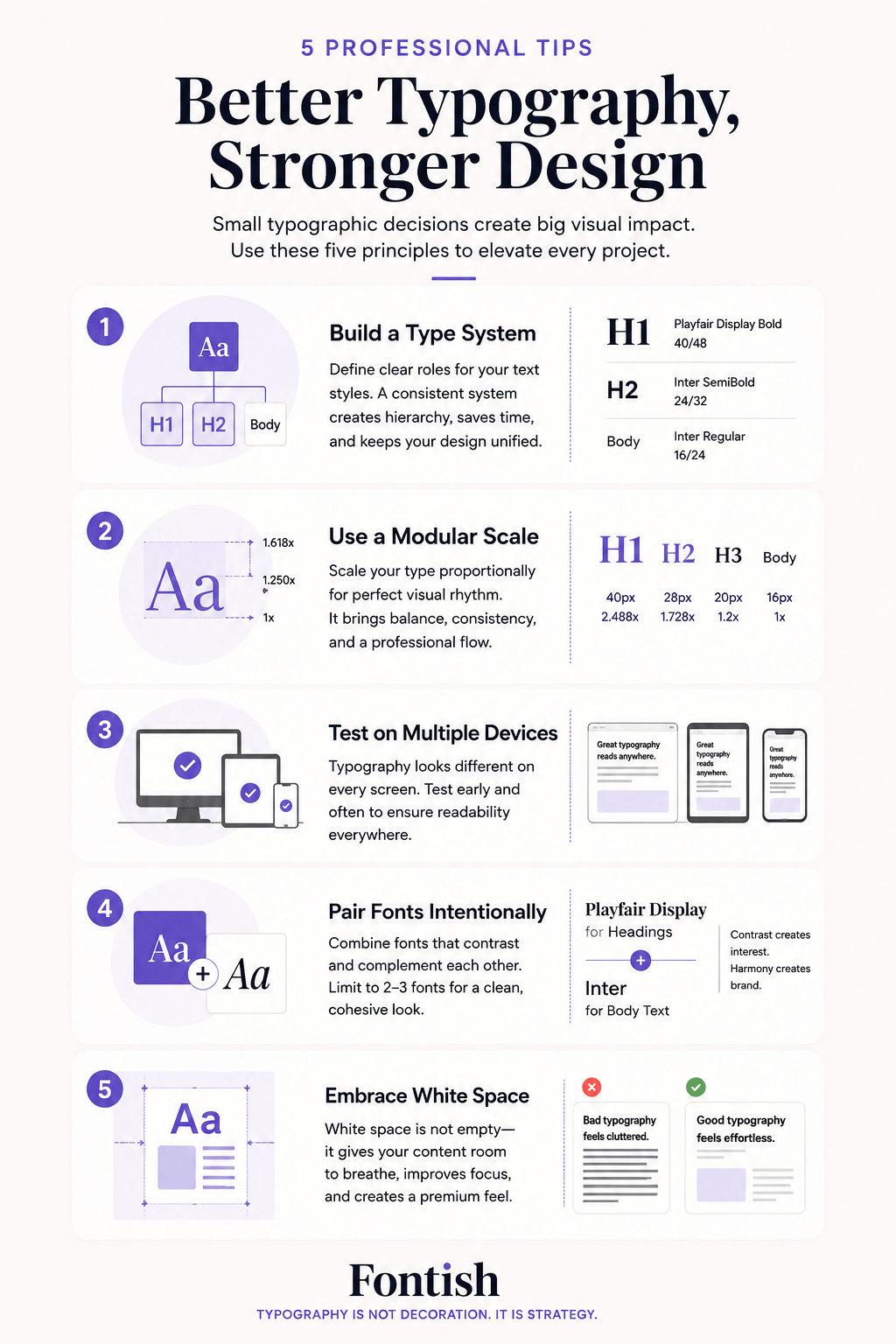
Improving your typography doesn’t require dozens of fonts or expensive software. Small, intentional decisions often make the biggest difference.
- Build a type system. Define consistent styles for headings, body text, captions, and buttons before you start designing.
- Use a modular scale. A proportional sizing system creates balanced hierarchy across the entire layout.
- Test on multiple devices. Typography should feel equally comfortable on desktops, tablets, and phones.
- Pair fonts with purpose. Instead of choosing fonts that simply “look nice together,” combine typefaces that create clear contrast while sharing a similar personality.
- Let white space do its job. Empty space isn’t wasted space. It gives text room to breathe and makes content easier to scan.
Here’s a tip many beginners overlook: when something feels off, resist the urge to change the font first.
More often than not, adjusting spacing, hierarchy, or alignment solves the problem without replacing the typeface at all.
Typography vs. Related Concepts
Typography is often confused with related terms like fonts and typefaces, but they describe different concepts.
A typeface is the overall design family, a font is a specific variation within that family, and typography is the complete practice of arranging and presenting text.
The table below summarizes the differences at a glance.
| Typography | Font | Typeface |
|---|---|---|
| A complete system for arranging and presenting text | A specific font file or style (e.g., Bold, Italic) | A family of related fonts with a shared design |
| Includes spacing, hierarchy, alignment, and layout | Represents one weight or variation within a typeface | Contains multiple fonts, weights, and styles |
| Focuses on how text communicates and guides readers | Used as one component within typography | Defines the overall visual design of letterforms |
| Covers both print and digital text presentation | Example: Inter Bold or Roboto Italic | Example: Inter, Roboto, or Playfair Display |
| Goal: Improve readability, hierarchy, and user experience | Goal: Display a specific style or weight | Goal: Provide a consistent design system for fonts |
- Typography vs. Graphic Design: Graphic design is the broader discipline. Typography is one of its most important tools.
- Typography vs. Calligraphy: Typography focuses on arranging type, while calligraphy involves creating letterforms by hand.
Understanding these distinctions makes it much easier to communicate with other designers and choose the right techniques for each project.
The Bottom Line
Typography isn’t just about making text look attractive.
It’s about making communication effortless.
Every decision—from font choice and spacing to hierarchy and alignment helps determine how readers experience your message. When those decisions work together, people stay engaged, trust your brand, and understand your content with less effort.
The best typography rarely calls attention to itself. Instead, it quietly guides readers exactly where they need to go.
That’s why experienced designers don’t think in terms of fonts alone.
They think in systems.
Master typography, and you’ll improve almost every piece of visual communication you create.
Frequently Asked Questions
What is typography in simple terms?
Typography is the practice of arranging text so it’s easy to read, visually appealing, and effective at communicating information.
Is typography the same as choosing a font?
No. Choosing a font is only one part of typography. Typography also includes hierarchy, spacing, alignment, contrast, line length, and layout.
Why is typography important for branding?
Typography influences how people perceive a brand. The right typography can make a business feel modern, trustworthy, luxurious, creative, or approachable before a single word is read.
What makes typography effective?
Effective typography combines readable fonts, clear hierarchy, balanced spacing, appropriate contrast, and consistent styling to create a comfortable reading experience across both print and digital media.