
 I
I
On This Page
Quick Definition
Leading in typography is the vertical space between lines of text. Good leading improves readability and keeps paragraphs comfortable to scan; too little feels cramped, while too much makes the lines feel disconnected.
Have you ever read a page that looked great but somehow felt difficult to get through?
The font wasn’t the problem. More often than not, the culprit was leading in typography.
Leading is the vertical space between lines of text, and it has an enormous impact on readability. When it’s balanced, reading feels effortless. When it’s too tight or too loose, even beautifully written content becomes tiring.
It’s also one of the easiest typography principles to overlook. Many font designers spend hours choosing the perfect typeface but only seconds adjusting the spacing between lines. Professional designers know those priorities should almost be reversed.
If you’re learning the fundamentals of typography, understanding leading is essential. Together with concepts like kerning, tracking, and typography hierarchy, it helps create layouts that are comfortable to read and visually polished.
Let’s look at why this seemingly small detail makes such a big difference.
What Is Leading?
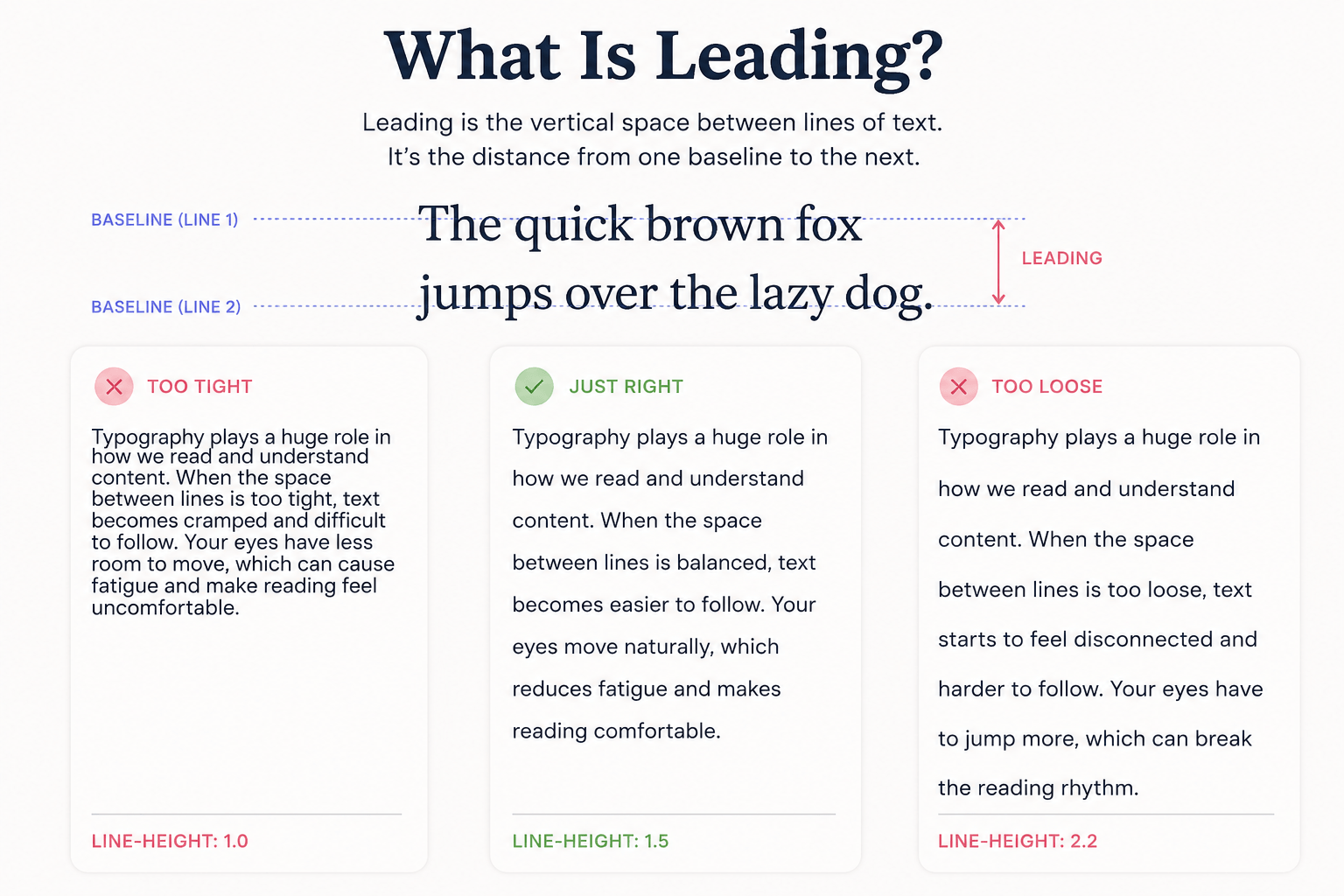
Leading (pronounced “led-ding”) is the vertical distance between one line of text and the next. More precisely, it measures the space from one text baseline to the baseline below it.
In simple terms, leading is line spacing.
The name dates back to traditional printing, when typesetters inserted thin strips of lead between rows of metal type to increase the space between lines. While today’s designers adjust leading with software instead of metal strips, the purpose remains exactly the same.
Good leading gives text room to breathe.
When lines sit too close together, paragraphs feel cramped and difficult to scan. When they’re spaced too far apart, readers struggle to connect one line to the next. The ideal leading creates a comfortable rhythm that helps your eyes move naturally through the page.
You’ll often hear leading mentioned alongside tracking and kerning, but they solve different problems. Tracking adjusts the overall spacing between letters, kerning fine-tunes the space between individual letter pairs, while leading controls the vertical relationship between entire lines of text.
Why Leading Matters in Design
Leading is much more than a cosmetic adjustment. It affects how people read, how they experience your design, and even how they perceive your brand.
Readability
Reading happens both horizontally and vertically. Your eyes don’t simply move across a sentence—they also jump down to the next line.
If the spacing is too tight, those jumps become difficult, and readers can easily lose their place. If it’s too loose, each line feels disconnected, slowing the reading flow.
Balanced leading creates a comfortable rhythm that keeps readers engaged from one paragraph to the next. That’s one reason professionally designed books, magazines, and websites feel noticeably easier to read.
Remember that leading works together with line length. Wider text columns usually benefit from slightly more line spacing, while narrow columns can often use a tighter setting.
User Experience
Visitors won’t complain that your line-height is incorrect.
They’ll simply stop reading.
Poor leading quietly increases the effort required to process information, while well-balanced spacing makes content feel lighter and easier to consume. It’s a subtle change that can improve engagement, reduce visual fatigue, and encourage readers to stay on the page longer.
Typography isn’t just about appearance—it’s about removing friction.
Visual Hierarchy
Leading also helps organise information.
Different elements need different spacing because they serve different purposes. Headlines often use tighter leading for impact, while body text needs more breathing room for comfortable reading. Captions, pull quotes, and navigation menus each have their own spacing requirements as well.
When every element shares the same leading, the hierarchy begins to disappear, and the design feels flat.
Combined with font size, weight, and white space, leading helps guide readers naturally through a layout.
Key Note: Leading matters because it controls how comfortably readers move from one line to the next. The right spacing makes text feel clear, balanced, and inviting, while poor leading can make even a beautiful font look cramped, scattered, and difficult to read.
How Leading Works
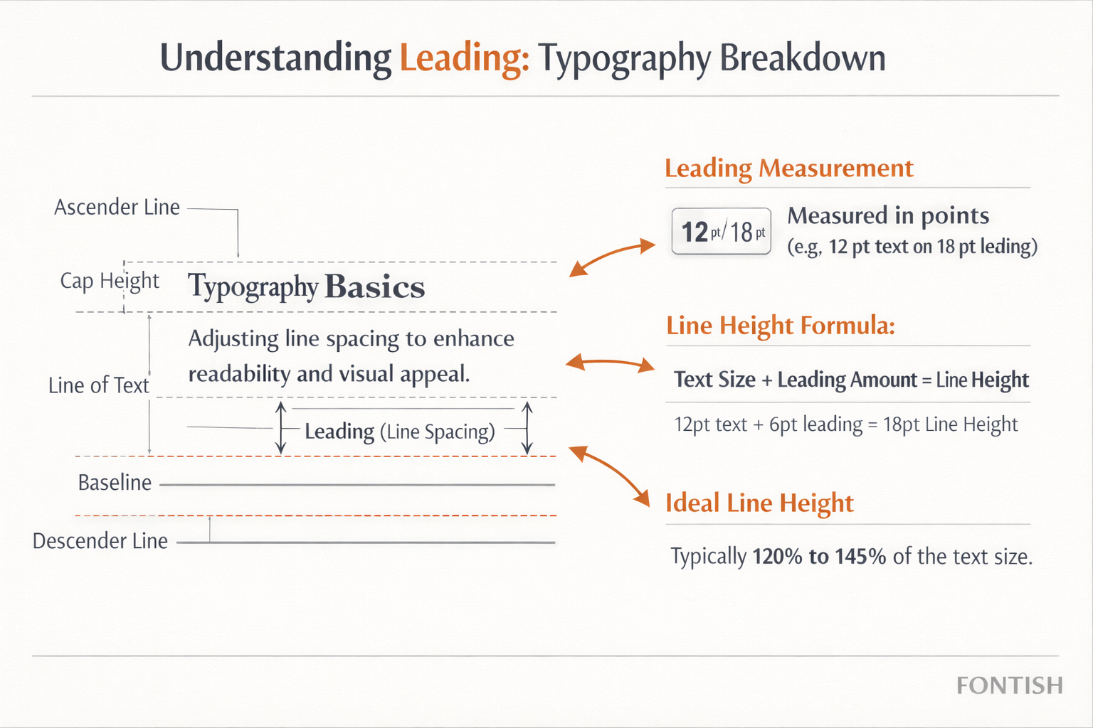
In digital typography, leading is usually expressed as line-height.
A common starting point for body text is 1.4 to 1.6 times the font size. For example:
- 16px text → 24px line height
- 18px text → 28px line height
- 20px text → 30px line height
Think of these as guidelines rather than fixed rules.
The ideal leading depends on several factors, including the typeface, line length, font weight, and the device people are reading on.
A condensed font often needs more breathing room than a wider typeface, while long-form articles typically benefit from slightly looser leading than interface labels.
Professional designers rarely accept the default setting. They make small adjustments until the typography simply feels right.
The numbers provide a starting point.
Your eyes make the final decision.
Tight Leading vs. Loose Leading
Leading in typography isn’t a one-size-fits-all setting. The amount of space between lines influences the mood of a design just as much as its readability.
Tight Leading
Tight leading reduces the vertical space between lines, creating a compact and energetic appearance. It’s commonly used for:
- Headlines
- Posters
- Editorial covers
- Display typography
When used in headlines, tighter leading keeps multi-line titles visually connected and creates stronger impact.
The mistake is carrying that same spacing into body text. Long paragraphs with tight leading quickly become difficult to read, especially on mobile devices where screen space is limited.
Loose Leading
Loose leading creates a lighter, more spacious feel. You’ll often see it used in:
- Editorial websites
- Luxury branding
- Landing pages
- Long-form articles
Generous spacing makes large blocks of text feel less intimidating and gives layouts a clean, modern appearance.
However, too much leading creates another problem. When the space between lines becomes excessive, paragraphs lose their rhythm and readers have to work harder to connect one line to the next.
The goal isn’t tight or loose leading—it’s finding the balance that suits the content.
Leading vs. Line Height
One of the most common questions beginners ask is whether leading and line-height are the same thing.
The short answer is: almost.
Leading is the traditional typography term that originated in print, while line-height is the digital measurement used in CSS and most design software. Both describe the vertical spacing between lines of text.
The difference is mostly historical.
If you’re working in Adobe InDesign, you’ll usually see the setting labelled Leading. If you’re styling text on a website, you’ll use the CSS property line-height. Both are controlling the same visual relationship.
For practical purposes, designers often use the two terms interchangeably. Understanding both simply makes it easier to move between print and digital design workflows.
Leading in Web and Print Design
Whether you’re designing for screens or paper, the objective stays the same: make reading comfortable.
On websites, generous leading usually works best because people read on different screen sizes and often skim content quickly. Long-form articles, blogs, and documentation all benefit from giving text more room to breathe.
Print offers a little more control. Since books and magazines have fixed page sizes, designers can use slightly tighter leading while still maintaining excellent readability.
The principle never changes.
Good leading helps readers move effortlessly from one line to the next without ever noticing the spacing itself.
Common Leading Mistakes
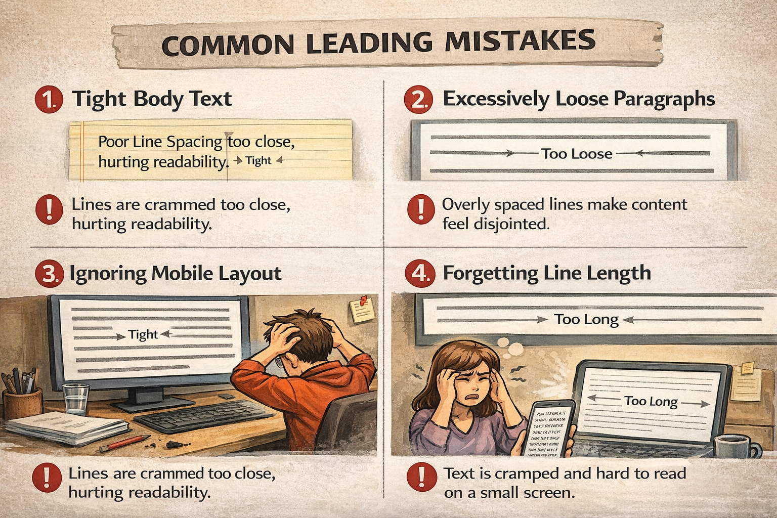
Leading mistakes are surprisingly common—even in professional work. Fortunately, they’re also some of the easiest typography problems to fix.
Making Body Text Too Tight
Trying to fit more words onto a page often results in cramped paragraphs that feel tiring to read.
If your content looks dense, increasing the leading is usually one of the quickest improvements you can make.
Adding Too Much Space
More spacing doesn’t automatically improve readability.
Excessively loose leading breaks the connection between lines and slows reading, making paragraphs feel fragmented rather than comfortable.
Using the Same Leading Everywhere
Headlines, body copy, captions, and navigation each have different jobs. Giving them all identical leading removes visual hierarchy and makes the design feel less refined.
Ignoring Mobile Devices
Typography that looks balanced on a desktop monitor may become cramped on a phone.
Always review your spacing across multiple screen sizes before publishing.
Professional Tips for Using Leading
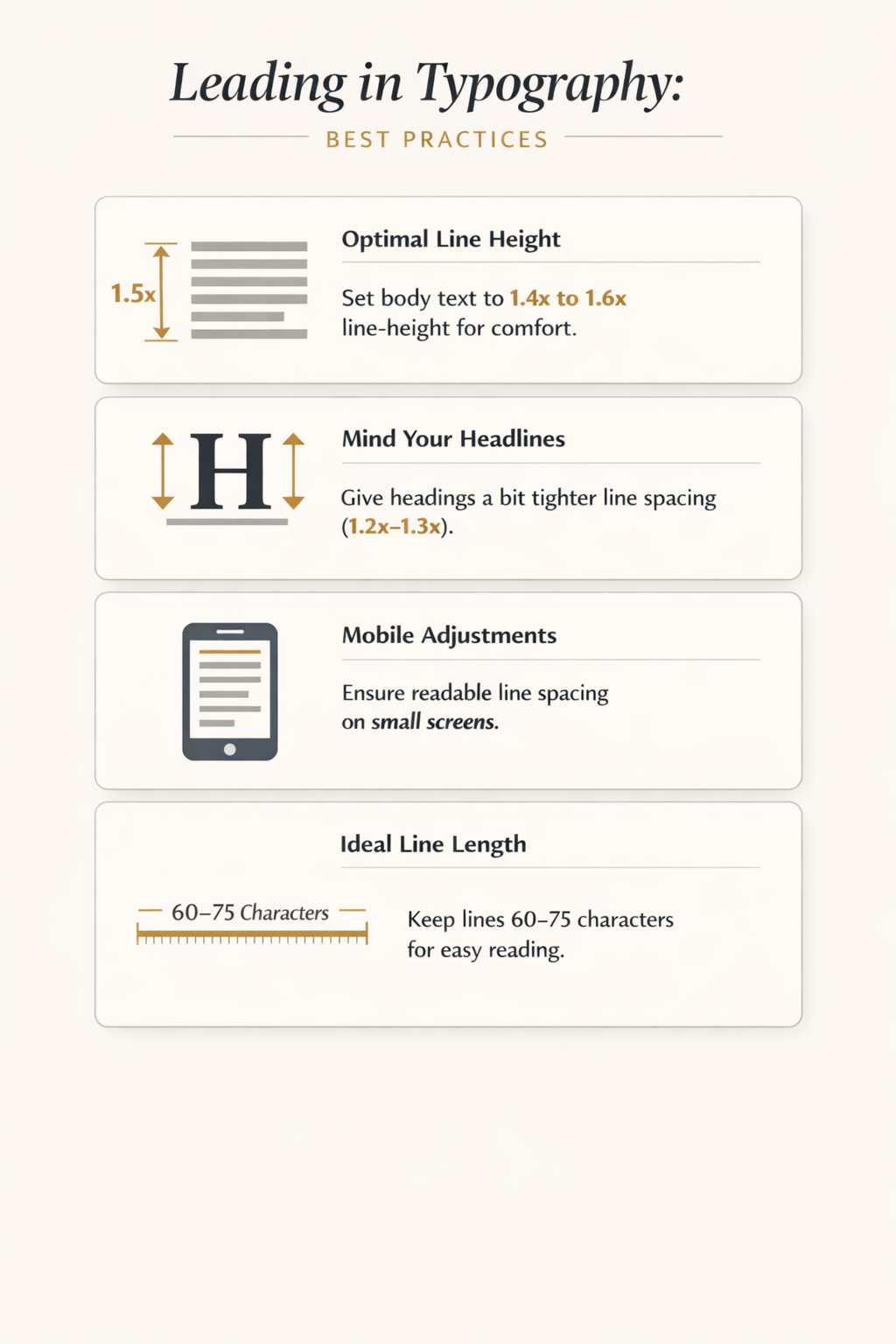
Keep these principles in mind whenever you’re working with text:
- Start with a line-height of 1.4–1.6× the font size.
- Adjust visually instead of relying on formulas alone.
- Increase leading as line length increases.
- Keep headlines slightly tighter than body text.
- Test every layout on desktop and mobile.
- Read your content from start to finish before publishing. If your eyes begin to tire, revisit the spacing.
One final tip: don’t evaluate leading in isolation. It works alongside font choice, hierarchy, white space, and line length to create an enjoyable reading experience.
That’s why professional typography feels effortless—it isn’t one setting that makes the difference, but dozens of small decisions working together.
Want to take your typography skills further? Learn How to Pair Fonts Like a Designer or explore Font Design for Beginners to build stronger, more professional type systems.
Frequently Asked Questions
What is leading in typography?
Leading is the vertical space between lines of text. In digital design, it’s commonly controlled using the line-height setting. Well-balanced leading improves readability by making text easier and more comfortable to scan.
Why is it called leading?
The term comes from traditional printing, where typesetters inserted thin strips of lead between rows of metal type to create extra space between lines. Although today’s designers adjust leading digitally, the original name has remained.
What is a good leading for body text?
A good starting point is 1.4 to 1.6 times the font size. For example, 16px body text typically works well with a 24–26px line height. However, the ideal value also depends on the typeface, line length, and reading environment.
Does leading affect readability?
Absolutely. Proper leading reduces eye strain, helps readers maintain their place, and makes long passages of text feel more inviting. Even small adjustments can dramatically improve the reading experience.
Is leading the same as line-height?
They’re closely related but come from different worlds.
Leading is the traditional typography term used in print design, while line-height is the digital property used in CSS and most design software. Today, designers often use the terms interchangeably because they control the same visual spacing between lines.
How is leading different from kerning and tracking?
These three typography terms control different kinds of spacing:
- Leading adjusts the space between lines of text.
- Kerning adjusts the space between individual letter pairs.
- Tracking changes the overall spacing across a group of letters or an entire word.
Together, they create typography that feels balanced and easy to read.
The Bottom Line
Leading is one of the simplest typography settings to adjust, yet it has one of the biggest impacts on readability.
It influences how your eyes move through a page, how approachable your content feels, and how polished your designs appear. When the spacing is balanced, readers barely notice it. They simply enjoy a smoother reading experience.
That’s why experienced designers don’t stop after choosing the right typeface. They refine the spacing until the typography feels effortless.
If you’re building your typography knowledge, don’t stop with leading. Learning kerning, tracking, typography hierarchy, and readability will help you create layouts that not only look professional but also communicate more effectively.
Great typography isn’t just about choosing beautiful fonts.
It’s about making every word easier to read.