
 I
I
On This Page
Typography can feel too tight, too loose, or somehow “off”—even when you’ve chosen a great typeface.
Most people blame the font itself. Others adjust the font size, increase the line height, or switch to another typeface entirely. Yet the real culprit is often something much smaller: tracking.
Tracking in typography controls the overall spacing between letters. It’s a subtle adjustment that rarely gets noticed when it’s done well, but it instantly affects how polished, readable, and professional your design feels.
Whether you’re designing a website, building a brand identity, creating a logo, or laying out a magazine, tracking quietly influences how people experience your work. It’s one of those details that separates typography that simply works from typography that feels intentional.
If you’ve already learned about typography fundamentals, you’ll quickly discover that tracking isn’t just another design setting. It’s part of the rhythm that makes good typography look effortless.
What Is Tracking in Typography?
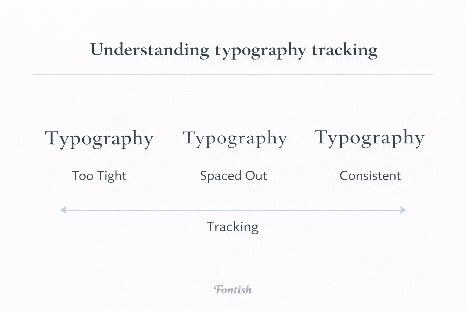
Tracking is the adjustment of spacing across a group of letters rather than between individual letter pairs.
Instead of moving one character closer to another, tracking increases or decreases the spacing evenly throughout a word, sentence, paragraph, or entire block of text.
The easiest way to remember it is this:
- Kerning adjusts individual letter pairs.
- Tracking adjusts every letter equally.
Think of kerning as fine-tuning a musical instrument. Tracking is changing the overall tempo.
Increase tracking, and every character gains a little breathing room. Decrease it, and the letters become more compact, giving the text a denser appearance.
Neither choice is automatically better. Good tracking simply matches the purpose of the design.
For example, an elegant fashion brand might use slightly wider tracking in its logo to create a refined, luxurious feel. A sports brand, on the other hand, may tighten its headlines to make them feel energetic and powerful.
The font hasn’t changed. Only the spacing has.
Yet the personality is completely different.
Why Tracking Matters in Design
Tracking is one of those details people rarely notice consciously, but almost everyone reacts to subconsciously.
Well-balanced spacing makes typography feel calm and trustworthy. Poor spacing creates friction, even if readers can’t explain why.
Let’s look at where tracking has the biggest impact.
Readability
Good typography should disappear. Readers shouldn’t have to think about the letters; they should simply absorb the message.
Tracking helps make that possible.
When letters are packed too closely together, individual shapes begin competing with one another. Words become harder to recognize, forcing readers to slow down.
Push the spacing too far in the opposite direction, and the problem changes. Words begin falling apart visually, making reading feel awkward and disconnected.
The sweet spot sits somewhere in the middle.
That’s why most professional fonts arrive with carefully considered default spacing. Designers adjust tracking only when the context demands it, not because they assume more spacing is automatically better.
A small adjustment of just a few units can dramatically improve comfort, especially in headlines and display text.
Brand Personality
Fonts communicate personality. Tracking refines that personality.
Imagine the word LUXURY set in elegant capital letters. With default spacing, it feels sophisticated.
Increase the tracking slightly, and the word suddenly becomes more premium, spacious, and editorial.
Now imagine a bold fitness brand. Instead of opening the letters, the designer pulls them slightly closer together. The same word now feels stronger, faster, and more confident.
This is why tracking plays such a significant role in branding. It isn’t simply creating space between letters; it’s shaping perception.
Visual Hierarchy
Designers often think hierarchy begins with size.
It doesn’t.
Hierarchy begins with contrast, and tracking offers another way to create that contrast without making everything larger or bolder.
For example:
- A tightly tracked headline feels compact and commanding.
- A lightly spaced subheading feels calmer and easier to scan.
- Body text remains close to its default spacing for maximum readability.
Used together, these small adjustments guide the reader naturally through a page.
The best typography rarely shouts. It quietly tells your eyes where to go next.
Creating Better Texture
Professional designers don’t only look at individual words; they step back and examine the page as a whole.
From a distance, typography creates what’s known as text texture: the overall rhythm, density, and visual pattern formed by paragraphs. Tracking has a direct impact on that texture.
Too tight, and the page feels heavy. Too loose, and it starts looking fragmented.
Balanced tracking creates an even texture that feels comfortable to read before someone has processed a single sentence. That’s one reason experienced designers constantly zoom out while refining typography.
They’re no longer judging individual letters. They’re judging the entire reading experience.
How Tracking Works
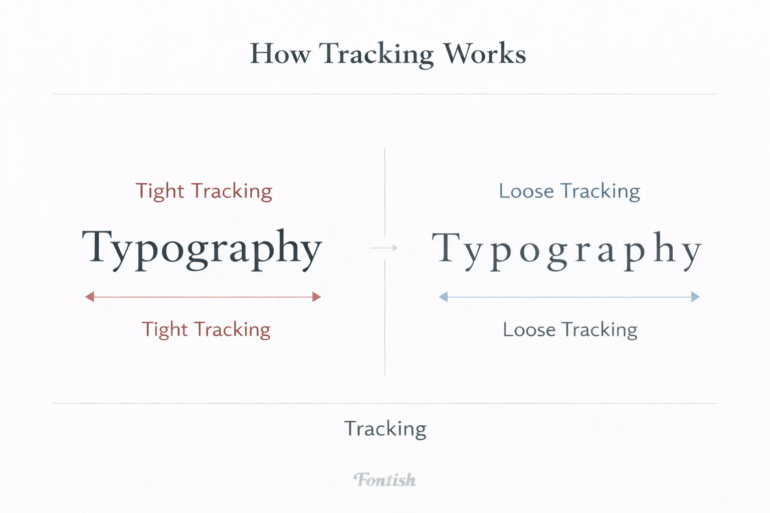
Every major design application—whether you’re using Adobe Illustrator, Photoshop, InDesign, Figma, or Canva—lets you adjust tracking.
You’ll usually see the setting represented by a number, often measured in points, ems, or thousandths of an em. Those numbers are useful, but they’re not the goal.
One mistake I see beginners make is chasing specific values they found online. They’ll read that “+20 tracking looks premium” and apply it to every font they own.
Typography doesn’t work that way.
Every typeface has its own built-in spacing. A value that looks perfect on Playfair Display may look awkward on Inter or Montserrat.
That’s why experienced designers trust their eyes more than the numbers. If it looks balanced, it probably is.
Tracking for Body Text
Body copy is where restraint wins.
Most professionally designed typefaces are already optimized for comfortable reading, so dramatic tracking adjustments usually reduce readability instead of improving it.
In most cases:
- Keep body text close to the font’s default spacing.
- Use only subtle positive tracking if text appears crowded at smaller sizes.
- Avoid heavy negative tracking, especially below 16px.
Your readers should never notice the tracking. They should simply enjoy reading.
Tracking for Headlines
Headlines are different. Because they’re larger, even tiny spacing changes become visually significant.
This gives designers more freedom to shape personality.
A bold technology startup might tighten its hero headline to create energy and momentum. A luxury fashion magazine may increase tracking slightly in uppercase headings to produce a more elegant, editorial feel.
Neither approach is universally correct. The typeface, audience, and brand personality should always guide the decision.
A good headline doesn’t just say something. Its spacing reinforces the message before the first word is read.
Tracking vs Kerning
Tracking and kerning are among the most frequently confused typography terms, largely because both deal with spacing.
The difference is surprisingly simple: tracking changes spacing evenly across an entire selection of text, while kerning adjusts the spacing between specific letter pairs.
Imagine the word AVATAR.
If only the “A” and “V” appear awkwardly spaced, that’s a kerning issue. If the entire word feels cramped from beginning to end, that’s a tracking issue.
Here’s a quick way to remember the difference:
- Tracking controls consistency.
- Kerning fixes exceptions.
Professional typography depends on both. Tracking creates the overall rhythm; kerning perfects the details.
The Psychology of Tracking
Typography doesn’t simply communicate information. It communicates emotion.
Before readers consciously understand your words, they subconsciously respond to their appearance. Tracking plays a surprisingly important role in that first impression.
Tighter spacing tends to feel:
- Energetic
- Bold
- Urgent
- Modern
Looser spacing often feels:
- Elegant
- Relaxed
- Premium
- Deliberate
This explains why luxury brands frequently use generous tracking in uppercase logos. The additional breathing room creates sophistication without relying on decorative graphics or expensive visual effects.
Spacing alone changes perception.
That’s powerful—and it’s why tracking should never be treated as an afterthought.
Common Mistakes Designers Make With Tracking
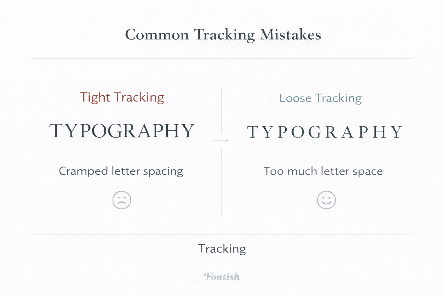
Even experienced designers occasionally push tracking too far. Fortunately, most mistakes are easy to avoid once you know what to look for.
Adding Too Much Tracking to Body Text
Body copy exists to be read—not admired.
Excessive spacing interrupts normal word recognition, slowing readers down and making long passages feel uncomfortable. If every word looks like it’s falling apart, you’ve probably gone too far.
Over-Tightening Headlines
Designers often tighten headlines to create impact. That’s perfectly reasonable.
The problem begins when letters start colliding. Once characters lose their individual shapes, readability drops quickly, and the headline feels cramped instead of confident.
Applying Wide Tracking to Lowercase Text
Uppercase typography usually tolerates increased tracking quite well. Lowercase text is different.
Its ascenders, descenders, and varied letter shapes rely on natural spacing patterns. Stretch those patterns too much, and reading becomes noticeably harder.
Ignoring Responsive Design
Typography that looks balanced on a 27-inch monitor can fall apart on a phone.
Always review your tracking across multiple screen sizes before publishing. Professional typography is responsive typography.
Believing More Space Always Looks Premium
This is probably the biggest myth surrounding tracking.
Luxury brands don’t look premium because they use lots of spacing. They look premium because they use the right amount of spacing for their typeface, layout, and audience.
More spacing doesn’t automatically create elegance.
Thoughtful spacing does.
Professional Tips for Mastering Tracking
Tracking isn’t about making typography look different. It’s about making it feel right.
These habits will help you make better spacing decisions, regardless of the typeface or project.
Zoom Out Before You Judge
When you’re adjusting tracking, don’t stare at individual letters. Zoom out.
Typography should be evaluated as a system, not a collection of characters. Looking at the page from a distance makes it much easier to spot uneven texture and awkward spacing.
Make Small Adjustments
Tracking is incredibly sensitive. A change of just a few units can noticeably alter the feel of a headline.
Large jumps usually create more problems than they solve. Professional typography is built through refinement, not dramatic edits.
Pair Tracking With Font Weight
Weight and tracking work together.
Bold fonts generally tolerate slightly tighter spacing because their thicker strokes naturally reduce white space. Lightweight fonts often benefit from a little extra breathing room to prevent them from feeling cramped.
Always judge these settings as a pair rather than in isolation.
Respect the Typeface
Professional type designers spend countless hours refining spacing before a font is released. Their default settings are usually an excellent starting point.
Instead of assuming every font needs adjustment, begin with the original spacing and make changes only when the design clearly calls for them.
Sometimes the best tracking adjustment is no adjustment at all.
Tracking is only one part of great typography. Once you understand letter spacing, the next skill is learning how to pair fonts like a designer so your typefaces work together with balance and purpose.
If you’re creating a logo, website, or visual identity, you’ll also want to choose the right font for your brand. The right typeface and the right spacing always work hand in hand.
Tracking vs Leading vs Kerning
Typography uses several spacing controls, and it’s easy to mix them up. Each one solves a different problem.
| Term | Controls | Best Used For |
| Tracking | Space across all letters | Changing the overall density and personality of text |
| Kerning | Space between individual letter pairs | Fixing awkward combinations like “AV” or “To” |
| Leading | Space between lines of text | Improving readability and vertical rhythm |
Think of them as three separate layers.
Tracking shapes horizontal rhythm. Kerning perfects individual details. Leading controls vertical flow.
When all three work together, typography feels balanced without calling attention to itself.
The Bottom Line
Tracking is one of typography’s quietest tools, yet it has an outsized influence on how people experience your design.
It improves readability, strengthens hierarchy, reinforces brand personality, and gives layouts a level of polish that’s difficult to achieve any other way.
The best part? You don’t need to make dramatic changes.
Most professional typography is built from dozens of tiny refinements working together. Tracking is one of those refinements.
If you’re serious about becoming a better designer, start paying as much attention to spacing as you do to fonts. You’ll quickly discover that professional typography isn’t just about choosing the right typeface.
It’s about giving that typeface the space it needs to perform at its best.
Frequently Asked Questions
What is tracking in typography?
Tracking is the uniform adjustment of spacing between letters across a word, sentence, paragraph, or block of text. Unlike kerning, it affects every character equally.
Is tracking the same as kerning?
No. Tracking adjusts the overall spacing across multiple letters, while kerning fine-tunes the spacing between specific letter pairs that appear visually uneven.
Does tracking affect readability?
Yes. Balanced tracking improves reading comfort and helps readers recognize word shapes more easily.
Spacing that’s too tight or too loose makes text harder to scan and understand.
Should I adjust tracking in body text?
Usually only slightly. Most professional fonts are carefully spaced by their designers, so body text often performs best with little or no adjustment.
Should uppercase text have more tracking?
Often, yes. Uppercase headings and logos frequently benefit from a small increase in tracking because the additional spacing improves clarity and creates a more refined appearance.
The ideal amount depends on the typeface and design context.
Can tracking improve a logo?
Absolutely. Many memorable logos rely on careful tracking adjustments rather than custom lettering.
Even subtle spacing changes can make a wordmark feel cleaner, more balanced, and more distinctive.
Next Steps
Tracking is only one piece of the typography puzzle. To build stronger typography systems, continue with these related Fontish guides:
- Kerning in Typography: Learn how to refine spacing between individual letter pairs.
- Leading in Typography: Discover how line spacing affects readability and visual rhythm.
- Typography: Explore the core principles that bring fonts, spacing, hierarchy, and layout together into one cohesive system.