
 I
I
In This Guide
If you’ve ever created a font combination that looked almost right but never quite professional, you’re not alone.
Learning how to pair fonts is one of those design skills that seems deceptively simple until you’re staring at hundreds of typefaces wondering why none of them work together.
Experienced designers rarely choose fonts at random. Instead, they rely on a handful of principles that create hierarchy, contrast, balance, and consistency across an entire typography system.
Once you understand those principles, learning how to pair fonts becomes far less intimidating and a lot more enjoyable.
At Fontish, we believe something simple but powerful:
Typography is not decoration. It’s strategy.
The moment you stop treating fonts as isolated design choices and start thinking of them as parts of a complete communication system, everything begins to click.
Instead of asking, “Which fonts look good together?” you’ll start asking, “Which fonts help this design communicate more clearly?” That’s exactly how professional designers approach typography, and it’s the mindset that separates intentional typography from guesswork.
By the end of this guide, you’ll know how to:
- Pair fonts with confidence instead of guesswork.
- Build typography systems that feel polished and professional.
- Avoid the most common font pairing mistakes.
- Test combinations the same way experienced designers do.
If you’re still choosing fonts based solely on whether they “look nice together,” this guide will completely change the way you approach typography.
Why Font Pairing Matters More Than You Think
People rarely land on a website and consciously admire its typography. What they do notice is how the experience makes them feel.
Strong font pairing quietly communicates confidence, professionalism, and trust, while weak font pairing creates subtle friction even when visitors can’t explain exactly what’s bothering them.
Imagine two websites selling the same product. One feels polished, premium, and effortless to read. The other feels cluttered, inconsistent, or strangely difficult to scan. More often than not, the difference isn’t the logo, the colors, or the photography.
It’s the typography.
Fonts shape first impressions faster than most people realize.
A refined serif paired with a clean sans-serif can make a young startup feel established, while a mismatched pairing can make an experienced company look surprisingly unprofessional. That’s why learning how to pair fonts is about much more than aesthetics; it’s about influencing how people perceive your brand before they read a single sentence.
One misconception appears again and again:
Myth: If two fonts look great individually, they’ll automatically work together.
Unfortunately, typography doesn’t work that way.
Fonts are a little like personalities. Two remarkable individuals don’t always make a great partnership. Sometimes they’re too similar. Sometimes they compete for attention. Sometimes they’re simply speaking completely different visual languages.
The strongest pairings aren’t created by finding two beautiful fonts. They’re created by giving each font a distinct role within the design.
Learning how to pair fonts isn’t about collecting beautiful typefaces. It’s about assigning clear responsibilities, creating meaningful contrast, and building a hierarchy that guides readers through your content with almost no effort.
When typography works well, visitors don’t notice the fonts themselves; they notice how comfortable and intuitive the reading experience feels.
What Makes a Good Font Pairing?
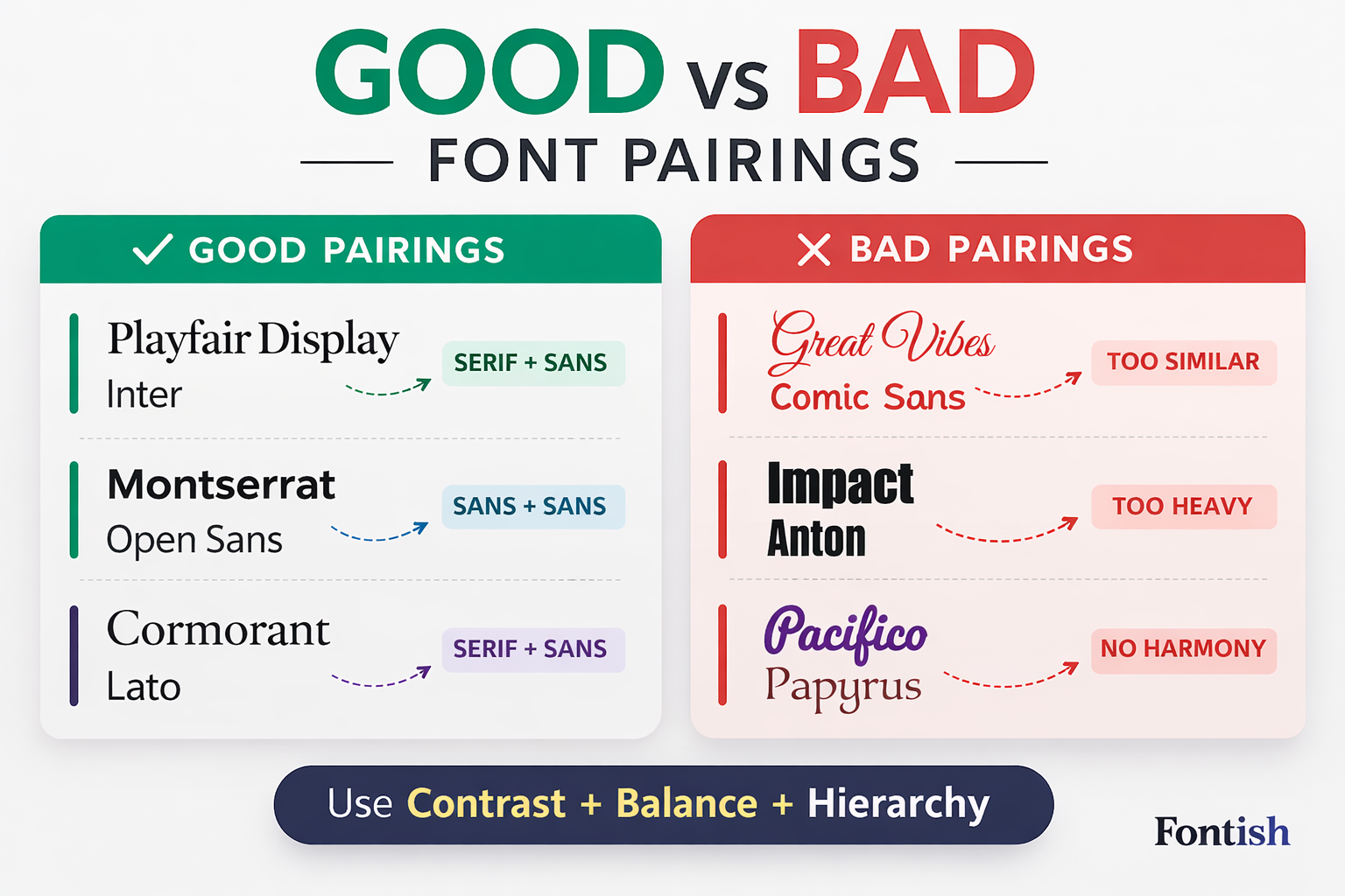
Before looking at specific combinations, let’s define what actually separates professional typography from accidental typography.
A successful font pairing balances four essential qualities that work together to create clarity, consistency, and a better reading experience.
1. Contrast
When learning how to pair fonts, Contrast creates personality.
When two fonts look almost identical, nothing stands out. Headlines lose impact, sections blend together, and the entire layout begins to feel flat because readers struggle to distinguish one element from another.
Contrast gives each font a clear purpose and helps establish visual hierarchy from the very first glance.
Contrast can come from several directions:
- Serif vs. sans-serif
- Heavy vs. light weights
- Wide vs. narrow letterforms
- Traditional vs. contemporary styles
- Formal vs. casual personalities
The important thing to remember is that contrast doesn’t always require two completely different fonts. Even subtle differences can create enough separation to guide the reader naturally from one element to the next.
The goal isn’t dramatic contrast for its own sake—it’s creating enough distinction that every piece of text has a clear visual role.
2. Harmony
Contrast attracts attention, but harmony keeps everything together.
The strongest font pairings feel different enough to create interest, yet similar enough to belong to the same visual family. They complement each other rather than compete, giving the entire design a sense of cohesion.
Imagine inviting one presenter wearing a tailored business suit and another wearing beach shorts. Individually, neither outfit is wrong, but together they send a confusing message. Typography behaves exactly the same way.
Two fonts may be beautiful on their own, yet still feel disconnected when combined because they communicate entirely different personalities.
The goal isn’t maximum contrast.
It’s meaningful contrast.
3. Clear Hierarchy
Every font should have a purpose.
Headlines capture attention, body text quietly delivers information, navigation guides people through the interface, and buttons encourage action.
When every element tries to become the loudest voice on the page, readers quickly become overwhelmed, and the design loses its sense of direction.
Professional designers don’t simply choose fonts—they build visual hierarchy. That’s why hierarchy depends on much more than font choice alone.
Size, spacing, weight, rhythm, and positioning all work together to organize information and help readers instinctively know where to look next.
4. Functional Roles
One of the easiest ways to spot an inexperienced typography system is seeing every font used for every purpose. Professional designers assign responsibilities instead of letting fonts compete for attention.
Headlines create emotion.
Body copy delivers information.
Buttons prioritize interaction.
Captions provide supporting context.
Navigation improves usability.
Once every font has a clearly defined role, consistency becomes dramatically easier to maintain.
Instead of asking, “Which font should I use here?” you’ll naturally begin asking, “Which role am I designing?” That subtle mindset shift influences almost every typography decision you make and leads to cleaner, more professional layouts.
The 6 Core Principles of Professional Font Pairing

If there’s one section worth bookmarking, it’s this one.
These six principles sit behind nearly every successful typography system you’ll see across websites, editorial layouts, branding projects, and product interfaces.
Professional designers don’t memorize hundreds of font combinations. They learn a small set of timeless principles and apply them consistently. Once those principles become second nature, learning how to pair fonts becomes dramatically easier.
1. Create Contrast in Style
The classic pairing formula still works remarkably well:
Serif headlines + sans-serif body text.
It’s popular for a simple reason—each font performs a different job. The serif introduces personality, authority, and visual interest, while the sans-serif quietly delivers readability across longer passages of text.
Together they create contrast that’s immediately noticeable without ever feeling forced.
Of course, serif versus sans-serif isn’t your only option. You can also successfully combine:
- Geometric sans with humanist sans
- Bold display fonts with neutral sans-serifs
- Traditional serifs with contemporary serifs
- Rounded typefaces with sharper geometric styles
The important question isn’t whether two fonts belong to different categories. It’s whether readers can instantly recognize that each font serves a different purpose within the design.
2. Use Weight to Build Structure
Many font design beginners spend hours choosing the perfect fonts while overlooking one of typography’s most powerful tools: weight.
Even an excellent font pairing can feel lifeless if every heading, paragraph, and button uses Regular 400.
Everything blends into one grey block, leaving readers with very little visual guidance. Often, the problem isn’t the font family at all—it’s the lack of contrast between text elements.
Instead, build hierarchy through deliberate weight choices:
- Headlines: Bold or SemiBold
- Section headings: Medium or SemiBold
- Body copy: Regular
- Captions: Regular or Medium
Many outstanding websites use just one or two font families throughout the entire design. Their hierarchy doesn’t come from introducing more fonts—it comes from using weight consistently and intentionally.
3. Think Beyond Font Size
Hierarchy isn’t simply about making headlines larger. It’s created by combining several elements that work together to guide the reader’s eye.
These include:
- Size
- Weight
- Spacing
- Line height
- Rhythm
- Placement
A headline that’s only slightly larger than the paragraph beneath it rarely establishes enough visual authority. Readers should immediately understand which information deserves attention first.
As a practical starting point:
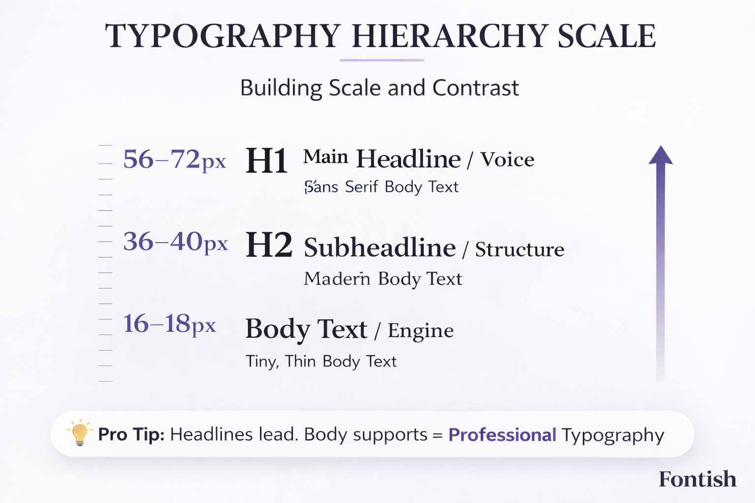
- H1: 56–72px
- H2: 32–40px
- H3: 24–28px
- Body: 16–18px
These aren’t rigid rules; they’re useful benchmarks. The important lesson is that meaningful differences create stronger hierarchy, while tiny differences often go unnoticed.
4. Refine Spacing Before Changing Fonts
Here’s something that surprises many new designers.
Sometimes the fonts aren’t the problem.
The spacing is.
I’ve reviewed countless websites where a simple adjustment to line height, tracking, or paragraph spacing transformed an average-looking layout into something polished—without changing a single typeface.
Before downloading another font, it’s worth asking whether your typography simply needs more room to breathe.
As a general rule:
- Headlines often benefit from tighter line-height.
- Body text usually reads best between 150% and 170% line-height.
- Serif headlines may benefit from slightly tighter tracking.
- Sans-serif headlines usually need little or no tracking adjustment.
One thing I’ve noticed after reviewing hundreds of websites is that beginners usually blame the font first, while experienced font designers blame the spacing first.
More often than you’d expect, the typography doesn’t need replacing—it simply needs better rhythm and breathing room.
5. Give Every Font One Clear Job
This is where many typography systems quietly fall apart.
Designers discover a beautiful display font, fall in love with it, and begin using it everywhere—headlines, subheadings, buttons, navigation, and even body text.
Before long, every element is competing for attention, making the entire interface feel louder than it needs to be.
Instead, think in layers:
- Voice — Headlines
- Structure — Subheadings
- Engine — Body text
- Function — Navigation and interface elements
When every layer understands its responsibility, the entire design feels calmer, more intentional, and significantly easier to read.
Great typography isn’t about making every font stand out—it’s about making every font contribute to the overall experience.
6. Stay Consistent
Professional typography can feel almost… boring.
And that’s exactly why it works.
Once you’ve chosen your font pairing, resist the temptation to keep experimenting. Lock your headline styles, reuse the same body font, maintain a consistent spacing system, and stick to the same heading scale across every page.
Those small decisions create familiarity, and familiarity builds trust.
Visitors shouldn’t notice your typography changing as they move through your website. They should simply enjoy a reading experience that feels effortless from beginning to end.
The strongest typography systems aren’t constantly evolving, but they’re quietly dependable, and that’s precisely what makes them feel professional.
Serif + Sans: The Classic Formula (And Why It Still Works)

If you’re learning how to pair fonts, this is the safest place to begin.
A serif headline combined with a sans-serif body has remained one of the most reliable typography formulas for decades because it naturally balances personality with readability.
The serif brings character, authority, and visual interest, while the sans-serif quietly handles long-form reading without demanding attention. Together, they create a clear visual hierarchy that feels familiar and effortless.
You’ll start noticing this pairing everywhere once you know what to look for.
Editorial magazines use it to create elegant layouts, luxury brands rely on it to communicate sophistication, and even modern SaaS companies often adopt the same structure to add warmth and credibility to otherwise minimalist interfaces.
The beauty of this combination isn’t that it’s fashionable. It’s that each font solves a different problem.
The headline captures attention.
The body copy keeps readers engaged.
Together, they create a comfortable reading rhythm that feels intentional rather than decorative.
Some dependable examples include:
- Playfair Display + Inter
- Libre Baskerville + Inter
- Cormorant Garamond + Inter
- Merriweather + Open Sans
Each pairing balances personality with practicality. The serif acts as the visual voice, while the sans-serif quietly carries the reading experience in the background, allowing the content, not the typography, to remain the hero.
One professional habit worth adopting is this: whenever you’re evaluating a font pairing, spend more time reading the body copy than admiring the headline.
Beautiful headlines attract visitors, but comfortable body text keeps them on the page. If readers become tired after a few paragraphs, even the most attractive headline font won’t save the experience.
If you’d like ready-made combinations that have already been tested across different industries, explore our Best Serif and Sans Font Pairings guide, where we break down combinations for branding, websites, portfolios, and editorial projects.
Sans + Sans Pairings (Modern & Clean)

Using two sans-serif fonts sounds risky until you understand one simple rule:
They must feel different.
Some of the cleanest websites on the internet rely entirely on sans-serif typography, yet they never feel repetitive because the chosen fonts have distinct personalities.
Rather than relying on obvious stylistic contrast, these pairings create separation through subtle differences in structure, proportion, and tone.
For example, a geometric sans-serif often feels structured, technical, and contemporary. Pair it with a humanist sans-serif, and you immediately introduce warmth and approachability without sacrificing clarity.
The result feels balanced because one font provides precision while the other adds personality.
Successful sans-serif pairings usually create contrast through:
- Weight
- Width
- Letterform design
- Overall personality
A few reliable examples include:
- Sora + Inter
- Space Grotesk + DM Sans
- Montserrat + Open Sans
- Poppins + Inter
Notice what these combinations have in common. The fonts don’t compete for attention.
One confidently leads while the other quietly supports, creating a hierarchy that feels natural rather than forced. That’s exactly what you want from any typography system.
Sans-serif pairings work particularly well for:
- SaaS platforms
- Startup websites
- Product landing pages
- Mobile applications
- Technology companies
- Corporate brands
They’re clean, highly readable, fast-loading, and naturally suited to digital products.
One observation I’ve made after reviewing countless startup websites is that the best minimalist designs rarely use unusual fonts. More often, they use familiar fonts exceptionally well through thoughtful spacing, hierarchy, and consistency.
Serif + Serif Pairings (Editorial & Luxury)
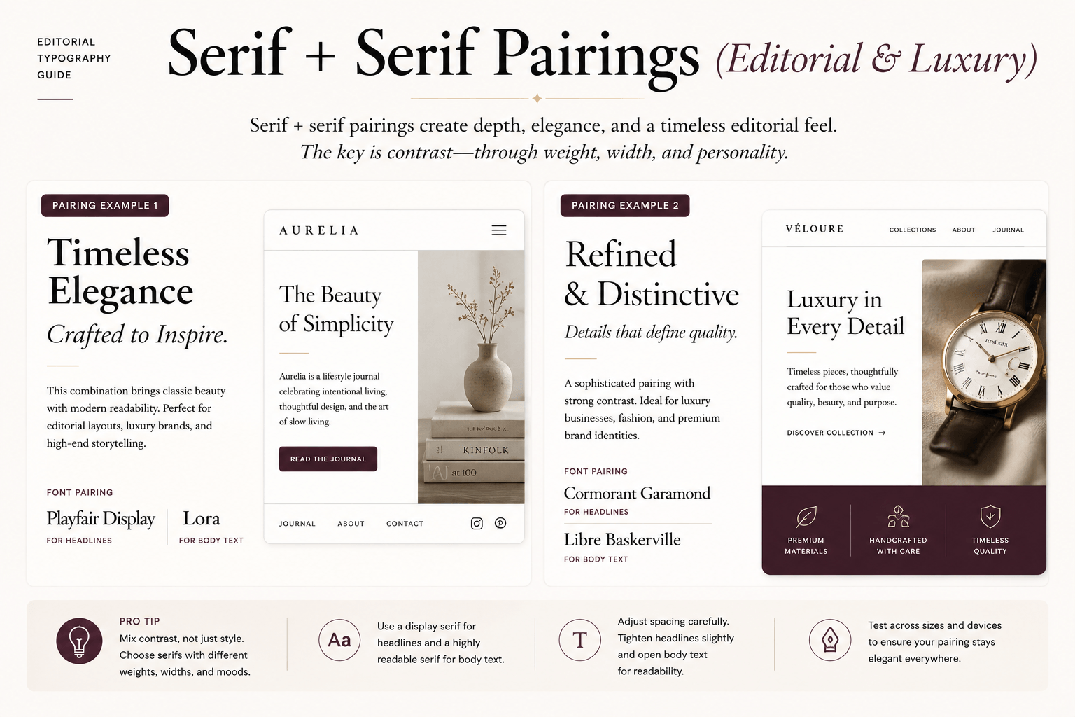
Pairing two serif fonts requires a little more discipline.
Done well, the result feels sophisticated and editorial.
Done poorly, it simply feels repetitive.
The secret is making sure one serif clearly takes the lead while the other supports the reading experience.
Readers should immediately understand which font carries personality and which one quietly reinforces readability. Without that distinction, two serif fonts often feel like they’re competing for the same role.
For example, you might pair:
- A dramatic high-contrast serif for headlines.
- A calmer transitional serif for longer reading.
The distinction doesn’t need to be dramatic. It simply needs to be obvious enough that readers instinctively know where their attention belongs.
Good typography should guide the eye naturally instead of making readers work to understand the hierarchy.
This style of pairing works beautifully for:
- Editorial publications
- Luxury fashion brands
- Premium consultants
- Book publishing
- Boutique hotels
- High-end lifestyle brands
Where many font designers struggle is pairing two serif fonts that belong to nearly the same visual family. Instead of creating hierarchy, they create confusion because neither font establishes a clear leadership role.
A useful rule I’ve followed for years is this:
Don’t pair cousins. Pair personalities.
If both fonts share nearly identical proportions, contrast, rhythm, and tone, readers won’t experience meaningful visual separation.
The typography won’t necessarily look bad—it will simply feel indecisive, and that’s often enough to weaken the overall design.
Display Fonts: How to Use Them Without Ruining Everything
Display fonts exist to attract attention.
That’s exactly why they require restraint.
One of the quickest ways to weaken a typography system is falling in love with a dramatic display font and using it everywhere.
I’ve seen designers use decorative display fonts for headlines, subheadings, navigation, buttons, and even body paragraphs, believing consistency means using the same expressive typeface throughout the interface.
The result is almost always the same.
Everything shouts.
Nothing stands out.
Display fonts work because they’re expressive. The more often you use them, the less expressive they become, eventually losing the very impact that made you choose them in the first place.
As a general rule:
- Use display fonts for primary headlines.
- Occasionally use them for hero sections or campaign graphics.
- Avoid them for body copy.
- Use them sparingly for subheadings.
- Keep interface elements clean and highly readable.
Think of display fonts like strong seasoning.
A little transforms the entire experience.
Too much overwhelms it.
If you’re curious why these fonts behave so differently from text faces, our Font Design for Beginners guide explores how professional typefaces are designed for completely different reading environments.
Step-by-Step: How to Pair Fonts for a Brand or Website
By now, you understand the principles behind successful font pairing. The next step is putting them into practice.
Rather than relying on instinct every time you open Google Fonts, use a simple framework that works across websites, brands, landing pages, and editorial projects.
This is the exact process I follow whenever I’m building a typography system from scratch. Whether I’m designing a startup homepage, a personal portfolio, or a luxury brand identity, these five steps rarely change because they’re based on principles rather than trends.

Step 1: Define the Brand Personality
If you’re serious about learning how to pair fonts, never begin by browsing fonts.
Begin by defining the feeling you want people to experience.
Ask yourself:
- Is the brand modern?
- Professional?
- Friendly?
- Luxurious?
- Playful?
- Bold?
- Editorial?
- Technical?
Typography amplifies personality.
It doesn’t create it.
If you haven’t defined your brand voice first, every font will feel like a possibility, and none of them will feel completely right.
Our guide on How to Choose the Right Font for Your Brand explores this process in much greater detail and shows how typography becomes dramatically easier once your brand personality is clearly defined.
Step 2: Choose the Headline Voice
Once the personality is clear, choose your expressive font first because this is the typeface visitors notice within the first few seconds of arriving on your website.
Ask yourself one simple question:
What should someone feel immediately after landing on this page?
- Authority?
- Innovation?
- Luxury?
- Trust?
- Warmth?
- Confidence?
Your headline font answers that question long before anyone begins reading your copy. Choose carefully because it sets the emotional tone for everything that follows.
Step 3: Choose the Body Engine
Now it’s time to calm everything down.
A body font has an entirely different responsibility. It isn’t trying to impress anyone—it’s trying to disappear. The easier your content is to read, the more successful your body font has done its job.
Great body fonts usually have several characteristics in common:
- Comfortable readability at 16–18px
- Multiple font weights
- True italics
- Excellent mobile rendering
- Broad language support
- Consistent spacing
Fonts like Inter, Source Sans 3, Open Sans, and DM Sans remain popular because they excel at exactly this job. Ironically, the best body font is often the one readers barely notice.
Step 4: Build Your Hierarchy
Once you’ve chosen both fonts, establish the rules that every page will follow. Define your heading sizes, body text size, line-height, spacing, and font weights before designing additional pages.
Your system should include:
- H1 size
- H2 size
- H3 size
- Body size
- Line-height
- Font weights
- Vertical spacing
Then document those decisions. Professional designers don’t redesign typography every time they create a new page—they build systems. Consistency, not constant experimentation, is what creates authority and trust.
Step 5: Test Fonts in Real Situations
Never judge typography using a single headline sitting on a blank canvas because that’s not how anyone experiences a website.
Instead, test your pairing inside real layouts such as:
- A homepage hero
- A blog article
- An About page
- A pricing section
- A mobile screen
You’ll quickly discover details that weren’t obvious inside the font picker. Maybe the headlines wrap awkwardly on smaller devices, the body copy feels cramped after several paragraphs, or your buttons suddenly look undersized.
Typography only proves itself when it lives inside real content. The more realistic your testing environment, the more confident you’ll feel when committing to a pairing.
Professional Tip: Don’t evaluate a font pairing with Lorem Ipsum alone. Test it using your real headlines, body copy, navigation, and buttons. Typography behaves very differently when it’s carrying meaningful content instead of placeholder text.
How to Pair Fonts Case Study: Fixing a Weak Font Pairing
Typography has a remarkable ability to change how people perceive a brand without changing a single word of its message. That’s why designers often say typography is invisible when it’s done well—it quietly shapes trust, professionalism, and readability behind the scenes.
Consider this simple example.
Before
A small creative agency launched a new website using a thin script font for headlines, a light serif for subheadings, and a thin sans-serif for body copy.
None of the fonts were poor choices individually, but together they created a weak visual hierarchy. Headlines lacked authority, body copy became difficult to read on smaller screens, and every section competed for attention instead of guiding visitors naturally through the page.
The overall impression wasn’t that the agency lacked talent—it simply felt hesitant rather than confident.
Visitors never emailed to complain about the typography. They simply spent less time on the site because the design made reading feel harder than it needed to be.
After
Instead of redesigning the website, the agency rebuilt only its typography system. The script headline was replaced with a confident editorial serif, the body copy switched to a neutral sans-serif, spacing became more generous, and a consistent heading scale was introduced across every page.
Nothing else changed.
The logo stayed the same.
The colors stayed the same.
The copy stayed exactly the same.
Yet the website immediately felt more established, easier to scan, and significantly more trustworthy. That’s the quiet power of good typography. Learning how to pair fonts isn’t about making designs prettier—it’s about making communication clearer and making every page easier to understand.
Common Font Pairing Mistakes Designers Make
Even experienced font designers occasionally create awkward font combinations. The encouraging news is that most typography problems aren’t caused by choosing bad fonts.
They’re usually caused by using good fonts without a clear system, which makes them surprisingly easy to fix once you know what to look for.
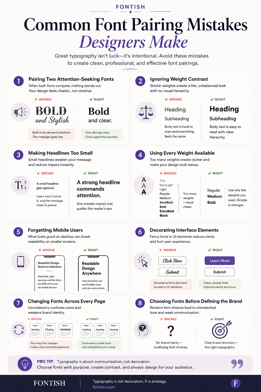
Here are the mistakes I encounter most often in detail.
1. Pairing Two Attention-Seeking Fonts
One expressive font can create personality.
Two expressive fonts usually create competition.
When both typefaces demand attention, readers don’t know where to look first. Imagine two people trying to lead the same conversation. Both may have something valuable to say, but the discussion quickly becomes exhausting. Typography behaves in much the same way.
A simple rule solves this problem: let one font become the voice while the other quietly supports it.
2. Ignoring Weight Contrast
Many beginners assume hierarchy comes from choosing different fonts.
In reality, hierarchy often comes from using the same font family more effectively.
If every heading, paragraph, and button uses Regular 400, the entire page begins to blend together. Simply introducing Bold, SemiBold, or Medium weights in the right places can transform the layout without adding another typeface.
Some of the strongest typography systems on the web rely on just one or two fonts with carefully controlled weight variations rather than constantly introducing new typefaces.
3. Making Headlines Too Small
Designers are often surprisingly conservative with headline sizes.
Professional designers usually aren’t.
Large headlines create confidence, establish hierarchy immediately, and give readers a clear starting point. If visitors have to search for the main message, your typography probably isn’t working as hard as it should.
Strong headlines don’t overwhelm readers—they simply guide them toward the information that matters most.
Remember, hierarchy isn’t about shouting.
It’s about leading.
4. Using Every Weight Available
Modern font families often include ten or more weights, but that doesn’t mean your design should use them all.
Moving from Thin to Black within the same page creates inconsistency instead of flexibility because every section begins to feel like it belongs to a different design system.
Most successful typography systems rely on three or four carefully selected weights that remain consistent across the entire website.
Discipline almost always produces better typography than variety.
5. Forgetting Mobile Users
A pairing that looks elegant on a large desktop monitor can completely fall apart on a phone. That’s why typography should always be tested on the devices where people are most likely to experience it.
Always test:
- Heading wraps
- Paragraph spacing
- Navigation
- Button labels
- Line length
- Overall readability
Mobile typography isn’t a secondary consideration anymore. For many websites, it’s the primary reading experience, so your font pairing needs to work just as well on a six-inch screen as it does on a large desktop monitor.
6. Decorating Interface Elements
Buttons, navigation, forms, and menus have one responsibility:
Help users complete tasks.
Decorative typography often gets in the way. Clean, highly readable sans-serifs almost always perform better for interface elements because they reduce cognitive effort and keep attention focused on the action rather than the styling.
Save your expressive fonts for places where they genuinely add value.
7. Changing Fonts Across Every Page
A homepage using Playfair Display.
A blog using Lora.
A landing page using DM Serif Display.
Individually, these fonts are excellent.
Together, they make the brand feel inconsistent.
Professional typography systems build familiarity through repetition. Visitors shouldn’t consciously notice that every page uses the same typography system—but they will absolutely notice when every page uses a different one.
Consistency quietly reinforces trust, even when readers aren’t aware of it.
8. Choosing Fonts Before Defining the Brand
This is probably the most common mistake of all.
Many designers browse font libraries first and think about branding later.
Reverse that process.
Start by defining the brand’s personality, goals, and audience. Once those decisions are clear, choosing fonts becomes dramatically easier because every option can be measured against a clear strategy instead of personal preference.
Strong typography always begins with a clear understanding of what the brand wants to communicate.
How to Test a Font Pairing Like a Pro
Choosing two fonts is only half the job. Before committing to a typography system, test it the same way professional designers do—in realistic situations rather than isolated previews.
A pairing that looks beautiful inside a font picker can behave very differently once it’s surrounded by real content, buttons, images, navigation, and multiple screen sizes.
Use this checklist before calling your typography system finished.
✓ Is the contrast immediately obvious?
Readers should instantly recognize which font leads and which font supports. If the hierarchy feels subtle or confusing, increase the contrast through weight, size, spacing, or font choice before assuming you need completely different typefaces.
✓ Is the hierarchy clear at a glance?
Without reading a single sentence, visitors should immediately know where to begin. Strong typography guides the eye naturally from headline to subheading to body copy without requiring conscious effort.
✓ Is the body text comfortable after thirty seconds?
Many fonts make attractive headlines.
Far fewer remain comfortable after reading several paragraphs.
Always test real articles—not just sample sentences. Reading comfort is one of the strongest indicators of a successful font pairing because visitors spend far more time reading body copy than admiring headlines.
✓ Does the system still work on mobile?
Resize your browser.
Open the page on your phone.
Ask someone else to scroll through it.
Fresh eyes often reveal spacing, wrapping, and hierarchy issues you’ve stopped noticing yourself. A typography system that works beautifully on every device is almost always stronger than one designed exclusively for desktop screens.
✓ Does every interface element feel consistent?
Review your buttons, forms, navigation, cards, captions, alerts, and menus together. They should all feel like they belong to the same design system.
If one component suddenly looks unrelated, revisit your typography roles before introducing another font.
When a pairing passes all of these tests, you’re usually very close to a professional typography system.
Tools & Resources for Learning How to Pair Fonts
Learning how to pair fonts becomes much easier when you have the right tools. While experience is ultimately the best teacher, a handful of high-quality resources can dramatically reduce trial and error by helping you evaluate combinations more efficiently.
These tools won’t replace a solid understanding of typography, but they can speed up the learning process and help you discover combinations you might not have considered on your own.
Some of my favorites include:
- Google Fonts for exploring free web fonts and testing combinations.
- Adobe Fonts for a broader professional type library.
- Font pairing generators for inspiration and quick experimentation.
- Curated Fontish pairing guides, where every combination has been tested across branding, editorial, and web design projects.
It’s worth remembering that tools don’t make design decisions for you; they simply provide options. The real skill comes from understanding why a particular pairing works and applying the principles you’ve learned throughout this guide.
If you’d rather skip hours of experimentation, download the Fontish Pairing System™. It includes carefully tested font combinations for startups, agencies, ecommerce brands, editorial websites, and personal brands, helping you build a typography system with confidence instead of relying on guesswork.
Frequently Asked Questions
How many fonts should you pair together?
For most websites, two fonts are all you need. One establishes personality while the other handles readability and structure, creating a clean and consistent typography system.
A third font can work when it has a clearly defined purpose, but adding more than three usually introduces unnecessary complexity and makes consistency much harder to maintain.
Can you pair two serif fonts?
Yes—but only when one serif clearly dominates. The two fonts should have noticeably different personalities so readers immediately understand which one leads and which one supports.
Pairing two nearly identical serif families usually weakens hierarchy instead of strengthening it, leaving the design feeling repetitive instead of refined.
How do I know if my font pairing looks professional?
Professional font pairing feels effortless. Hierarchy is immediately obvious, long passages remain comfortable to read, and every interface element feels consistent.
When readers remember your content instead of your typography, you’ve probably built a successful system.
Is serif plus sans-serif still the safest option?
Absolutely. Despite changing design trends, serif and sans-serif pairings remain one of the most versatile typography systems available.
They work equally well across branding, editorial design, marketing websites, blogs, and digital products because they naturally create contrast while preserving readability.
How to Pair Fonts Like a Designer: The Bottom Line
Learning how to pair fonts isn’t about memorizing hundreds of combinations or constantly searching for the next trendy typeface.
It’s about understanding a handful of timeless principles that consistently produce stronger typography.
Once you begin thinking in terms of hierarchy, contrast, spacing, and clearly defined roles, choosing fonts becomes far less intimidating and far more strategic.
The strongest font pairings create contrast without conflict. They establish hierarchy without overwhelming readers, reinforce a brand’s personality without becoming distracting, and quietly improve readability from the first headline to the final paragraph.
Most importantly, they feel intentional because every font has a clear job within the system.
If there’s one lesson worth remembering, it’s this:
Don’t choose fonts. Build a typography system.
Once you stop thinking about individual typefaces and start thinking about the relationships between them, every design decision becomes easier.
Instead of asking which fonts look good together, you’ll naturally begin asking which fonts help this brand communicate more clearly.
That’s the question professional designers ask because it shifts the focus away from decoration and toward communication.
Anyone can mix two fonts together.
Professional designers build typography systems that people trust.

