
 I
I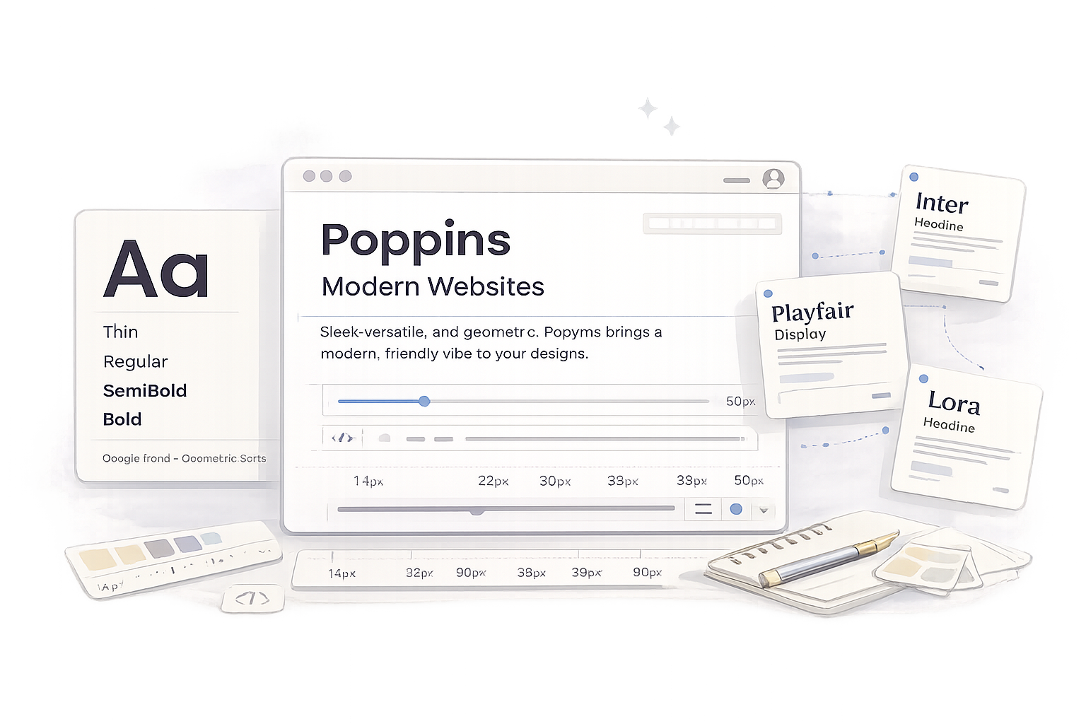
In This Review
Poppins is one of the most popular Google Fonts on the web and for good reason. Its clean geometric design, broad weight range, and excellent readability have made it a favourite for websites, apps, startups, and modern brands.
But does its popularity mean it’s the right font for your next project?
In this Poppins font review, I’ll explore where Poppins performs exceptionally well, where it has limitations, and whether it’s the best choice for your brand or website. You’ll also discover its best use cases, recommended font pairings, practical alternatives, and the common mistakes to avoid when using it.
If you’re still learning the fundamentals of typography, I also recommend reading our guide on How to Choose the Right Font before selecting your next typeface.
Quick Verdict
Poppins is one of the safest and most versatile free fonts you can choose for modern digital design. It delivers excellent readability, works beautifully across interfaces and websites, and is flexible enough for almost any digital project.
Font Snapshot
Before we dive into the details, here’s a quick overview of what Poppins is.
About Poppins
What are Poppins fonts?
Poppins is a geometric sans-serif typeface designed by the Indian Type Foundry and released through Google Fonts in 2014. Inspired by classic geometric typography, its nearly circular letterforms create a clean, structured appearance that feels modern without becoming cold or mechanical.
What makes Poppins stand out is its balance between personality and practicality. It has enough character to give headings confidence, yet remains neutral enough for interfaces, websites, and everyday reading.
With nine weights, matching italics, excellent screen rendering, and broad language support, it adapts easily to everything from landing pages and ecommerce stores to mobile apps and SaaS dashboards.
Its widespread adoption is a testament to its versatility. Designers continue to choose Poppins because it’s free, dependable, and easy to pair with other typefaces. While it may not be the most distinctive font available, it’s one of the most reliable choices for building clean, modern typography systems.
Live Font Preview
Reading about a font is helpful, but seeing it in action is what really tells you whether it fits your project.
Try Poppins at different sizes and weights using the preview below. Test a homepage headline, a paragraph of body text, or even a call-to-action button.
Notice how its circular letterforms, generous spacing, and clean geometry create a modern look without sacrificing readability.
Use this preview to judge contrast, reading rhythm and hierarchy before applying the pairing to a real website or brand system.
ABCDEFGHIJKLMNOPQRSTUVWXYZ
abcdefghijklmnopqrstuvwxyz
0123456789 ! ? & % $ # @ ( ) [ ] : ; , .
Once you’ve experimented with it, you’ll quickly understand why Poppins has become a go-to choice for designers building modern digital products.
Why Designers Love Poppins
Poppins isn’t popular simply because it’s free. Designers continue to use it because it solves everyday typography problems without getting in the way. Here are the four biggest reasons it has become a staple in modern web design.
Excellent readability
Poppins performs exceptionally well on screens. Its generous x-height, open counters, and balanced spacing keep headings crisp and interface text easy to scan, even on smaller devices.
Flexible typography system
With nine weights and matching italics, Poppins gives you enough flexibility to build a complete design system using a single font family.
From bold hero headings to subtle navigation labels, it creates clear hierarchy without introducing unnecessary complexity.
Built for modern digital design
Whether you’re designing a SaaS dashboard, ecommerce store, portfolio, or marketing website, Poppins feels right at home. Its clean geometric structure gives interfaces a polished, contemporary appearance without distracting from the content.
Easy to pair with other fonts
Poppins has a neutral personality that works well with both serif and sans-serif typefaces. It pairs beautifully with fonts like Playfair Display, Lora, and Inter, making it easy to create balanced typography systems for almost any project.
Best Use Cases
Poppins is remarkably versatile, but there are certain projects where it truly excels. If your design falls into one of the categories below, it’s likely to be an excellent choice.
Websites
Delivers clean headings, readable navigation, and excellent screen performance across desktop and mobile.
Apps & UI Design
Consistent spacing and multiple weights make it ideal for interfaces, dashboards, and mobile applications.
SaaS Products
Supports scalable design systems with a professional yet friendly appearance.
Branding
Creates a modern, approachable identity for startups, agencies, and technology brands.
Marketing Materials
Works well for social graphics, presentations, landing pages, and digital advertising.
Creative Portfolios
Gives portfolios and personal websites a clean, contemporary look without overpowering the work.
Note: While Poppins adapts well to many digital projects, it isn’t the perfect solution for every brand. Luxury fashion, premium editorial publications, and heritage-inspired identities often benefit from typefaces with more character and historical influence.
That’s why choosing the right font is never just about popularity; it’s about matching the personality of the typeface to the message you want your brand to communicate.
Best Poppins Font Pairings
One of Poppins’ biggest strengths is its versatility. Its clean geometric shapes make it easy to combine with both serif and sans-serif fonts without creating visual conflict.
Whether you’re building a SaaS dashboard, a luxury brand, or a content-heavy blog, the right pairing helps establish a stronger visual hierarchy and gives your design more personality. The combinations below are some of the best places to start.
| Font Pairing | Best For | Difficulty | Verdict |
| Poppins + Inter | SaaS, startups, websites, UI design | Easy | ⭐⭐⭐⭐⭐ |
| Poppins + Playfair Display | Luxury brands, editorial websites, agencies | Medium | ⭐⭐⭐⭐⭐ |
| Poppins + Lora | Blogs, portfolios, educational websites | Easy | ⭐⭐⭐⭐☆ |
| Poppins + Merriweather | Articles, publishing, documentation | Medium | ⭐⭐⭐⭐☆ |
| Poppins + Libre Baskerville | Premium blogs, corporate websites | Medium | ⭐⭐⭐⭐☆ |
The best pairing depends on the personality you’re trying to create. If you want a clean digital experience, Inter is the natural companion. For premium branding, Playfair Display introduces elegant contrast, while Lora creates a softer, more editorial feel that’s ideal for blogs and long-form content.
Use this preview to judge contrast, reading rhythm and hierarchy before applying the pairing to a real website or brand system.
ABCDEFGHIJKLMNOPQRSTUVWXYZ
abcdefghijklmnopqrstuvwxyz
0123456789 ! ? & % $ # @ ( ) [ ] : ; , .
Looking for more inspiration? Browse our complete collection of Font Pairing Guides to discover combinations for branding, websites, ecommerce stores, editorial layouts, and digital products.
Strengths, Limitations & Common Mistakes
Like every typeface, Poppins has situations where it shines and others where it’s less suitable. Understanding both sides will help you decide whether it’s the right choice for your next project.
What Poppins Does Well
- Excellent readability on desktop and mobile devices.
- Nine weights with matching italics provide exceptional flexibility.
- Free for personal and commercial projects through Google Fonts.
- Clean, modern appearance that suits most digital brands.
- Easy to pair with both serif and sans-serif fonts.
- Consistent performance across websites, apps, and user interfaces.
Where It Falls Short
- Its popularity makes it less distinctive than many premium fonts.
- The geometric construction can feel repetitive in long editorial layouts.
- It isn’t the strongest choice for luxury, heritage, or highly expressive brands.
- Heavy weights can feel bulky if overused in body copy.
Common Mistakes to Avoid
Even a great font can underperform if it’s used incorrectly. These are the mistakes I see most often when reviewing websites that use Poppins.
- Using too many weights. Most projects only need three or four weights to create a strong hierarchy.
- Pairing it with another geometric sans-serif. Similar shapes reduce contrast instead of improving it.
- Using heavy weights for long paragraphs. Regular or Medium usually produces a more comfortable reading experience.
- Ignoring spacing and hierarchy. Good typography depends just as much on spacing, line height, and layout as it does on the font itself.
Compare the weak example with the corrected version to see how one small typography decision changes the entire result.
The Mistake
The treatment feels cramped, inconsistent, or difficult to scan.
The Better Approach
The corrected treatment creates clearer hierarchy, rhythm, and readability.
Use Poppins well, and it almost disappears behind your content—which is exactly what good typography should do.
Alternatives to Poppins
Poppins is an excellent all-rounder, but it isn’t the perfect font for every project. If you’re looking for a different personality, improved readability, or a more distinctive brand identity, these alternatives are well worth considering.
Each font below offers a different balance of style and functionality, so choose the one that best supports your design goals rather than simply following what’s popular.
| Font | Personality | Best For | Why Consider It |
| Inter | Neutral, modern | UI design, SaaS, apps | Exceptional screen readability and one of the best body text fonts available. |
| Montserrat | Bold, geometric | Branding, display headings | Similar geometric style with a stronger, more confident personality. |
| Open Sans | Friendly, humanist | Blogs, documentation, business websites | Easier to read in long-form content and highly versatile. |
| Source Sans 3 | Professional, understated | Enterprise platforms, educational sites | Clean interface font with excellent readability. |
| Manrope | Contemporary, minimal | Startups, landing pages, product websites | A modern alternative with a cleaner, more refined appearance. |
| DM Sans | Friendly, modern | Mobile apps, startups, marketing | Soft, approachable letterforms that work beautifully across digital products. |
The best alternative depends on what you’re trying to achieve. If readability is your top priority, Inter is difficult to beat. If you’re after stronger branding, Montserrat adds more visual presence.
For content-heavy websites, Open Sans remains one of the safest choices, while Manrope and DM Sans provide a fresh, contemporary feel for newer digital brands.
The Bottom Line
Poppins has earned its reputation as one of the best Google Fonts available, and after using it across websites, branding projects, and digital products, it’s easy to see why.
It combines clean geometric styling with excellent readability, a generous range of weights, and the flexibility to work across almost every type of digital project.
Whether you’re building a startup website, designing a mobile app, or refreshing your brand identity, Poppins offers a dependable foundation that rarely disappoints.
Its only real limitation is that it’s everywhere. If your goal is to create a highly distinctive or luxury-focused brand, you may prefer a typeface with more personality. For most modern websites, however, Poppins remains one of the smartest free font choices you can make.
If you’re still deciding, experiment with the live preview, compare a few alternatives, and test different pairings before committing.
Great typography isn’t about choosing the most popular font—it’s about choosing the one that communicates your brand most effectively.
Frequently Asked Questions
Is Poppins a good font?
Yes. Poppins is one of the best free Google Fonts for websites, apps, branding, and modern digital design thanks to its readability and versatility.
Is Poppins free for commercial use?
Yes. It’s available through Google Fonts under the SIL Open Font License, making it free for both personal and commercial projects.
Is Poppins good for body text?
Yes, for short to medium-length content. For long articles, fonts like Inter or Open Sans are often more comfortable to read.
What fonts pair well with Poppins?
Inter, Playfair Display, Lora, Merriweather, and Libre Baskerville are among its strongest pairings.
Is Poppins better than Montserrat?
It depends on your project. Poppins feels softer and more approachable, while Montserrat has a bolder, more architectural style.
Is Poppins better than Inter?
Neither is better overall. Poppins is stronger for branding and headings, while Inter excels in body text and interface design.
Does Poppins work well for logos?
Yes. It’s an excellent choice for modern technology, startup, and digital-first brands, though luxury brands may benefit from a more expressive typeface.
Why is Poppins so popular?
Because it’s free, highly readable, easy to use, available in many weights, and performs consistently across websites, apps, and digital products.
Related Reading
If you enjoyed this review, continue building your typography knowledge with these guides:
The more fonts you explore, the easier it becomes to choose the right typeface for every project.