
 I
I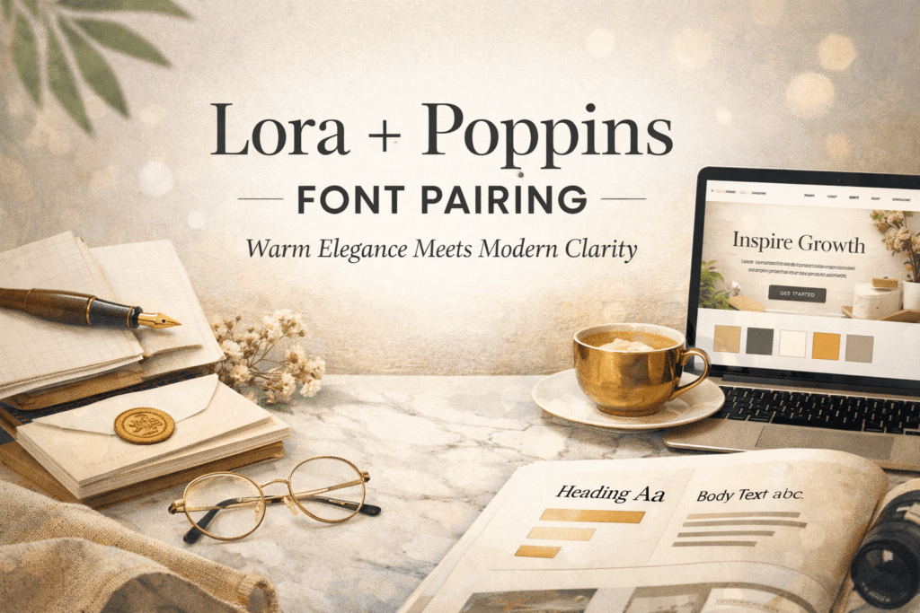
In This Pairing
If you’re searching for a Google Fonts combination that feels professional without looking cold, the Lora + Poppins font pairing deserves a place at the top of your shortlist.
Lora brings warmth, personality, and editorial elegance, while Poppins contributes clean geometry and modern structure. Together, they create a typography system that’s approachable enough for blogs, polished enough for brands, and versatile enough for websites, presentations, and marketing materials.
It’s a pairing I often recommend because it achieves something many font combinations struggle with: personality without sacrificing clarity.
Rather than competing for attention, both fonts understand their roles, creating a balanced reading experience from the first headline to the final paragraph.
If you’re still learning the fundamentals of typography, our Font Design for Beginners guide explains why successful font pairings rely on hierarchy, contrast, and purpose, not simply mixing a serif with a sans serif.
Quick Verdict
The Lora + Poppins font pairing is one of the strongest serif-and-sans combinations available on Google Fonts.
Lora adds warmth, credibility, and a subtle editorial character, while Poppins introduces clean structure, rhythm, and excellent readability. Neither font overwhelms the other. Instead, they work together to create a hierarchy that feels natural and effortless.
Overall Rating: 9.6/10
Lora + Poppins font pairing Snapshot
Lora + Poppins Live Font Pairing Preview
Build Trust Through Better Typography
Professional typography isn’t about using more fonts—it’s about giving every font a clear purpose. Lora provides warmth and personality, while Poppins keeps the reading experience clean, structured, and comfortable.
Choosing the right fonts is only part of the process. Building effective hierarchy, spacing, and contrast is what transforms two good fonts into a professional typography system. If you’d like to master that process, our How to Pair Fonts Like a Designer guide walks through every step with practical examples.
Why This Pairing Works So Well
Great font pairings aren’t built on contrast alone. They’re built on complementary personalities.
That’s exactly why the Lora + Poppins font pairing continues to appear on high-performing websites, modern brands, and editorial layouts. It combines two distinct voices that support one another instead of competing for attention.
Lora is a contemporary serif with subtle calligraphic influences. It feels human, trustworthy, and comfortable to read, making it an excellent choice for storytelling, editorial content, and brands that want to feel approachable.
Poppins sits at the opposite end of the spectrum. Its geometric construction delivers crisp lines, excellent legibility, and a polished appearance that feels perfectly at home in modern interfaces and digital products.
Together they create a clear visual hierarchy:
- Lora introduces personality.
- Poppins provides structure.
- Readers instantly know where to look first.
That balance is precisely what makes this pairing so effective. The typography feels intentional without calling attention to itself—a quality shared by many of the best-designed websites.
Designer Insight
One of the easiest ways to weaken this pairing is by giving both fonts equal visual importance. Let one font lead while the other supports. Strong typography depends on clear roles, not equal attention.
At a Glance
| Attribute | Rating |
| Readability | ⭐⭐⭐⭐⭐ |
| Branding | ⭐⭐⭐⭐⭐ |
| Websites | ⭐⭐⭐⭐⭐ |
| Editorial Design | ⭐⭐⭐⭐⭐ |
| UI Design | ⭐⭐⭐⭐☆ |
| Mobile Performance | ⭐⭐⭐⭐⭐ |
| Versatility | ⭐⭐⭐⭐⭐ |
| Overall Score | 9.6 / 10 |
Another reason this pairing remains so popular is its practicality. Both Lora and Poppins fonts are free through Google Fonts, load efficiently on modern websites, and offer enough weights to build a professional typography system without introducing unnecessary complexity.
Best Ways to Use the Lora + Poppins Font Pairing
Understanding why this combination works is one thing. Using it well is what separates an average design from a polished one.
One of the greatest strengths of the Lora and Poppins font pairing is its versatility. Unlike combinations that only suit a specific niche, this pairing feels equally comfortable on a personal blog, a SaaS landing page, a consultant’s website, or a growing brand’s marketing materials.
The key is simple: give each font a distinct job. Let one provide personality while the other focuses on readability. When both fonts try to lead, the hierarchy quickly falls apart.
Option 1: Lora Headlines + Poppins Body (Recommended)
If I had to recommend one layout for most projects, this would be it.
Lora’s elegant letterforms naturally draw the eye, giving headlines warmth, confidence, and just enough editorial character to feel memorable. Poppins then takes over in the body, keeping paragraphs crisp, highly readable, and comfortable across desktops, tablets, and mobile devices.
The contrast feels natural rather than forced. Readers immediately recognize where to begin, then move smoothly through the content without distraction.
This setup works particularly well for:
- Company websites
- Personal brands
- Blogs and online magazines
- Landing pages
- Online courses
- Small business websites
If you’re building a website from scratch, this arrangement is an excellent starting point.
Option 2: Poppins Headlines + Lora Body
Reversing the roles creates an entirely different personality.
Poppins headlines feel cleaner, sharper, and slightly more technical, making them well-suited to startups, digital products, and technology brands. Lora then softens the experience by adding warmth to longer passages of text.
The overall impression is contemporary without becoming cold—a subtle distinction that can make a surprising difference in how approachable a brand feels.
This variation is particularly effective for:
- Startup websites
- SaaS landing pages
- Technology companies
- Creative agencies
- Digital products
Because Lora was designed with comfortable reading in mind, longer articles and product pages remain enjoyable without sacrificing sophistication.
Designer Insight
When using Poppins for headlines, avoid choosing the heaviest weight by default. Medium or SemiBold often feels more refined and allows Lora to introduce warmth without creating excessive contrast.
Recommended Font Weights
One of the biggest mistakes I see is loading every available font weight simply because it’s there.
Professional typography usually relies on restraint, not abundance. Three carefully selected weights will almost always outperform seven inconsistent ones.
| Element | Font | Weight |
| H1 | Lora | Bold (700) |
| H2 | Lora | SemiBold (600) |
| H3 | Poppins | Medium (500) |
| Body | Poppins | Regular (400) |
| Buttons | Poppins | Medium (500) |
This combination creates a strong hierarchy while keeping the overall design cohesive and easy to maintain.
Who Should Use This Pairing?
Not every font pairing fits every brand, but this one comes remarkably close.
The Lora + Poppins font pairing is ideal for designers, entrepreneurs, and businesses that want to appear both approachable and professional. It balances personality with usability, making it suitable for industries where trust matters just as much as visual appeal.
It’s an excellent choice for:
- Personal brands
- Consultants and coaches
- Marketing agencies
- Bloggers and publishers
- Educational platforms
- Non-profit organizations
- Creative portfolios
- Lifestyle brands
- Small businesses
- Professional service websites
Because both fonts include multiple weights and broad language support, they’re also practical choices for brands that expect to grow over time.
When This Pairing Isn’t the Best Choice
As versatile as this combination is, it isn’t the answer to every design problem. If your brand depends on dramatic luxury aesthetics, highly expressive typography, or playful display fonts, Lora and Poppins may feel a little too restrained.
Their strength lies in balance, not spectacle.
I’d explore a different direction if you’re designing for:
- Luxury fashion houses
- Premium jewellery brands
- Wedding invitations
- Children’s products
- Vintage branding
- Experimental editorial projects
For those situations, combinations featuring Playfair Display, Cormorant Garamond, or DM Serif Display often create a stronger emotional impact.
Choosing typography isn’t about finding the “best” fonts; it’s about finding the fonts that reinforce your brand’s personality.
Real-World Example
Imagine a financial consultant launching a new website.
The goal isn’t to impress visitors with decorative typography. It’s to build trust within the first few seconds.
Using Lora for page titles immediately introduces warmth and credibility, while Poppins keeps service descriptions, pricing tables, navigation, and call-to-action buttons clean and easy to scan.
Nothing feels overly corporate.
Nothing feels unnecessarily decorative.
Instead, the typography quietly communicates professionalism, allowing the expertise behind the business—not the fonts—to become the centre of attention.
That’s exactly what effective typography should do.
Why Designers Keep Coming Back to This Pairing
Many trendy font combinations look exciting when they’re first released.
A year later, they already feel dated.
Lora and Poppins have remained popular because they’re built on timeless design principles rather than short-lived trends. The pairing succeeds through contrast, readability, and clearly defined hierarchy instead of visual gimmicks.
That’s why it continues to appear across websites, brands, and publications in completely different industries.
Good typography doesn’t chase trends.
It creates clarity—and clarity rarely goes out of style.
Common Mistakes When Using the Lora + Poppins Font Pairing
Even the best font combinations can fall flat when they’re applied without a clear typography system. More often than not, the problem isn’t the fonts—it’s how they’re being used.
I’ve seen beautifully designed websites lose their impact because the hierarchy was inconsistent, the spacing felt cramped, or every available font weight was loaded onto the page. Fortunately, these are easy mistakes to avoid.

❌ Wrong
- Using five or six font weights throughout the page
- Giving Lora and Poppins equal visual emphasis
- Making body text too small for comfortable reading
- Using inconsistent spacing between headings and paragraphs
✅ Right
- Limit the system to three carefully chosen weights
- Let one font lead while the other supports
- Keep body text between 16–18px for digital reading
- Use generous spacing and a consistent line height
Typography is often an exercise in restraint. Removing unnecessary complexity usually improves a design faster than adding another font or another weight.
Designer Insight
If your page feels visually “busy,” resist the temptation to replace the fonts. Review your hierarchy first. Nine times out of ten, spacing and weight—not the typefaces themselves—are the real issue.
Similar Font Pairings to Consider
Although the Lora + Poppins font pairing is one of my favourite all-round combinations, every project has its own personality.
Depending on your brand, another serif-and-sans pairing may communicate the right tone more effectively.
Here are a few excellent alternatives.
| Font Pairing | Best For |
| Playfair Display + Inter | Luxury brands and editorial websites |
| Merriweather + Open Sans | Corporate websites and business blogs |
| Libre Baskerville + Montserrat | Professional branding and publishing |
| Cormorant Garamond + Inter | Fashion brands and creative portfolios |
| DM Serif Display + Poppins | Modern editorial brands with stronger personality |
Each of these combinations follows the same principle: pair an expressive font with one that prioritises readability. The mood changes, but the underlying strategy stays remarkably consistent.
If you’re still exploring options, browse our collection of font pairing guides, where we break down dozens of professionally curated combinations for websites, branding, publishing, and digital products.
My Recommendation
If someone asked me to recommend one Google Fonts pairing that works across the widest range of projects, Lora + Poppins would comfortably make the shortlist.
It’s dependable without being predictable.
Lora introduces warmth, credibility, and just enough editorial personality to make a design feel inviting. Poppins balances that warmth with clean geometry and exceptional readability, giving layouts the structure they need without feeling rigid.
That combination makes it suitable for almost everything from blogs and personal brands to agencies, online courses, and business websites.
Would I use it for a luxury fashion house or a highly experimental design project? Probably not.
For those situations, I’d lean towards something with stronger visual drama.
But if your goal is to create a typography system that feels timeless, approachable, and professional, it’s difficult to find a better free alternative.
Lora and Poppins Font Pairing: The Bottom Line
The Lora + Poppins font pairing proves that great typography doesn’t need to be complicated.
Lora brings warmth, trust, and a subtle editorial quality that makes content feel approachable. Poppins contributes clean structure, excellent legibility, and the consistency needed for modern digital experiences.
Together, they create a typography system that’s balanced rather than flashy—one that quietly guides readers through the page instead of demanding attention.
That’s exactly why designers continue returning to this pairing year after year. It isn’t driven by trends. It’s built on timeless typography principles that work across industries, devices, and audiences.
Typography rarely succeeds because of one beautiful font.
It succeeds because every font has a clear role.
Lora and Poppins understand that balance exceptionally well.
Frequently Asked Questions
Is Lora and Poppins a good font pairing?
Yes. Lora and Poppins complement each other exceptionally well. Lora contributes warmth and editorial character, while Poppins provides clean, geometric readability. Together, they create a balanced typography system that’s suitable for websites, branding, and long-form content.
Which font should I use for headings: Lora or Poppins?
For most projects, I recommend Lora for headings and Poppins for body text. This creates stronger contrast and makes content easier to scan. If you’re designing for a startup or technology company, reversing the roles can produce a cleaner, more contemporary feel.
Is Lora + Poppins suitable for websites?
Absolutely. Both fonts are optimised for screen use, freely available through Google Fonts, and include multiple weights that make building a clear typography hierarchy straightforward. They perform consistently across desktop and mobile devices.
Is Lora + Poppins a good choice for branding?
Yes. This pairing communicates professionalism without feeling overly formal. It’s particularly effective for consultants, agencies, educators, creators, startups, and service-based businesses that want to appear trustworthy, approachable, and modern.
Are both Lora and Poppins free to use?
Yes. Both fonts are available through Google Fonts under the SIL Open Font License, making them free for personal and commercial projects. It’s still worth checking the latest licence details if you plan to modify or redistribute the font files.
If this pairing feels close but not quite right, don’t settle too quickly. The best typography systems are chosen with intention, not convenience. Explore more of our carefully curated font pairing guides to discover combinations tailored to luxury brands, creative portfolios, SaaS products, editorial websites, and everything in between.