
 I
I
In This Pairing
The Libre Baskerville + Inter font pairing combines classic editorial elegance with modern digital clarity.
It’s one of those rare Google Fonts combinations that feels equally at home on a magazine website, a consultant’s portfolio, or a content-rich SaaS landing page.
Libre Baskerville gives your headlines authority. Inter makes everything else effortless to read. Together, they create a typography system that’s balanced, trustworthy, and built to last.
If you’re searching for a serif and sans serif pairing that looks professional today and will still look professional years from now, this is one of the easiest recommendations I can make.
Quick Verdict
The Libre Baskerville + Inter pairing succeeds because each font knows its role.
Libre Baskerville creates personality and draws attention, while Inter quietly handles readability across paragraphs, navigation, and user interfaces. The result is a typography system that feels polished rather than overdesigned.
Perfect for: Editorial websites, personal brands, consultants, publishers, and professional businesses.
Libre Baskerville + Inter Snapshot Card
Libre Baskerville + Inter Font pairing at a Glance
Live Pairing Preview
Build Brands That Inspire Trust
Great typography isn’t about choosing beautiful fonts—it’s about creating a clear hierarchy that guides readers through your message. Libre Baskerville captures attention, while Inter keeps every paragraph effortless to read
Why This Font Pairing Works
Every successful font pairing is built on contrast, but not the kind that fights for attention.
The Libre Baskerville + Inter font pairing works because it balances two complementary personalities. One font provides expression, while the other focuses on function.
Libre Baskerville introduces warmth, authority, and a subtle editorial feel. Inter counters that elegance with exceptional screen readability and a neutral appearance that never distracts from the content.
Instead of competing, they support one another.
Think of Libre Baskerville as the voice of your brand and Inter as the conversation that follows. One captures attention. The other keeps readers engaged.
This approach follows one of the most reliable principles in typography: pair an expressive headline font with a restrained supporting font. The hierarchy feels natural because every element has a clearly defined purpose.
That’s why you’ll see this combination working across everything from publishing platforms and consultant websites to knowledge bases and premium marketing pages.
Before deciding whether it’s the right pairing for your project, let’s take a closer look at the role each typeface plays.
Quick Font Comparison
Although these fonts are often used together, they were designed with very different goals in mind. Understanding those differences makes it much easier to know when—and how—to use them.
| Feature | Libre Baskerville | Inter |
| Classification | Transitional Serif | Neo-Grotesque Sans Serif |
| Primary Role | Headlines & Display Text | Body Copy & User Interface |
| Personality | Elegant • Literary • Trustworthy | Neutral • Modern • Functional |
| Biggest Strength | Authority & Visual Impact | Readability & Screen Performance |
| Best Environment | Editorial Design & Branding | Websites, Apps & Long-form Reading |
| Google Fonts | ✓ | ✓ |
Neither font is objectively “better.”
They’re designed to solve different problems, which is exactly why they make such an effective pair.
Meet the Fonts
Libre Baskerville
Libre Baskerville is a transitional serif that brings classic publishing aesthetics to modern digital design. It feels intelligent, refined, and dependable without becoming overly formal.
Compared with more dramatic serif fonts like Playfair Display, it takes a quieter approach. That’s what makes it so versatile.
Best used for:
- Hero headlines
- Article titles
- Pull quotes
- Editorial branding
- Premium landing pages
Inter
If Libre Baskerville provides the personality, Inter provides the performance.
Designed specifically for digital interfaces, Inter has become one of the most respected sans serif fonts thanks to its outstanding legibility, generous spacing, and flexible weight family.
It doesn’t try to steal attention.
It simply makes every paragraph, menu, button, and form easier to read.
Best used for:
- Body copy
- Navigation
- Buttons
- Forms
- UI components
- Mobile interfaces
Curious how typefaces like Libre Baskerville and Inter are created? Our Font Design for Beginners guide explains the fundamentals of type design and shows how professional fonts go from simple sketches to polished, production-ready typefaces.
Best Use Cases for the Libre Baskerville + Inter Font Pairing
The Libre Baskerville and Inter font pairing performs best when a brand wants to communicate expertise without feeling cold or corporate. It combines the warmth of a classic serif with the usability of a modern sans serif, making it suitable for a wide range of professional projects.
Rather than trying to fit every design style, it focuses on one thing exceptionally well: building trust through thoughtful typography.
📚 Editorial Websites
★★★★★ Excellent Match
Perfect for:
- Online magazines
- News websites
- Publishing platforms
- Long-form blogs
Libre Baskerville gives article titles a refined editorial presence, while Inter keeps long reading sessions comfortable across desktop and mobile devices. The result feels polished without becoming overly formal.
👔 Personal Brands & Consultants
★★★★★ Excellent Match
Perfect for:
- Coaches
- Consultants
- Writers
- Agencies
- Public speakers
Professional service businesses often need to balance credibility with approachability. This pairing does exactly that, helping personal brands appear experienced without looking old-fashioned.
🚀 Content-Driven SaaS
★★★★☆ Great Match
Perfect for:
- SaaS landing pages
- Knowledge bases
- Product documentation
- Resource centres
Many SaaS websites rely entirely on geometric sans serif fonts. Introducing Libre Baskerville for hero headlines immediately adds personality while allowing Inter to maintain excellent usability throughout the interface.
⚖ Professional Services
★★★★★ Excellent Match
Perfect for:
- Legal firms
- Financial services
- Healthcare
- Education
- Non-profit organisations
Trust is often the deciding factor in these industries. Libre Baskerville communicates stability and expertise, while Inter ensures information remains clear and accessible.
✨ Luxury Brands
★★★★☆ Great Match
Perfect for:
- Boutique brands
- Interior design
- High-end services
- Premium ecommerce
Luxury doesn’t always require dramatic typography.
This pairing creates sophistication through restraint, making it ideal for brands that prefer timeless elegance over visual excess.
Real-World Example
Imagine you’re designing the homepage for a boutique legal consultancy.
Your typography could look like this:
Hero Headline
Libre Baskerville Bold — 60px
Legal Advice Built on Experience and Trust.
Supporting Text
Inter Regular — 18px
Helping businesses and individuals navigate complex legal matters with practical, straightforward guidance.
Primary Button
Inter Medium — 16px
Book a Consultation
Nothing feels forced.
The serif headline establishes authority immediately, while the supporting content remains clean, readable, and easy to scan.
That’s exactly how good typography should behave.
Want to Build Better Font Pairings?
Choosing two fonts is only the beginning.
If you’d like to understand why certain combinations work, our How to Pair Fonts Like a Designer guide walks through the same principles professional designers use when building typography systems from scratch.
It’s the perfect companion to this review if you’re creating a brand, redesigning a website, or choosing fonts for a client project.
Brand Fit Meter
Not every font pairing fits every brand personality. Here’s where Libre Baskerville + Inter performs best.
| Brand Personality | Rating | Verdict |
| 📰 Editorial & Publishing | ⭐⭐⭐⭐⭐ | Outstanding |
| 👔 Consultants & Personal Brands | ⭐⭐⭐⭐⭐ | Outstanding |
| ⚖ Professional Services | ⭐⭐⭐⭐⭐ | Outstanding |
| 🎓 Education | ⭐⭐⭐⭐☆ | Excellent |
| 🚀 SaaS & Technology | ⭐⭐⭐⭐☆ | Excellent |
| ✨ Luxury Brands | ⭐⭐⭐⭐☆ | Excellent |
| 🏢 Corporate Websites | ⭐⭐⭐⭐☆ | Excellent |
| 🎨 Creative Studios | ⭐⭐⭐☆☆ | Good |
| 👗 Fashion Brands | ⭐⭐⭐☆☆ | Good |
| 🎮 Gaming | ⭐☆☆☆☆ | Not Recommended |
| 🧸 Children’s Brands | ⭐☆☆☆☆ | Not Recommended |
| 🛹 Streetwear | ⭐☆☆☆☆ | Not Recommended |
Overall, this pairing feels calm, intelligent, and trustworthy.
If your goal is to create a brand that communicates expertise, clarity, and professionalism, it’s difficult to find a better free combination.
If you’re aiming for playful energy, youthful expression, or experimental design, you’ll likely be happier with a more expressive pairing.
Typography isn’t just about choosing attractive fonts. It’s about giving every font a clear responsibility.
Now that we’ve established where this pairing performs best, let’s look at how to structure it so every headline, paragraph, and button works together as one cohesive system.
How to Structure the Libre Baskerville + Inter Pairing
A great font pairing can still produce an average design if the hierarchy is weak.
Professional typography isn’t about finding two beautiful fonts—it’s about giving each font a clear responsibility.
With this pairing, the formula is simple:
Libre Baskerville leads. Inter supports.
Stick to that principle, and most of your hierarchy decisions become surprisingly easy.
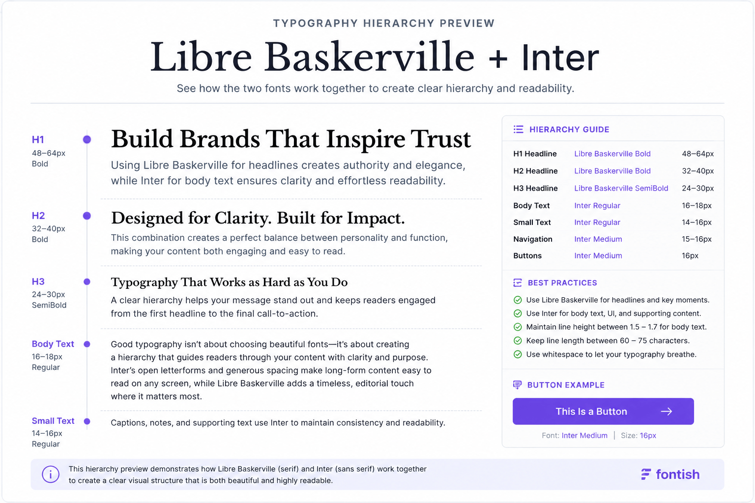
Libre Baskerville + Inter font Recommended Typography Hierarchy
| Element | Font | Weight | Recommended Size |
| H1 | Libre Baskerville | Bold | 48–64px |
| H2 | Libre Baskerville | Bold | 32–40px |
| H3 | Libre Baskerville | Regular / Bold | 24–30px |
| Body Copy | Inter | Regular (400) | 16–18px |
| Small Text | Inter | Regular | 14–16px |
| Buttons | Inter | Medium (500) | 16px |
| Navigation | Inter | Medium | 15–16px |
This setup works beautifully for blogs, business websites, landing pages, portfolios, and most content-first brands.
Headline Strategy
Libre Baskerville should always be the visual voice of the page. Use it wherever you want to create emphasis or establish authority.
Recommended for:
- Hero headlines
- Page titles
- Section headings
- Pull quotes
- Editorial highlights
The font already has elegant contrast and refined proportions, so resist the temptation to over-style it.
Large shadows, outlines, excessive italics, or decorative effects usually reduce its impact. When in doubt, choose simplicity. Elegant typography rarely needs decoration.
Body Text Strategy
Inter handles everything readers spend the most time looking at. Its neutral appearance allows the content, not the font, to remain the focus.
Use Inter for:
- Paragraphs
- Lists
- Captions
- Navigation
- Forms
- Buttons
- Interface elements
For the best reading experience, start with:
- Font Size: 16–18px
- Line Height: 1.5–1.7
- Weight: 400 for body, 500 for emphasis
Those settings provide an excellent balance between readability and visual rhythm on both desktop and mobile devices.
Interface Strategy
One mistake I often see is mixing serif fonts into interface elements. Buttons, menus, navigation, and forms should all stay in Inter.
Keeping every interactive element in one typeface makes the entire website feel cleaner, faster, and more consistent.
A simple way to remember it is:
Libre Baskerville communicates.
Inter operates.
That’s the balance that makes this pairing feel effortless.
Professional Setup Cheat Sheet
If you’re starting from scratch, this configuration is a reliable foundation for almost any professional website.
| Component | Recommendation |
| Headline Font | Libre Baskerville Bold |
| Body Font | Inter Regular |
| Button Font | Inter Medium |
| Body Size | 16–18px |
| Line Height | 1.6 |
| Maximum Line Length | 60–75 characters |
| Headline Tracking | Slightly increase above 60px |
| Recommended Weights | 400 • 500 • 700 |
Think of this as your starting point—not a rigid rulebook. Adjust spacing and sizing to suit your brand, but keep the overall hierarchy consistent.
Common Mistakes Designers Make
Even excellent font pairings can fall apart with poor implementation. Here are the mistakes I see most often.
Using Libre Baskerville Everywhere
A beautiful headline font doesn’t automatically make a good body font.
Using Libre Baskerville for paragraphs, menus, and interface elements creates unnecessary visual fatigue.
Better approach: Let it lead the page—not dominate it.
Decorating the Headlines
Libre Baskerville already has plenty of personality. Heavy shadows, outlines, gradients, and excessive italics usually compete with the font instead of enhancing it.
Professional typography is often defined by restraint.
Forgetting White Space
Typography doesn’t exist in isolation. Even the perfect font pairing will feel cramped if there’s no room for it to breathe.
Generous margins, comfortable line spacing, and sensible paragraph lengths make a bigger difference than most designers realise.
Using Every Weight Available
Inter includes an extensive weight family, but that doesn’t mean every weight belongs in the same design.
For most projects, three weights are more than enough:
- Regular (400)
- Medium (500)
- Bold (700)
Limiting your palette creates stronger hierarchy and a cleaner visual rhythm.
Myth Debunked
Myth: Any serif can be paired with any sans serif.
That’s one of the biggest misconceptions in typography. Successful font pairing isn’t about choosing different classifications.
It’s about balancing personality, proportion, contrast, and purpose. Libre Baskerville and Inter work so well together because each font performs a different job.
Libre Baskerville captures attention.
Inter keeps people reading.
When every font has a clear responsibility, typography stops feeling decorative and starts becoming strategic.
That’s the difference between choosing fonts and designing a typography system.
Libre Baskerville + Inter font Similar Font Pairings
If the Libre Baskerville + Inter font pairing is close to what you’re looking for but not quite perfect, these alternatives are worth exploring.
Playfair Display + Inter
Mood: Dramatic • Luxurious • Editorial
Best for: Fashion brands, premium products, luxury websites
If you want a stronger editorial presence with more visual drama, Playfair Display delivers greater contrast while Inter keeps the layout balanced.
→ Read our Playfair Display + Inter pairing guide
Lora + Poppins
Mood: Friendly • Modern • Approachable
Best for: Startups, lifestyle brands, coaches
Lora feels softer and more conversational than Libre Baskerville, while Poppins introduces a warmer geometric style that works well for approachable brands.
→ Read our Lora + Poppins pairing guide
Merriweather + Open Sans
Mood: Traditional • Dependable • Corporate
Best for: Education, healthcare, corporate websites
If your priority is readability and familiarity over editorial character, this classic combination remains one of the safest choices available.
→ Read our Merriweather + Open Sans pairing guide
Cormorant Garamond + Inter
Mood: Elegant • Refined • Premium
Best for: Luxury brands, creative portfolios, publishing
Cormorant Garamond introduces more sophistication and visual flair while Inter maintains exceptional usability.
Each of these combinations follows the same design principle: one font creates personality, while the other focuses on readability. The difference lies in the mood each pairing communicates.
Libre Baskerville + Inter font Pairing Verdict
Libre Baskerville + Inter font pairing: The Bottom Line
If your goal is to build a website that feels trustworthy, readable, and professionally designed, the Libre Baskerville + Inter font pairing is one of the easiest recommendations I can make.
It succeeds because every font has a clear purpose.
Libre Baskerville establishes authority and captures attention. Inter quietly supports the experience, making every paragraph, menu, and button effortless to read.
That’s the hallmark of a well-designed typography system.
This pairing doesn’t rely on trends or visual gimmicks. Instead, it follows timeless typography principles that continue to work across blogs, business websites, editorial platforms, consultants, and content-first brands.
And that’s exactly why it’s so difficult to outgrow.
Typography trends will change.
Good hierarchy won’t.
If you’re building a professional brand that values clarity, credibility, and longevity, Libre Baskerville + Inter deserves a place at the top of your shortlist.
Ready to explore more combinations?
Browse our complete collection of Font Pairing Guides, or download the Font Pairing Cheat Sheet to discover dozens of professionally tested font combinations for branding, websites, and editorial design.
Libre Baskerville + Inter font pairing: FAQs
Is Libre Baskerville + Inter a good Google Fonts pairing?
Yes. Both fonts are free, highly optimised for the web, and complement each other beautifully. Libre Baskerville creates visual authority, while Inter delivers exceptional readability.
Can I use Libre Baskerville for body text?
You can, but it’s better reserved for headlines and display text. Inter is easier to read over long passages, especially on screens.
Is this pairing suitable for branding?
Absolutely. It’s an excellent choice for consultants, agencies, publishers, educational organisations, and businesses that want to communicate trust and professionalism.
Which industries work best with this pairing?
Editorial publishing, finance, legal services, education, healthcare, SaaS, non-profit organisations, and personal brands all benefit from its balanced, high-trust appearance.
What headline size works best for Libre Baskerville?
For most websites, use 48–64px for H1 headings and 32–40px for H2 headings. Pair these with 16–18px Inter body text and a line-height of around 1.6 for optimal readability.
Can I use this pairing for print projects?
Yes. Although Inter was designed for digital interfaces, both fonts perform beautifully in print, making them suitable for magazines, brochures, reports, presentations, and other editorial layouts.