 I
I
In This Guide
So… You Want to Design a Font?
If you’ve been exploring font design for beginners, you’ve probably searched through hundreds of fonts only to find that none quite matches the idea in your head.
Eventually, a tempting question appears:
“What if I just designed my own font?”
That’s where many professional type designers began.
Font design may sound intimidating, with its Bézier curves, kerning, metrics, and unfamiliar software. But beneath the technical language, it’s simply the process of building a consistent visual system that people can read effortlessly.
In this guide, I’ll walk you through the complete process—from shaping your first letters to spacing, testing, and exporting a working font.
By the end, you won’t just understand how fonts are created. You’ll begin seeing typography through the eyes of a type designer—and that’s where the real transformation starts.
What Is Font Design (And What You’re Actually Creating)
One of the biggest misconceptions about font design is the belief that you’re simply drawing letters.
You’re not.
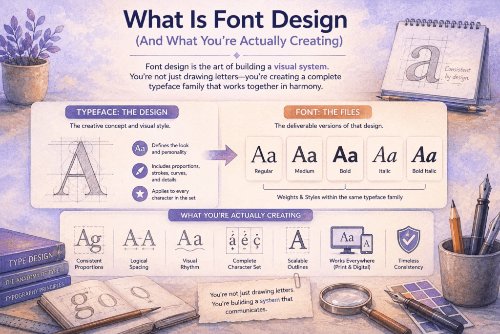
You’re designing a visual system.
Every character inside a typeface must feel like it belongs to the same family. The capital A should share the same personality as the M. The lowercase n should naturally relate to the h, m, and u.
Even punctuation marks and numbers need to follow the same visual logic. That consistency is what separates a professional typeface from a collection of attractive individual letters.
Before we go any further, let’s clear up one piece of terminology that often confuses beginners.
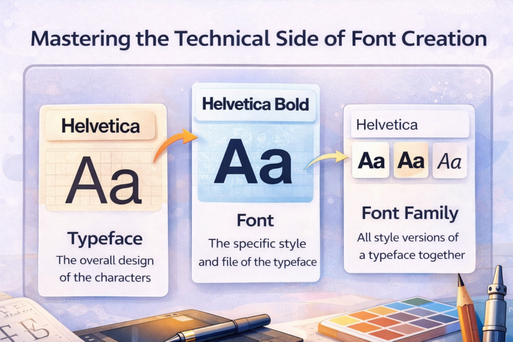
A typeface is the creative design itself—the visual concept that defines the appearance of every character. A font is the software file that delivers that design, whether it’s Regular, Bold, Italic, or another weight within the same family.
If you’re still unsure about the distinction, our Font vs. Typeface guide explains it with practical examples.
When you begin designing a typeface, you’re creating much more than an alphabet. You’re building a flexible system that includes:
- Consistent proportions
- Logical stroke construction
- Predictable visual rhythm
- Balanced spacing
- Distinct personality
- Scalable digital outlines
This is exactly why font design feels so different from illustration.
An illustration only needs to succeed as a single image. A typeface has to work across thousands of words, countless layouts, multiple screen sizes, and every imaginable reading environment. Every new character must reinforce the same design language without becoming repetitive.
That’s why experienced type designers rarely obsess over making one beautiful letter. Instead, they focus on building relationships between letters until the entire alphabet feels cohesive.
Once you understand that shift in thinking, designing a font becomes much less intimidating. You’re no longer chasing perfection one character at a time—you’re building a system that gradually grows stronger with every new glyph.
Designer Insight
Great fonts aren’t created letter by letter. They’re built system by system. The sooner you start thinking in relationships instead of individual characters, the faster your type design skills will improve.
Why Learning Font Design Matters in the Modern Design Economy
Typography has quietly become one of the most valuable creative skills a designer can learn.
Whether you’re designing websites, mobile apps, packaging, social media graphics, or complete brand identities, typography influences how people experience your work long before they consciously notice it. That’s one reason font designing has become increasingly popular among graphic designers, UI designers, and branding specialists alike.
Think about some of the world’s most recognizable companies.
Apple developed San Francisco to create a unified experience across its products. Netflix introduced Netflix Sans to strengthen its brand identity while reducing licensing costs. Google invested heavily in Google Sans to create visual consistency across its ecosystem.
None of those decisions were purely aesthetic.
They were strategic business decisions built around typography.
Fortunately, you don’t need to be a billion-dollar company to benefit from understanding how fonts are made.
Learning font design can help you:
- Build stronger brand identities
- Improve your logo and editorial work
- Create more readable websites and interfaces
- Develop premium digital products
- Understand typography at a much deeper level
- Create intellectual property that can generate long-term income
Even if you never release a commercial typeface, learning how professional fonts are built will permanently improve the way you evaluate typography. You’ll begin noticing proportions, spacing, rhythm, and consistency that most people overlook.
That’s why many experienced designers recommend studying font design—even if your primary goal isn’t becoming a type designer.
It’s one of the fastest ways to become better at typography itself.
Understanding Typography Fundamentals Before You Draw Anything
This is the section many font design beginners are tempted to skip.
Don’t.
Trying font designing without understanding typography fundamentals is like trying to compose music before learning rhythm. You might create something interesting by accident, but consistency becomes incredibly difficult.
Professional type designers spend years studying existing letterforms because every successful font builds upon principles that have evolved over centuries.
Understanding those principles will save you countless hours of trial and error once you begin drawing your own glyphs.
Anatomy of Letterforms (With Real Impact)
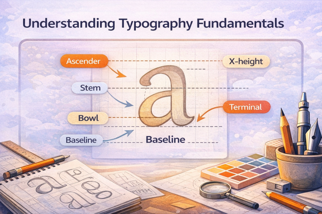
Every letter is built from a surprisingly small collection of structural components.
Once you recognize these parts, you’ll stop looking at fonts as decoration and start seeing them as carefully engineered systems.
Baseline
The invisible line that supports most letters.
A consistent baseline creates stability throughout a typeface and helps entire paragraphs feel visually balanced.
X-Height
The height of lowercase letters such as x, a, and e.
X-height has an enormous influence on readability. Fonts with larger x-heights generally feel more comfortable on digital screens because lowercase letters appear larger relative to capital letters.
Ascenders and Descenders
Ascenders extend above the x-height in letters like b, d, and h, while descenders extend below the baseline in letters such as g, p, q, and y.
Together, they create the distinctive silhouettes our brains use to recognize words quickly during reading.
Bowls
Bowls are the rounded sections found in letters like b, d, o, and p.
Although they appear simple, subtle differences in bowl proportions dramatically influence whether a typeface feels geometric, humanist, traditional, or contemporary.
Counters
Counters are the enclosed—or partially enclosed—spaces inside letters.
One of the biggest lessons in beginning font design is realizing that you’re designing white space just as much as black shapes. Well-balanced counters improve readability almost invisibly, while cramped counters make text feel dense and uncomfortable.
Stress
Stress describes the direction of a letter’s thick-to-thin transitions.
Vertical stress often creates a modern, structured appearance, while diagonal stress introduces a more traditional, calligraphic character.
Contrast
Contrast refers to the variation between thick and thin strokes.
High-contrast typefaces often communicate elegance and luxury. Low-contrast designs tend to feel cleaner, friendlier, and perform better at smaller sizes or on digital interfaces.
Individually, these elements may seem technical.
Together, they determine whether a typeface feels approachable, authoritative, playful, luxurious, or highly readable. Every professional font you’ve ever admired is simply the result of hundreds of small decisions working together.
Typography isn’t just visual.
It’s psychology translated into letterforms.
Serif vs. Sans Serif vs. Display: Choosing Your Direction
Before opening your font software, decide what kind of typeface you’re actually building.
This single decision influences almost everything that follows, from proportions and spacing to stroke construction and personality. One reason many font designers lose direction is that they change styles halfway through the alphabet.
Ask yourself:
- Is this a serif designed for long-form reading?
- A geometric sans serif for modern interfaces?
- A humanist sans with a warmer personality?
- A display font for large headlines?
- Or perhaps a variable font built for maximum flexibility?
Each category follows its own internal logic.
Serif typefaces require consistency in serif treatment and stroke contrast. Geometric sans serifs rely on mathematical precision, while humanist sans serifs introduce subtle irregularities inspired by handwriting. Display fonts prioritize personality over versatility and are usually intended for large sizes rather than extended reading.
One of the most common mistakes I see is design drift.
The first few letters look geometric. Halfway through, curves become more humanist. By the end of the alphabet, the typeface no longer has a clear identity.
Professional fonts feel cohesive because every design decision supports the same visual idea from beginning to end.
Choose your direction early.
Commit to it.
Your future self—and your future typeface—will thank you.
Choosing the Right Tools for Font Design
One of the biggest myths surrounding font design is that you need an expensive studio before you can produce professional work.
You don’t.
A reliable computer, the right software, and a willingness to revise your work over and over again are far more valuable than a premium setup.
The best type designers didn’t become experts because they owned expensive equipment—they became experts because they learned to see small details that everyone else ignored.
That doesn’t mean your tools don’t matter.
Choosing software designed specifically for type design will make the entire learning process smoother and save you from unnecessary frustration later.
Font Design Software Worth Learning
Unlike illustration software, font editors are built around the needs of type designers. They allow you to manage spacing, kerning, metrics, OpenType features, exports, and every other technical component that transforms a collection of drawings into a working font.
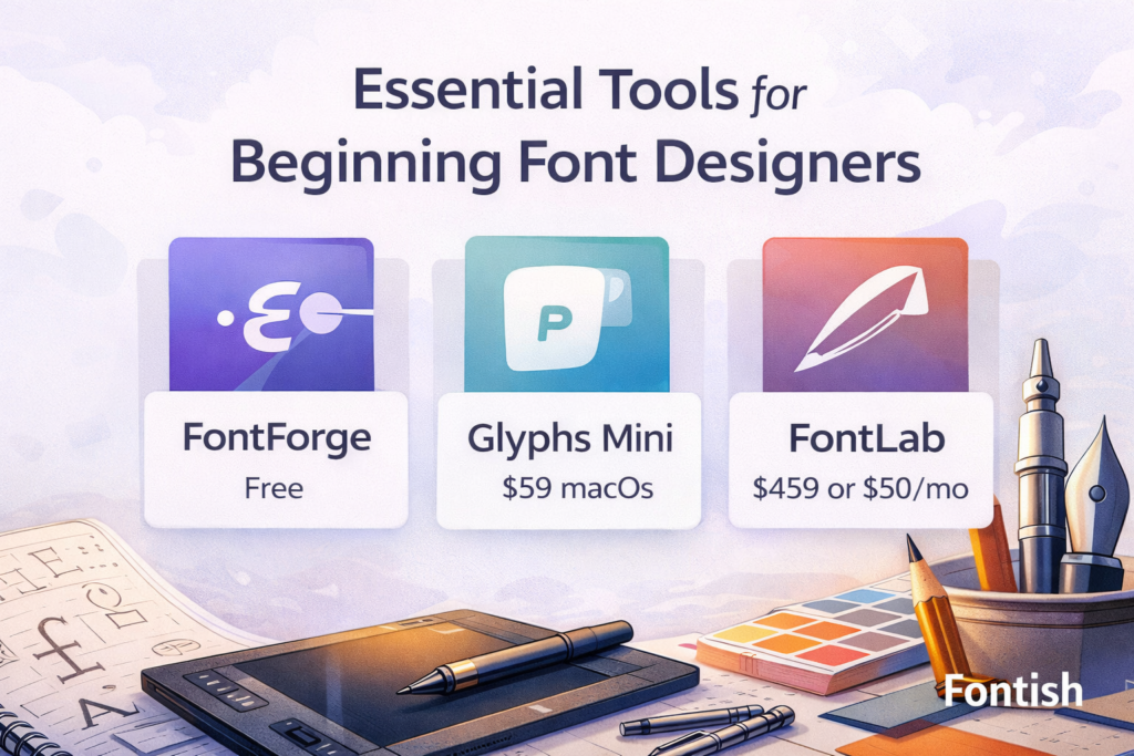
If you’re serious about font design for beginners, these are the applications worth exploring:
- Glyphs – Widely considered the industry favorite for macOS thanks to its intuitive interface and professional workflow.
- FontLab – A powerful all-around solution suitable for beginners and experienced designers alike.
- RoboFont – Popular among advanced type designers who want scripting, automation, and complete creative control.
- FontForge – A surprisingly capable open-source editor that’s completely free, making it one of the best starting points for new designers.
You’ll also find many designers sketching ideas in Adobe Illustrator, Affinity Designer, or Figma before moving into dedicated font software.
That’s a perfectly reasonable workflow.
Think of vector software as your sketchbook.
Think of your font editor as the workshop where those sketches become a functional typeface.
Once your design enters font software, you’ll begin working with elements that ordinary design programs simply aren’t built to handle, including:
- Glyph organization
- Side bearings
- Kerning pairs
- Font metrics
- OpenType features
- Export settings
- Font metadata
These technical details might sound intimidating at first, but they’re a major part of what separates professional fonts from decorative lettering. Learning them early will make every future project easier.
Pro Tip
Don’t spend weeks comparing software before you start learning. Every major font editor follows the same core principles. Pick one, learn it well, and upgrade later if your workflow demands it.
Do You Need a Drawing Tablet?
Probably not.
This surprises a lot of font design beginners because type design looks like illustration from the outside. In reality, creating a successful typeface is far less about freehand drawing and far more about refinement, consistency, and optical precision.
Many professional type designers spend most of their day using nothing more than a mouse or trackpad.
A drawing tablet can certainly make early sketching feel more natural, especially if you’re exploring calligraphic or hand-lettered concepts. But once you move into Bézier curves, you’ll spend much more time adjusting anchor points than sketching loose outlines.
Don’t let hardware become another excuse to postpone your first project.
If your current computer can comfortably run font software, you already have everything you need to begin.
What Are the Steps to Designing Your First Typeface?
One reason font designing feels overwhelming is that many beginners start in the wrong place.
They install a font editor, open a blank document, and immediately begin drawing the letter A. Three hours later, they’re frustrated because nothing looks consistent.
Professional type designers rarely work this way.
Instead, they follow a structured workflow that gradually transforms a handful of simple characters into a complete typeface. Every stage builds on the decisions made before it, which makes the entire process far more manageable than trying to invent every letter independently.
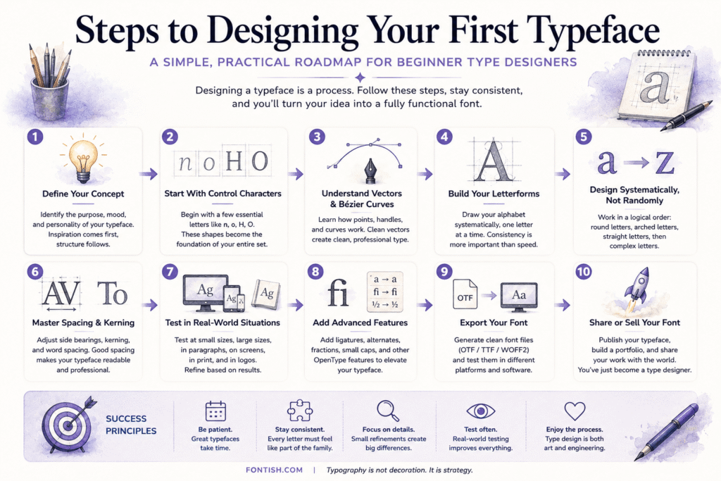
Let’s walk through that workflow for designing a font one step at a time.
Step 1: Plan Before You Draw Anything
The strongest typefaces begin long before the first Bézier curve.
Professional font designers almost always start by defining the purpose of the project. Without that direction, every design decision becomes a guess, and the typeface slowly loses its identity.
Before opening your font editor, ask yourself a few simple questions:
- Who is this font for?
- Where will it be used?
- Is it intended for headlines or body text?
- Should it feel modern, traditional, playful, elegant, or technical?
- What makes it different from fonts that already exist?
Write your answers down.
Even a short design brief creates useful constraints, and constraints almost always lead to better design decisions. They help you evaluate every future choice against a clear objective instead of relying on instinct alone.
Imagine you’re creating a font for a luxury coffee brand.
Rounded bowls, moderate contrast, and warm humanist proportions might reinforce the brand’s personality.
Now imagine you’re designing a typeface for a cybersecurity company.
Suddenly, tighter spacing, cleaner geometry, and sharper terminals feel much more appropriate.
Neither solution is objectively better.
They’re simply solving different problems.
That’s one of the most important lessons in font design for beginners: successful typefaces don’t begin with beautiful letters—they begin with a clear purpose.
Myth vs Reality
Myth: Professional designers start drawing immediately.
Reality: Most spend considerable time defining the concept before creating a single glyph.
Step 2: Start With Control Characters (Not the Entire Alphabet)
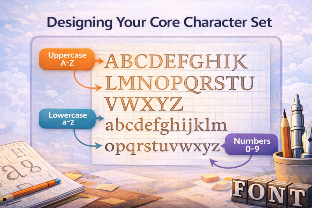
One of the smartest shortcuts in type design is realizing that you don’t need to design all twenty-six letters to understand whether your typeface is working.
Experienced designers usually begin with four “control characters”:
- n
- o
- H
- O
These simple letters establish much of the visual DNA of your typeface.
They determine:
- Stem thickness
- Counter size
- Overall proportions
- Curve construction
- Vertical rhythm
- Visual weight
Once the lowercase n feels balanced, you’ve already solved large portions of h, m, u, and r. Likewise, the lowercase o becomes the foundation for c, e, d, b, p, and q.
Instead of solving twenty-six unrelated design problems, you’re gradually expanding one coherent system.
That’s a much more efficient and far less intimidating way to approach font design for beginners.
Step 3: Understand Vectors and Bézier Curves
Unlike photographs, fonts aren’t made from pixels.
Every character is built from mathematical outlines called Bézier curves, allowing the font to remain perfectly sharp whether it’s displayed on a smartwatch or printed across a billboard.
Learning to control those curves is one of the biggest milestones for every new type designer.
You’ll spend much of your time adjusting:
- Anchor points
- Curve handles
- Direction changes
- Smooth transitions
The temptation is always the same.
When a curve doesn’t look right, beginners usually add another anchor point.
Ironically, that’s often what makes the curve worse.
Professional fonts achieve smoother outlines because they use fewer, more deliberate points. Each anchor exists for a reason, making future edits cleaner and the outlines easier to control.
Think of anchor points like punctuation in writing.
The right amount creates clarity.
Too many create clutter.
Designer Insight
If a curve still feels awkward after adding several points, the solution usually isn’t another point. It’s moving or removing the ones you already have.
Step 4: Set Up Your Metrics Properly
Behind every beautiful typeface sits an invisible measurement system.
This grid keeps every character aligned, balanced, and consistent across the entire font family. While you don’t need to copy another designer’s numbers exactly, starting with reliable metrics makes font design much easier.
A common setup looks like this:
- Units Per Em (UPM): 1000
- Baseline: 0
- X-height: approximately 500
- Cap height: 700–750
- Ascender: 750–800
- Descender: –200 to –250
One small detail deserves special attention: overshoot.
If you make the letter O exactly the same height as the letter H, the circle will actually appear smaller. Our eyes naturally perceive curved shapes differently from straight ones.
Professional type designers compensate by extending rounded letters slightly above the cap height and slightly below the baseline.
The adjustment is almost invisible.
Its impact isn’t.
Typography is full of these optical corrections, and learning to notice them is one of the biggest steps from beginner to professional.
Step 5: Design Systematically, Not Randomly
Once your foundation is in place, resist the urge to jump around the alphabet.
Professional designers work in groups because similar letters share similar construction. Solving one character often solves several others at the same time.
A practical sequence might look like this:
Round letters
- o
- c
- e
- d
- b
- p
- q
Arched letters
- n
- h
- m
- u
Straight letters
- i
- l
- t
- f
Complex letters
- a
- s
- g
- k
This workflow allows each new glyph to inherit decisions you’ve already refined.
Your spacing becomes more consistent.
Your proportions stabilize.
Most importantly, your typeface begins developing a recognizable personality instead of looking like a collection of unrelated drawings.
Many newcomers believe originality should be the priority.
It’s not.
Especially in font design for beginners, consistency is far more valuable than creativity. Once the system is stable, personality naturally follows.
Build the framework first.
Then let the character emerge.
Step 6: Master Spacing and Kerning (Where Good Fonts Become Great)
Suggested visual: How side bearings and kerning affect the appearance of common letter pairs.
Ask ten professional type designers what separates an average font from a great one, and most of them will give you the same answer:
Spacing.
That’s because people don’t read individual letters—they read words, sentences, and paragraphs. Even beautifully drawn letterforms will feel amateurish if the spacing is inconsistent. This is often the point where many font design projects either start looking professional or fall apart completely.
The first area to master is side bearings.
These are the spaces on either side of every letter, and together they establish the rhythm of your typeface. Too little space makes words feel cramped, while too much creates distracting gaps that interrupt reading.
A useful starting point is roughly 10–15% of a glyph’s width, but don’t treat that as an unbreakable rule. Every typeface develops its own rhythm, and your eyes, not the numbers—should make the final decision.
Once the overall spacing feels balanced, it’s time to refine kerning.
Kerning adjusts the spacing between specific letter pairs that naturally create awkward gaps because of their shapes. Some of the most common examples include:
- AV
- WA
- To
- Ty
- Yo
Although these adjustments are often tiny, they have an enormous impact on how polished your font feels.
The goal isn’t mathematical precision.
The goal is optical balance.
One of the oldest tricks in type design is testing with the word:
Hamburgefonstiv
It looks like nonsense because it is. Yet it contains a wide variety of stems, bowls, diagonals, counters, and curves, making it one of the best test words for evaluating spacing and overall rhythm.
Don’t stop there, though.
Install your font and type real paragraphs. Read headlines. Build a few mockups. What looks perfectly spaced inside a font editor can feel completely different once it’s surrounded by real content.
Common Mistake
Many beginners wait until the end of the project before thinking about spacing. Professional designers do the opposite—they refine spacing throughout the entire design process because every new glyph affects the rhythm of the typeface.
Step 7: Test Your Typeface in Real-World Situations

One of the biggest lessons for beginner font designers is realizing that exporting a font doesn’t mean it’s finished.
In fact, that’s usually when the real work begins.
Professional type designers constantly test their fonts in realistic situations because fonts rarely reveal their weaknesses inside the editor where they were created.
After exporting your first version, start using it exactly as your audience would.
- Create a landing page.
- Design a business card.
- Build a poster.
- Write several paragraphs.
- Open the font on your phone.
- Print a page.
- View it on different screens.
Each environment exposes different problems.
You may discover that certain letters feel too dark, some counters appear too small, or the spacing becomes inconsistent at smaller sizes. Occasionally you’ll notice that one character seems completely out of place, even though it looked perfect while you were designing it.
That’s normal.
Type design is built on repetition.
- Export.
- Install.
- Test.
- Refine.
- Repeat.
Some commercial fonts go through dozens or even hundreds of revisions before they’re released. That isn’t perfectionism; it’s simply the process of gradually removing small inconsistencies until the typeface feels effortless to read.
Your first project doesn’t need to reach that level.
Focus on making each version better than the last.
That’s how every experienced type designer learned.
Designer Insight
If your font starts looking worse the longer you work on it, don’t panic. Your drawing ability hasn’t suddenly declined—your eye has improved. You’re simply noticing imperfections that you couldn’t see a week ago.
Step 8: Add Advanced Features (When You’re Ready)
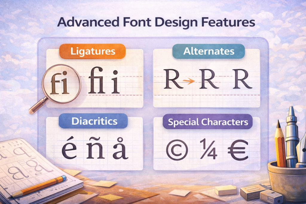
Once your basic alphabet is working consistently, you can begin expanding your typeface with advanced features.
These additions aren’t essential for your first release, but they significantly improve versatility and make your font feel more complete.
Popular additions include:
- Ligatures (fi, fl, ff)
- Stylistic alternates
- Small caps
- Old-style figures
- Lining figures
- Fractions
- Currency symbols
- Expanded punctuation
- Extended language support
Adding these features is exciting because they make your typeface feel increasingly professional.
However, this is also where many beginning font designers lose momentum.
Designers spend weeks creating beautiful ligatures while the regular alphabet still contains inconsistent spacing, uneven curves, or unfinished glyphs.
Finish the foundation first.
Then expand the family.
A simple, complete font will always outperform an ambitious project that’s only half finished.
Step 9: Export and License Your Font Properly
Eventually comes one of the most satisfying moments in the entire process.
Exporting your first working font.
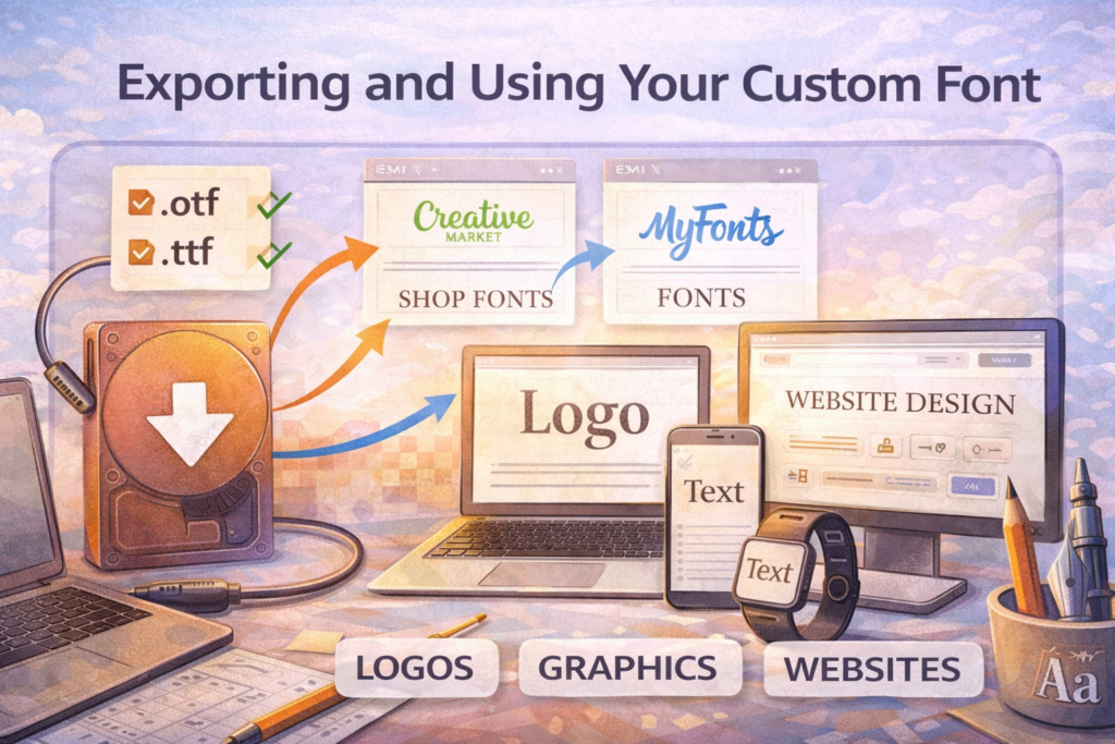
Most professional font editors allow you to generate several file formats, each intended for different environments:
- OTF (OpenType) – The preferred format for professional desktop publishing and design software.
- TTF (TrueType) – Still widely supported across operating systems and applications.
- WOFF and WOFF2 – Optimized for websites, making them ideal for modern web typography.
Before clicking Export, slow down and review your work one last time.
Ask yourself:
- Have overlapping paths been removed?
- Are anchor points clean and organized?
- Have all glyphs been checked?
- Is the spacing consistent?
- Does the kerning still feel balanced?
- Have you added proper metadata?
- Does the font install correctly on another computer?
Five extra minutes spent reviewing these details can save hours of troubleshooting later.
There’s another area beginners often overlook: licensing.
Even if you’re releasing your font for free, include a clear license that explains how people may use it. Can it be modified? Can businesses use it commercially? Can others redistribute it?
Clear licensing protects both you and your users while making your work appear far more professional.
If licensing still feels confusing, it’s worth reading our guide on font licensing before publishing your first typeface.
Step 10: Share or Sell Your First Font
After weeks or perhaps months of work, your first typeface is finally ready to leave your computer.
Now comes the exciting part.
Sharing it with the world.
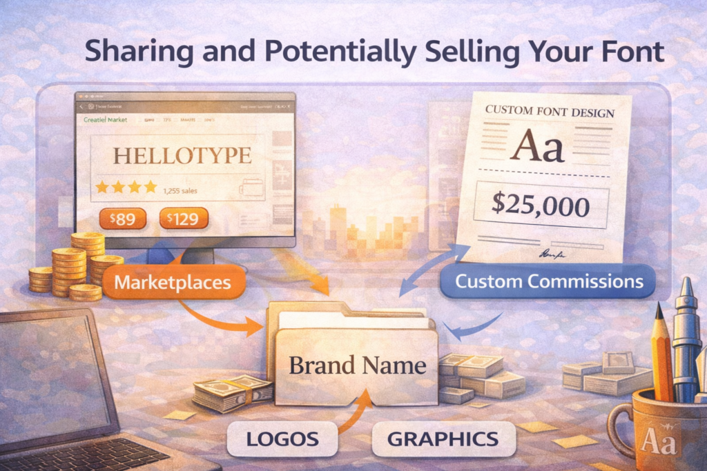
There are several ways to put your font to work:
- Release it as a free portfolio project.
- Offer it as a lead magnet on your website.
- Include it in client branding projects.
- Sell it through font marketplaces.
- License it directly from your own store.
Don’t put too much pressure on your first release.
Very few designers create a best-selling typeface on their first attempt. Instead, think of your first font as proof that you understand the complete process from concept to export.
That credibility alone makes you a stronger designer.
Many successful foundries began with one modest release before gradually expanding into larger families and commercial libraries.
Every professional collection starts exactly the same way.
With one finished font.
Mastering the Technical Side of Font Creation (Deep Dive)
Once you’ve completed your first typeface, something interesting begins to happen.
You stop noticing only the obvious details.
Instead, you begin seeing the tiny optical adjustments that separate competent fonts from exceptional ones. This is where font design starts evolving into genuine type design expertise.
Let’s look at a few of those professional concepts.
Units Per Em (UPM): The Invisible Grid Behind Every Font
Every digital font is built upon an internal measurement system called Units Per Em, or UPM.
Most modern fonts use a value of 1000 units, although other systems exist. This invisible grid establishes the proportions of every glyph and ensures consistency throughout the family.
A common setup looks like this:
- Baseline: 0
- X-height: 500
- Cap height: 720
- Ascender: 780
- Descender: –220
These numbers aren’t universal, but they provide an excellent foundation for most text-oriented typefaces.
Think of the UPM as the blueprint beneath a building.
Nobody sees it.
Yet every visible element depends on it.
Without a stable grid, characters gradually drift out of alignment, making paragraphs feel uneven even if readers can’t explain why.
Overshoots: The Optical Correction Nobody Notices
One of typography’s cleverest illusions is called overshoot.
Imagine drawing a perfect square and a perfect circle with identical heights.
Place them beside each other.
The circle appears smaller.
Our eyes naturally perceive curved shapes differently from straight ones, so professional type designers compensate by allowing rounded letters such as O, C, G, and S to extend slightly beyond the baseline and cap height.
The adjustment is incredibly small.
Most readers never consciously notice it.
Yet without it, the typeface feels subtly awkward.
This is exactly why typography is often described as the art of optical correction rather than mathematical precision.
Building Better Bézier Curves
The quality of your curves often determines whether a font feels polished or amateurish. The good news is that smoother curves usually require fewer anchor points—not more.
Whenever possible:
- Use the minimum number of anchor points.
- Keep Bézier handles balanced.
- Avoid unnecessary direction changes.
- Maintain smooth transitions between curves.
A guideline many experienced font designers follow is the 65% handle rule, where Bézier handles extend roughly two-thirds of the distance between neighboring points. It’s not a strict formula, but it often produces cleaner and more natural-looking curves.
One of the fastest ways to improve your own work is by studying professionally designed fonts.
Open them.
Inspect the outlines.
Notice how remarkably simple many of them are.
You’ll quickly discover that elegant curves are usually the result of restraint rather than complexity.
Hinting and Screen Optimization
Today’s high-resolution displays have reduced the importance of manual hinting, but it still plays a valuable role in professional font production.
Hinting tells operating systems how to render characters more clearly at smaller sizes, improving legibility on lower-resolution screens and certain operating systems.
For most font design beginners, auto-hinting is perfectly adequate.
Manual hinting becomes more important once you’re producing commercial fonts intended for widespread distribution.
Until then, spend your energy improving the outlines themselves. Great curves matter far more than perfect hinting during your first projects.
Kerning Classes: Working Smarter, Not Harder
Imagine manually adjusting every possible letter pair inside a complete typeface.
You’d still be working months from now. Advanced type designers solve this problem by creating kerning classes.
Instead of treating every letter individually, they group similar characters together.
For example:
- Round letters: O, C, G, Q
- Straight letters: H, I, N, M
- Diagonal letters: A, V, W, Y
Now, instead of adjusting thousands of individual combinations, you edit entire groups at once.
It’s faster.
It’s more consistent.
And as your typeface grows into multiple weights and styles, it becomes almost essential.
Like many professional workflows, kerning classes don’t make headlines.
They simply save an incredible amount of time.
Case Studies: Typography in the Real World
Case Study 1: Building a Modern Geometric Sans
Theory is useful, but seeing how professional decisions come together in a real project makes font design much easier to understand.
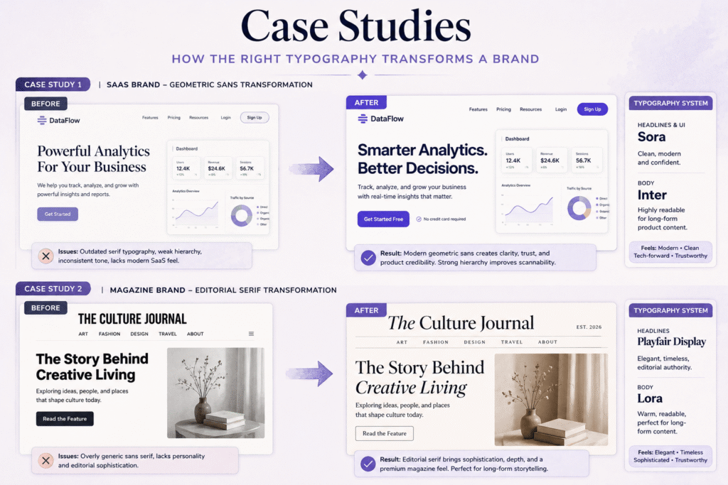
Imagine you’re creating a geometric sans serif for a fast-growing SaaS company. The brief is straightforward: the typeface should feel modern, intelligent, and trustworthy while remaining highly readable across websites, dashboards, and mobile interfaces.
Every design decision supports that goal.
The strokes remain consistent throughout the alphabet, creating a clean, engineered appearance. The x-height is slightly larger than average to improve readability on screens, while generous counters prevent the letters from feeling cramped at smaller sizes.
The biggest challenge isn’t making the font look modern.
It’s preventing it from becoming lifeless.
Perfect geometry often feels cold because computers naturally create shapes that are mathematically correct but optically uncomfortable.
Professional font designers compensate by softening corners, adjusting curve tension, refining terminals, and making countless tiny optical corrections that most users will never consciously notice.
Those refinements are what separate a usable interface font from one people genuinely enjoy reading.
The lesson here isn’t that every font should be geometric.
It’s that every design decision should support the personality you established in your original design brief.
Case Study 2: Designing an Editorial Serif
Now imagine a completely different project.
Instead of designing for software, you’re creating a serif typeface for a premium magazine.
The audience expects elegance, but they’ll also spend long periods reading articles. That means readability becomes just as important as personality.
Rather than chasing dramatic stroke contrast, the designer opts for moderate contrast, bracketed serifs, generous counters, and a slightly taller x-height to improve legibility in long-form text.
Thin strokes receive subtle reinforcement so they remain clear in print, while spacing is opened slightly to improve reading comfort over multiple paragraphs.
The finished typeface doesn’t demand attention.
It quietly earns it.
That’s often the hallmark of exceptional editorial typography.
When readers stop noticing the font altogether, it’s usually because the designer solved hundreds of small problems before anyone else had the chance to see them.
Designer Insight
The best typefaces rarely announce themselves. They simply make reading feel effortless.
Common Beginner Mistakes (And How to Avoid Them)

Every font designer makes mistakes.
The difference between professionals and beginners isn’t avoiding mistakes altogether—it’s recognizing them early enough to correct them before they spread throughout the entire typeface.
If you’re exploring font design for beginners, these are the pitfalls you’ll encounter most often.
Starting Without a Plan
Opening your font editor and immediately drawing letters feels productive.
Unfortunately, it’s usually the fastest way to create an inconsistent typeface.
Without a clear objective, your design slowly changes direction as new ideas appear. Before long, the first letters no longer resemble the last ones.
Spend fifteen minutes writing a simple design brief before you touch your software. It might be the highest-return investment you’ll make during the entire project.
Perfecting One Letter for Too Long
Many beginners spend days refining the lowercase n before moving forward.
The irony is that the letter will almost certainly change several more times before the project is complete.
Early glyphs aren’t final artwork. They’re prototypes that establish the visual language for everything that follows.
Keep moving.
You’ll refine them later.
Ignoring Spacing Until the End
This is one of the biggest mistakes in font design for beginners.
Beautiful letters with poor spacing still produce an average font.
Average letters with excellent spacing often look surprisingly professional.
Spacing isn’t something you add after the drawing is finished.
It’s part of the drawing itself.
If you’re unfamiliar with these concepts, our guides on Kerning, Tracking, and Leading are excellent next reads before refining your typeface.
Using Too Many Anchor Points
Adding more anchor points rarely fixes an awkward curve.
Most of the time, it creates new problems.
Professional outlines often look surprisingly simple because experienced type designers remove unnecessary points instead of adding them. Simpler curves are easier to edit, easier to maintain, and almost always produce smoother results.
When a curve feels wrong, try simplifying it first.
Not complicating it.
Designing Letters in Isolation
A letter may look beautiful by itself.
That doesn’t mean it works inside a sentence.
Professional type designers constantly test words, paragraphs, and headlines because typography is experienced in context—not one glyph at a time.
Build real layouts throughout the project. You’ll discover problems much earlier.
Creating Multiple Weights Too Early
It’s tempting to jump straight from Regular to Bold, Light, and Italic.
Resist the urge.
A strong Regular weight becomes the blueprint for every future style. If the foundation isn’t solid, every additional weight simply multiplies the same problems.
Complete one excellent style before expanding into a family.
Giving Up During the “Everything Looks Wrong” Stage
Almost everyone reaches this point. Usually around the twentieth or thirtieth glyph.
Suddenly every curve looks awkward, nothing feels consistent, and you begin questioning the entire project.
Ironically, that’s often the moment real progress begins.
Your drawing ability hasn’t declined.
Your eye has improved.
You’re noticing inconsistencies that were invisible when you started.
Keep going.
Every experienced type designer has lived through this stage.
Frequently Asked Questions
How long does it take to design a professional font?
For most beginner font designers, a basic Latin character set can take anywhere from four to twelve weeks of part-time work.
Professional font families with multiple weights, italics, language support, and OpenType features often require six months to several years.
Good typography rewards patience more than speed.
Which software do professional type designers use?
Glyphs, FontLab, and RoboFont remain the industry’s leading applications.
If you’re just getting started, FontForge provides an excellent free alternative that is fully capable of producing commercial-quality fonts.
The software matters less than developing a disciplined workflow.
Why is spacing often more important than the letterforms themselves?
Because readers process words—not isolated letters.
Even beautifully drawn glyphs become difficult to read if the spacing feels uneven. Strong spacing creates consistent reading rhythm, which is ultimately the goal of every successful typeface.
What is overshoot in typography?
Overshoot is a small optical correction where rounded letters extend slightly beyond alignment guides.
Without it, circles appear visually smaller than straight-sided letters of the same measured height.
It’s one of the many invisible adjustments that help professional fonts feel balanced.
Can beginners really make money designing fonts?
Absolutely.
However, your first release is more valuable as a learning experience than a source of income.
Many successful independent foundries spent years refining their craft before building profitable font libraries. Treat your first typeface as the beginning of a long-term portfolio rather than a one-time project.
Should I design a serif or sans serif font first?
Most designers recommend beginning with a sans serif.
Without the additional complexity of serif construction, you can focus on proportions, spacing, consistency, counters, and Bézier curves before tackling more advanced structures.
Once you’re comfortable with those fundamentals, moving into serif design becomes much less intimidating.
The Bottom Line
Learning font design isn’t really about learning to draw better letters.
It’s about learning to think in systems.
At first you’ll focus on individual glyphs. Before long, you’ll start noticing rhythm, spacing, proportions, and optical balance. Eventually, you’ll realize that every successful typeface is simply hundreds of thoughtful decisions working together toward a single goal.
That’s what makes type design so rewarding.
It combines creativity with precision, art with engineering, and visual expression with problem-solving.
Every project teaches you to observe more carefully, refine more patiently, and make stronger design decisions—not just when designing fonts, but across branding, editorial design, web design, and visual communication as a whole.
Most importantly, don’t wait until you feel “ready.”
No professional type designer started with a perfect alphabet.
They started with one letter.
Then another.
Then another.
Every typeface you’ve ever admired began as an unfinished sketch on someone’s screen.
The difference wasn’t talent.
It was persistence.
So open your font editor.
Draw your first n.
Refine your first o.
Keep testing.
Keep learning.
Because every professional type designer—and every remarkable typeface—started exactly the same way.
Continue Your Typography Journey
If you enjoyed this guide, continue building your typography skills with these next resources:
- How to Pair Fonts Like a Designer — Learn how professionals combine typefaces for branding, editorial layouts, and websites.
- How to Choose the Right Font for Your Brand — Discover a practical framework for selecting fonts that reinforce your brand personality.
The more you understand how type works, the better every design decision becomes.
Typography isn’t decoration. It’s strategy.