
 I
I
In This Pairing
Playfair Display + Inter create the kind of contrast designers usually spend far too long trying to manufacture. One is expressive, elegant, and rooted in editorial typography. The other is clean, practical, and built for modern screens.
Together, they make a polished font pairing that feels distinctive without making a website harder to read.
Playfair Display gives important moments a voice. Inter keeps everything around those moments clear, orderly, and easy to navigate.
If you want a pairing that can move comfortably between luxury branding, editorial content, portfolios, and refined websites, this font combination deserves a place near the top of your shortlist.
Playfair Display and Inter work because they do different jobs exceptionally well. Playfair Display attracts attention; Inter manages information. The result is expressive but controlled—a useful balance for brands that want to look premium without becoming ornamental or old-fashioned.
Playfair Display and Inter Pairing Snapshot
The safest starting point is Playfair Display Bold for major headings and Inter Regular for body text. Add Inter Medium or Semibold for navigation, buttons, and small labels. You rarely need more than four total font styles to make this pairing feel complete.
An Overview of Playfair Display and Inter
This pairing combines historical character with modern utility. Playfair Display takes inspiration from late-eighteenth-century transitional type, when printing technology allowed designers to create stronger contrast between thick and thin strokes. That history gives it a formal, editorial presence.
Inter comes from a very different design problem. It was created for computer screens, user interfaces, and dense information. Its open forms, generous x-height, and broad family make it dependable at the smaller sizes where Playfair Display becomes less comfortable.
That difference is the point. Good font pairing is not about finding two typefaces that look alike. It is about choosing fonts that share a believable mood while contributing different strengths.
Playfair Display and Inter both feel considered and precise. One communicates through personality; the other through restraint.
What Is Playfair Display?
Playfair Display, Explained
Playfair Display is a high-contrast serif typeface designed by Claus Eggers Sørensen. Its elegant curves, fine strokes, and dramatic details make it especially effective for headlines, editorial layouts, luxury branding, and other prominent display text.
The keyword in its name is “Display.” Playfair Display is at its best when it has enough size and space to show its character. Use it for headlines, section titles, quotations, article openers, and short statements—not for long paragraphs squeezed into a narrow mobile column.
Its strongest qualities include:
- ✅ Noticeable contrast between thick and thin strokes
✅ Distinctive letterforms that create an editorial mood
✅ Strong uppercase and lowercase headline presence
✅ Enough weight options to support varied display hierarchy
✅ A premium feel without requiring a paid font licence
Playfair Display can look luxurious, literary, romantic, or authoritative depending on the surrounding colour, imagery, spacing, and copy. That flexibility is useful, but it also means the font needs a quieter partner. Pair it with another dramatic typeface and the page may start competing with itself.
What Is Inter?
Inter, Explained
Inter is a modern sans-serif typeface designed by Rasmus Andersson for digital screens and user interfaces. Its generous x-height, clear letterforms, and extensive weight range make it highly readable for body copy, navigation, buttons, labels, and other functional text.
Its tall x-height keeps lowercase text clear at small sizes. The family also offers enough weights and typographic features to handle body copy, captions, labels, navigation, buttons, data, and interface components.
Inter brings several practical advantages to this pairing:
- ✅ Excellent screen readability
✅ A wide range of weights
✅ Clear letterforms at small sizes
✅ Strong support for interface-heavy layouts
✅ A neutral tone that lets Playfair Display lead
Inter is not here to steal the scene. It creates the quiet framework that makes Playfair Display look even more intentional.
Why Playfair Display and Inter Work So Well Together
Before looking at how Playfair Display and Inter work together, it’s important to understand the basics of font pairing. Good typography isn’t just about looks—it’s about clear hierarchy, tone, and readability working as a system.
If you’re still learning, our how to choose the right fonts guide explains the key principles.
With that in mind, let’s see why this pairing works so well.
They create immediate contrast
Playfair Display has fine hairlines, pronounced stroke contrast, and decorative energy. Inter uses simpler, more even strokes and compact shapes.
Readers can identify the difference between a headline and supporting text before consciously processing either font.
That makes hierarchy feel natural rather than forced.
They share a polished tone
Contrast alone is not enough. A playful display face paired with a rigid corporate sans serif may be readable, yet still feel emotionally mismatched.
Playfair Display and Inter avoid that problem. Both feel precise, contemporary, and carefully designed. Playfair adds elegance while Inter keeps that elegance grounded.
Each font solves the other’s weakness
Playfair Display can become delicate or tiring in small text. Inter can feel too plain when a design needs a memorable voice.
Used together, those weaknesses largely disappear. Inter handles the reading. Playfair handles the recognition.
The pairing supports a complete design system
You can use this combination across an entire website without searching for a third typeface. Playfair Display can cover display moments, while Inter supports every functional layer from paragraphs to form labels.
That simplicity improves consistency and usually helps performance too. Two well-managed families are easier to load, test, and maintain than a typographic cast of thousands.
Live Font Pairing Preview
Use the live pairing preview to test this combination with your own brand message before committing to it.
Playfair Display and Inter show their strength in real use: expressive headlines paired with clean, readable body text. The result is a balanced, modern system that feels refined and easy to read across all screens.
ABCDEFGHIJKLMNOPQRSTUVWXYZ
abcdefghijklmnopqrstuvwxyz
0123456789 ! ? & % $ # @ ( ) [ ] : ; , .
Try short and long headlines. Test sentence case and title case. Then reduce the preview to mobile width. Playfair Display’s thin details need enough size to remain visible, while Inter should stay comfortable across every breakpoint.
A strong starting setup is:
- Playfair Display: 48–64px, weight 700, line-height 1.05–1.15
- Inter body copy: 17–19px, weight 400, line-height 1.55–1.7
- Inter labels and navigation: 14–16px, weight 500 or 600
Treat those values as a starting point, not sacred typography law. A fashion landing page can support a larger, airier heading. A dense editorial article may need a more restrained scale.
Visual Hierarchy Example
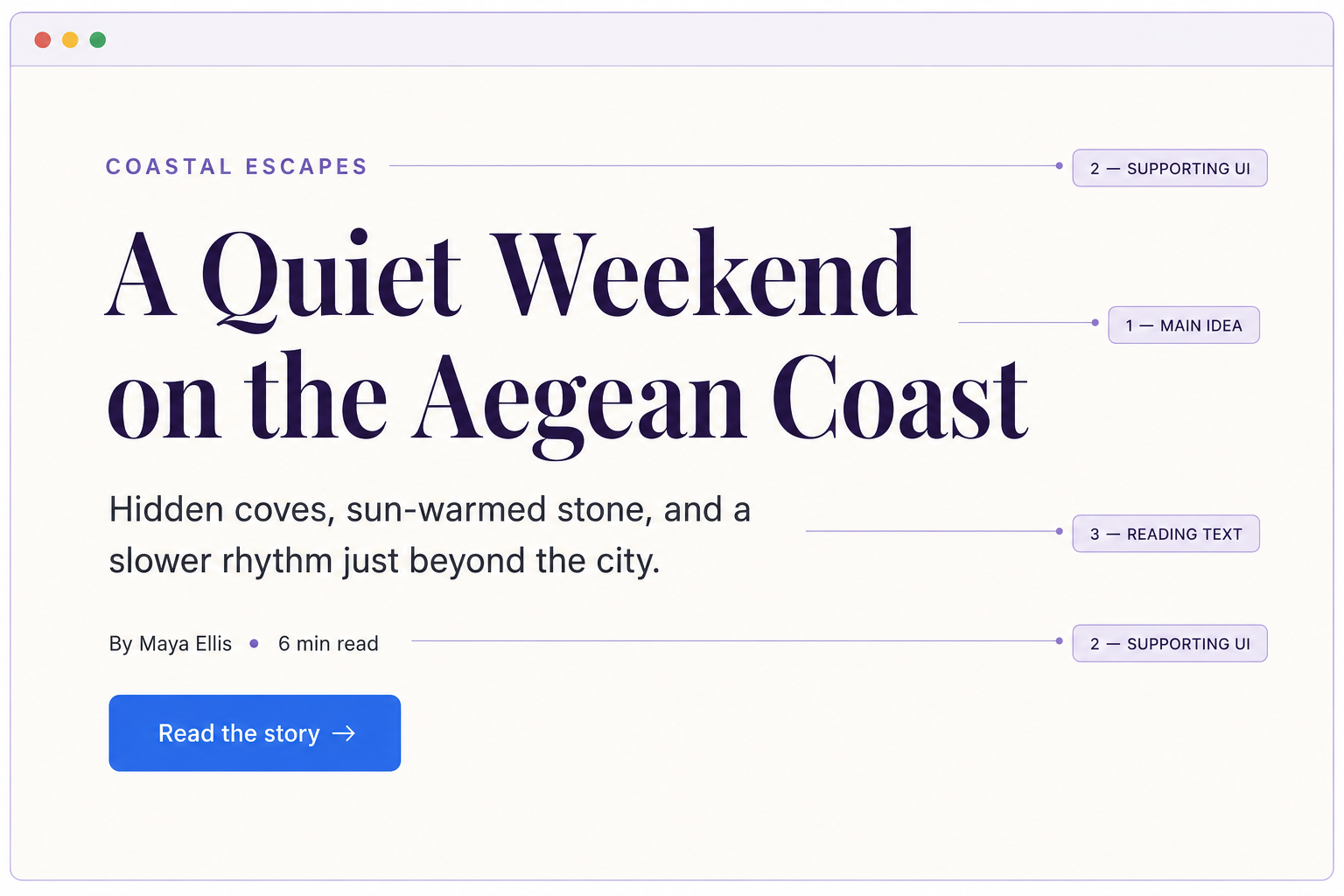
The category label—“Coastal Escapes”—appears in Inter Semibold, small and uppercase. The article title uses Playfair Display Bold at a generous size. A short introduction follows in Inter Regular, while the byline and reading time use a smaller Inter Medium.
Before the reader has finished the first sentence, the hierarchy is already clear:
- Playfair Display presents the main idea.
- Inter Semibold organises the supporting interface.
- Inter Regular carries the reading experience.
The design feels editorial because of Playfair Display, but it remains usable because Inter controls the details.
Best Use Cases for Playfair Display and Inter
The following use cases show where Playfair Display and Inter feel most natural, and how their contrast can be used to create clear hierarchy, tone, and readability across different types of projects.
Editorial Websites
Playfair Display gives feature stories and magazine-style headlines an elegant editorial presence, while Inter keeps long articles, navigation, and supporting details clear and comfortable to read.
Luxury Branding
This pairing brings refinement to fashion, beauty, hospitality, jewellery, and interior brands. Playfair Display creates a premium mood, while Inter keeps the overall identity modern, polished, and practical.
Creative Portfolios
Playfair Display adds personality to project titles and introductions without overpowering the work. Inter provides a clean foundation for descriptions, case studies, menus, and portfolio details.
Note: Playfair Display and Inter also work well for personal brands, thoughtful blogs, and other content-led projects that need editorial character without sacrificing readability.
Editorial websites and online magazines
This is the pairing’s natural territory. Playfair Display gives feature titles and section openers the presence of a magazine spread, while Inter keeps articles readable on screens.
Luxury and premium branding
Beauty, fashion, jewellery, interiors, boutique hospitality, and premium food brands can use Playfair Display to signal refinement. Inter prevents the identity from looking too traditional and works well across booking forms, product details, menus, and calls to action.
Creative portfolios
Photographers, art directors, designers, and writers often need personality without visual clutter. A restrained Playfair Display heading can frame the work, while Inter gets out of the way.
Personal brands
Consultants, authors, coaches, and creators can use Playfair Display to create authority and warmth. Inter keeps educational content, newsletters, and landing pages straightforward.
Blogs and content-led businesses
The combination creates a strong distinction between the editorial voice and the reading layer. It is especially effective for thoughtful topics such as culture, travel, design, food, and lifestyle.
When to Avoid This Pairing
Playfair Display and Inter are versatile, but they are not universal.
Avoid the pairing when the brand needs to feel highly technical, industrial, childlike, aggressively experimental, or deliberately casual. Playfair Display brings refinement even when you try to dress it down.
It may also be a poor choice for interfaces with very little room for display typography. In a dense dashboard, internal enterprise tool, or data-heavy application, Playfair Display can feel decorative rather than useful.
Finally, think twice if every competitor in your niche already uses a high-contrast serif with a neutral sans serif. The pairing will still work, but typography alone may not make the brand distinctive. You will need a stronger colour system, art direction, grid, or custom typographic treatment.
Recommended Type Hierarchy
| Element | Font | Weight | Suggested size | Line height |
| H1 | Playfair Display | 700 | 48–64px | 1.05–1.15 |
| H2 | Playfair Display | 700 | 32–40px | 1.15–1.25 |
| H3 | Inter | 600 | 23–28px | 1.25–1.35 |
| Body | Inter | 400 | 17–19px | 1.55–1.7 |
| Navigation | Inter | 500–600 | 15–17px | 1.2–1.4 |
| Eyebrow label | Inter | 600 | 12–14px | 1.2–1.4 |
| Button | Inter | 600 | 15–17px | 1.2 |
| Pull quote | Playfair Display | 600 | 28–38px | 1.25–1.4 |
This hierarchy keeps Playfair Display focused on moments that deserve attention. Inter handles all recurring and functional elements, making the system easier to scan.
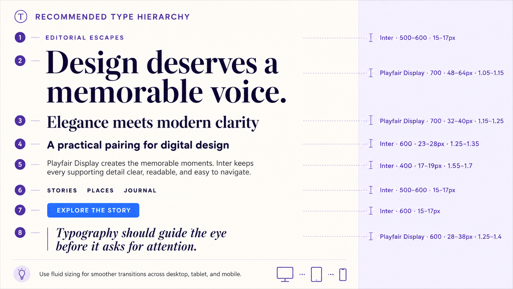
On small screens, reduce the H1 gradually rather than jumping straight from 64px to 36px. A fluid value such as clamp(2.5rem, 6vw, 4rem) creates a smoother transition.
How to Use Playfair Display and Inter on a Website
Load only the weights you actually use. For most websites, Playfair Display 600 and 700 plus Inter 400, 500, and 600 provide more than enough flexibility.
:root {
  --font-display: "Playfair Display", Georgia, serif;
  --font-body: "Inter", Arial, sans-serif;
}

body {
  font-family: var(--font-body);
  font-size: 1.125rem;
  line-height: 1.65;
}

h1,
h2,
.pull-quote {
  font-family: var(--font-display);
}

h1 {
  font-size: clamp(2.5rem, 6vw, 4rem);
  line-height: 1.08;
  letter-spacing: -0.02em;
}

button,
nav,
.eyebrow {
  font-family: var(--font-body);
  font-weight: 600;
}
Test the result in real content, not just a perfect three-word mock-up. Long headlines, numerals, punctuation, bold text, links, and mobile wrapping reveal problems much faster than “The quick brown fox.”
Also check performance. If the fonts are hosted externally, preload only essential files and use font-display: swap. If privacy, speed, or greater loading control matters, consider self-hosting the required font files.
Real-World Pairing Example
Consider a boutique hotel website.
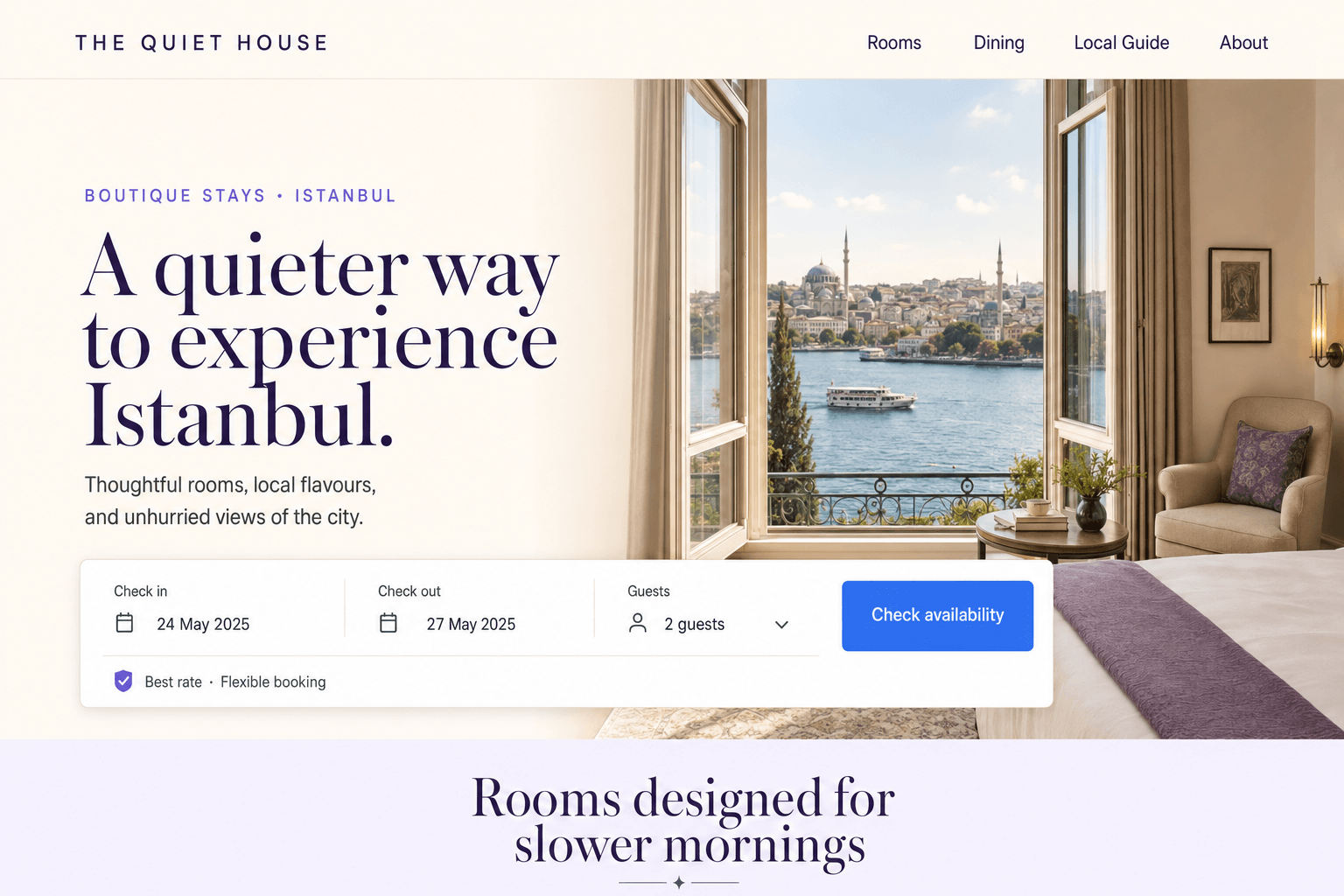
The homepage hero uses Playfair Display Bold for “A quieter way to experience Istanbul.” Inter supports it with a short description, availability dates, room details, and a booking button.
Playfair Display communicates atmosphere. Inter handles the transaction.
The same roles continue throughout the site: Playfair Display introduces rooms, dining, and local guides; Inter presents prices, amenities, policies, and booking information. Nothing feels pasted together because every font has a consistent job.
That is the difference between selecting two attractive fonts and building an actual type system.
Common Pairing Mistakes
❌ Using Playfair Display for body copy
Compare the weak example with the corrected version to see how assigning each font a clear role improves readability and hierarchy.
A More Thoughtful Way to Travel
Using Playfair Display for both the heading and paragraph makes longer text feel delicate, busy, and harder to read.
A More Thoughtful Way to Travel
Playfair Display creates an expressive headline, while Inter keeps the supporting copy clean, comfortable, and easy to scan.
❌ Making both fonts equally loud
If Playfair Display headings are bold and dramatic while every Inter label is uppercase, oversized, and heavily weighted, the hierarchy becomes noisy. Let one element lead at a time.
❌ Choosing too many weights
Loading every available style does not create sophistication. It creates more decisions and slower pages. Start with a limited set and add a weight only when it performs a specific job.
❌ Setting headlines too tightly
Playfair Display often benefits from slightly tighter letter spacing at large sizes, but excessive negative tracking can cause its shapes to collide. Watch combinations such as “fi,” “fl,” and tightly spaced capitals.
❌ Ignoring mobile line breaks
A graceful desktop headline can become a five-line wall on a phone. Test real titles at common viewport widths and adjust size, width, or wording where needed.
Alternative Font Pairings
| Pairing | Personality | Best for | Why consider it |
| Cormorant Garamond + Inter | Artistic, refined, expressive | Luxury editorials and fashion | More delicate and dramatic than Playfair Display |
| Libre Baskerville + Inter | Literary, trustworthy, grounded | Publications and professional brands | Calmer and more traditional |
| DM Serif Display + Inter | Bold, friendly, modern | Lifestyle brands and landing pages | Softer shapes and a warmer display voice |
| Playfair Display + Source Sans 3 | Editorial, open, approachable | Content-rich websites | A slightly more humanist body texture |
| Playfair Display + Manrope | Stylish, geometric, contemporary | Premium digital brands | Creates a sharper, more fashion-forward contrast |
Choose Cormorant Garamond when you want more drama, Libre Baskerville when readability and restraint matter most, or DM Serif Display when Playfair Display feels a little too formal.
Designer Tips for a More Polished Result
Give Playfair Display room to breathe. A generous text width, deliberate whitespace, and restrained line count make it feel more expensive than simply increasing the font size.
Make the Pairing Feel More Polished
Small typographic decisions can make Playfair Display and Inter feel intentional rather than simply placed together. Use these four principles to refine the pairing.
Give Playfair Room to Breathe
Use generous whitespace, comfortable margins, and restrained line lengths around Playfair Display headings. Its elegant details look best when they are not crowded.
Keep Inter Consistent
Assign consistent Inter weights to body text, labels, navigation, and buttons. A predictable system creates rhythm and makes the interface easier to scan.
Build a Complete Visual System
Support the fonts with a considered colour palette, strong imagery, and a clear grid. Typography works best when the rest of the design speaks the same visual language.
Note: These refinements may seem small, but together they determine whether the pairing feels merely attractive or genuinely professional. Keep the font roles clear, test them in context, and adjust the system—not just individual lines of text.
Use Inter to create rhythm. Repeat its weights consistently across labels, metadata, body text, and controls. Readers may not notice the pattern consciously, but they will feel the order it creates.
Do not rely on the fonts to do all the branding. Pair them with a considered colour palette, strong photography, and a clear grid. Typography can carry a lot, but it should not be forced to carry the sofa too.
Most importantly, test the pairing with the words your audience will actually read. Brand names, product titles, accented characters, prices, dates, and long article headings deserve a place in your type tests.
If you’re just starting to explore typography, it’s worth pairing this guide with our font design for beginners resource, which breaks down the core principles of choosing, pairing, and using type in a way that’s easy to apply to real projects.
Frequently Asked Questions
Is Playfair Display good for websites?
Yes. Playfair Display is excellent for website headings, hero statements, pull quotes, and editorial titles. Use a highly readable sans serif such as Inter for body copy and interface elements.
Is Inter a good match for Playfair Display?
Inter is one of the most dependable Playfair Display pairings. Its clean shapes and screen readability balance Playfair Display’s high contrast and decorative character.
Can I use Playfair Display and Inter for a logo?
You can use Playfair Display as a starting point for an elegant wordmark and Inter for a tagline or supporting identity. Check distinctiveness and licensing requirements, and consider customising the wordmark rather than using the font unchanged.
What weights should I use for Playfair Display and Inter?
Start with Playfair Display 700 for major headings, Inter 400 for body copy, and Inter 600 for navigation and buttons. Add Playfair Display 600 only if you need a softer secondary display level.
Are Playfair Display and Inter free to use?
Both are open-source typefaces available through Google Fonts. Review the current licence files for your distribution method, especially if you plan to package or redistribute the font software.
Should You Choose Playfair Display and Inter?
Choose this pairing if your design needs editorial character, clear hierarchy, and dependable digital readability. It is especially strong when the brand should feel refined, intelligent, or premium without looking stuck in the past.
Look elsewhere if the project needs a playful, rugged, highly technical, or deliberately unconventional voice. A good pairing must support the brand’s personality, not merely look attractive in a specimen.
The Bottom Line
Playfair Display and Inter succeed because the division of labour is obvious. Playfair Display creates memorable moments. Inter turns those moments into a usable, readable system.
Keep Playfair Display large, selective, and expressive. Let Inter handle the everyday work. With disciplined weights, responsive sizing, and enough whitespace, this pairing can make a simple layout feel editorially polished without sacrificing clarity.
Ready to see whether it fits your project? Test your real headline, body copy, and call to action in the Fontish pairing preview, then compare the result at desktop and mobile sizes before you commit.